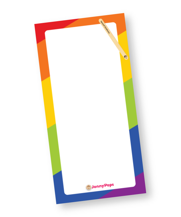
“A Better Pop for a Better World!” JonnyPops mission has always been to make high-quality products and to make the world a kinder place. All JonnyPops are free from artificial dyes, made in a peanut-free facility, and have a kind deed printed on every pop stick.
Enjoy on desktop to learn more about the strategy behind the design.
-
In this role, I created a wide range of marketing assets including social media content, digital ads, email campaigns, and internal communications supporting company-wide initiatives and product launches. Highlights included developing Minnesota State Fair collateral, building reusable social templates for brand-consistent content, co-directing product photoshoots, and producing materials for R&D flavor testing. I also represented the brand at consumer events statewide, coordinated internal events and Give Back Days, and mentored marketing interns.
-
Supported the Creative Team on fast-paced design projects for retailers and internal teams, delivering social media content, stickers, swag mockups, and promotional signage under tight turnarounds.
2026
The Minnesota State Fair is the largest state fair in the U.S. by average daily attendance, drawing nearly 2 million visitors to Falcon Heights, MN each year. JonnyPops has been a fair vendor since 2014, serving fan-favorite pops like Rainbow Fruit Stacks and Unicorn Twist from its West End Market stand. Focusing on this year's fair menu, creative work mattered well beyond the booth: with over a million fairgoers passing through daily, the creative on display at the Fair functions as one of JonnyPops' highest-visibility brand touch points of the year.
Minnesota State Fair 2026
Problem
State Fair is a high-volume sampling opportunity (250K+ pops), making it hard to connect meaningfully with that many people through a booth alone - clear communication about our products and brand is our number one priority.
Solution
Cohesive design across menus, crowns, and socials allows the brand feels like a unified moment; we can clearly communicate across all channels.
Outcome
Every touchpoint reinforces kindness and magic through interactions with consumers and clearly communicates JonnyPops’s offerings
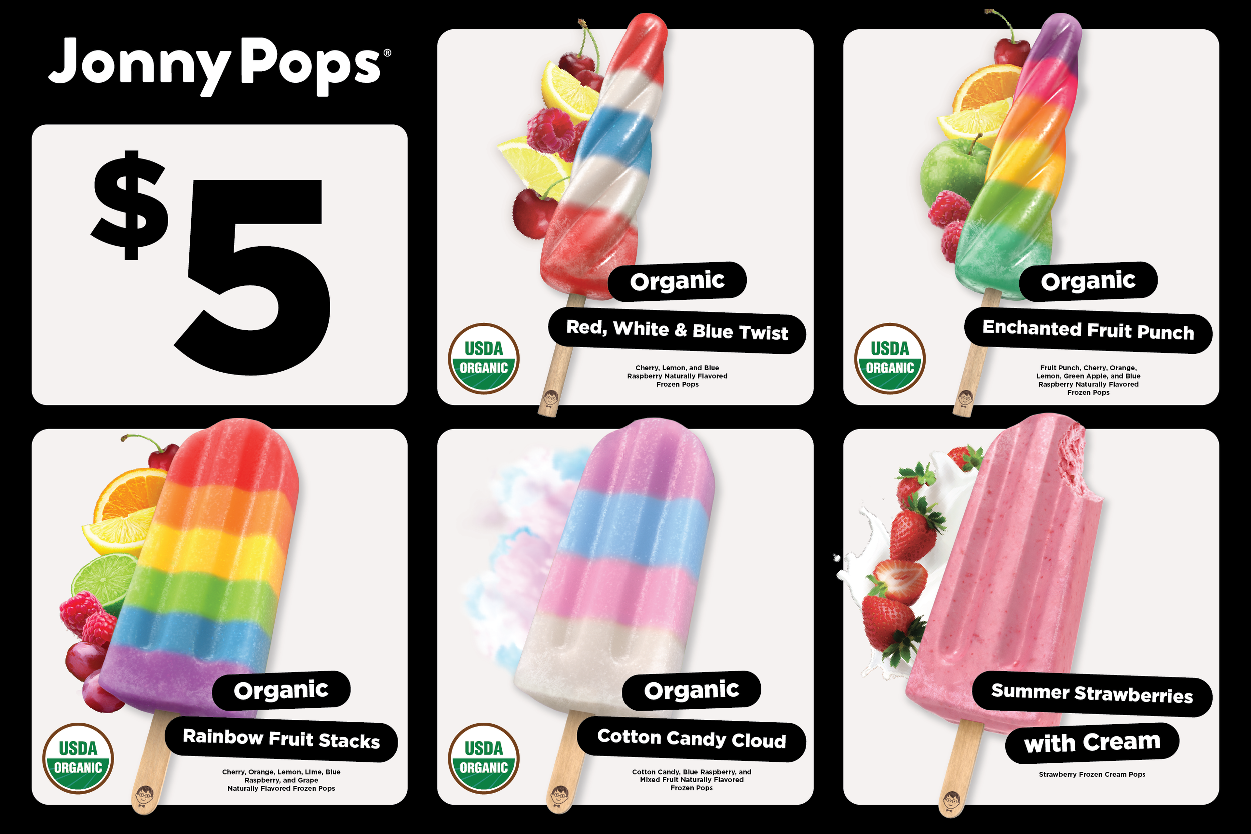
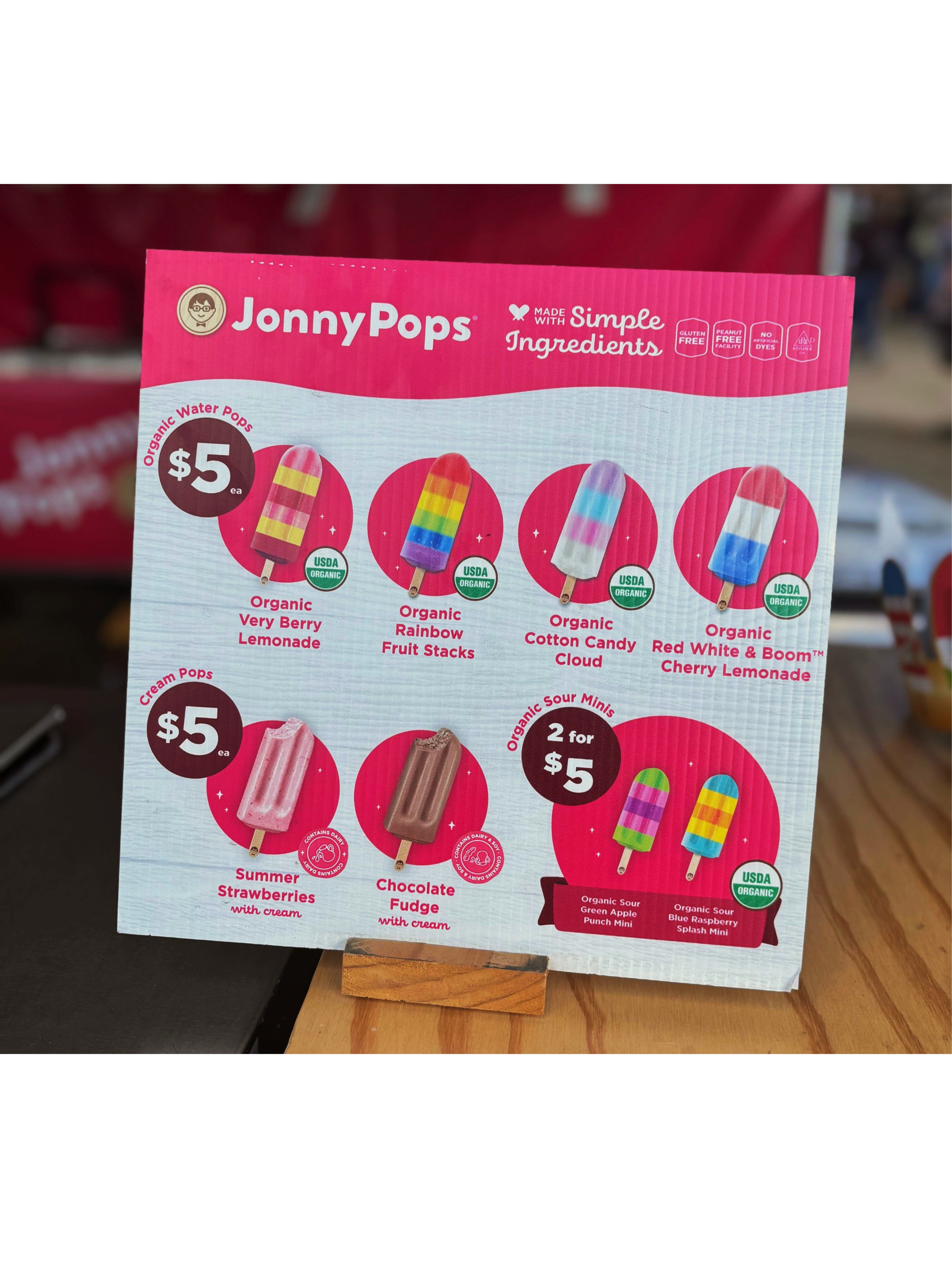
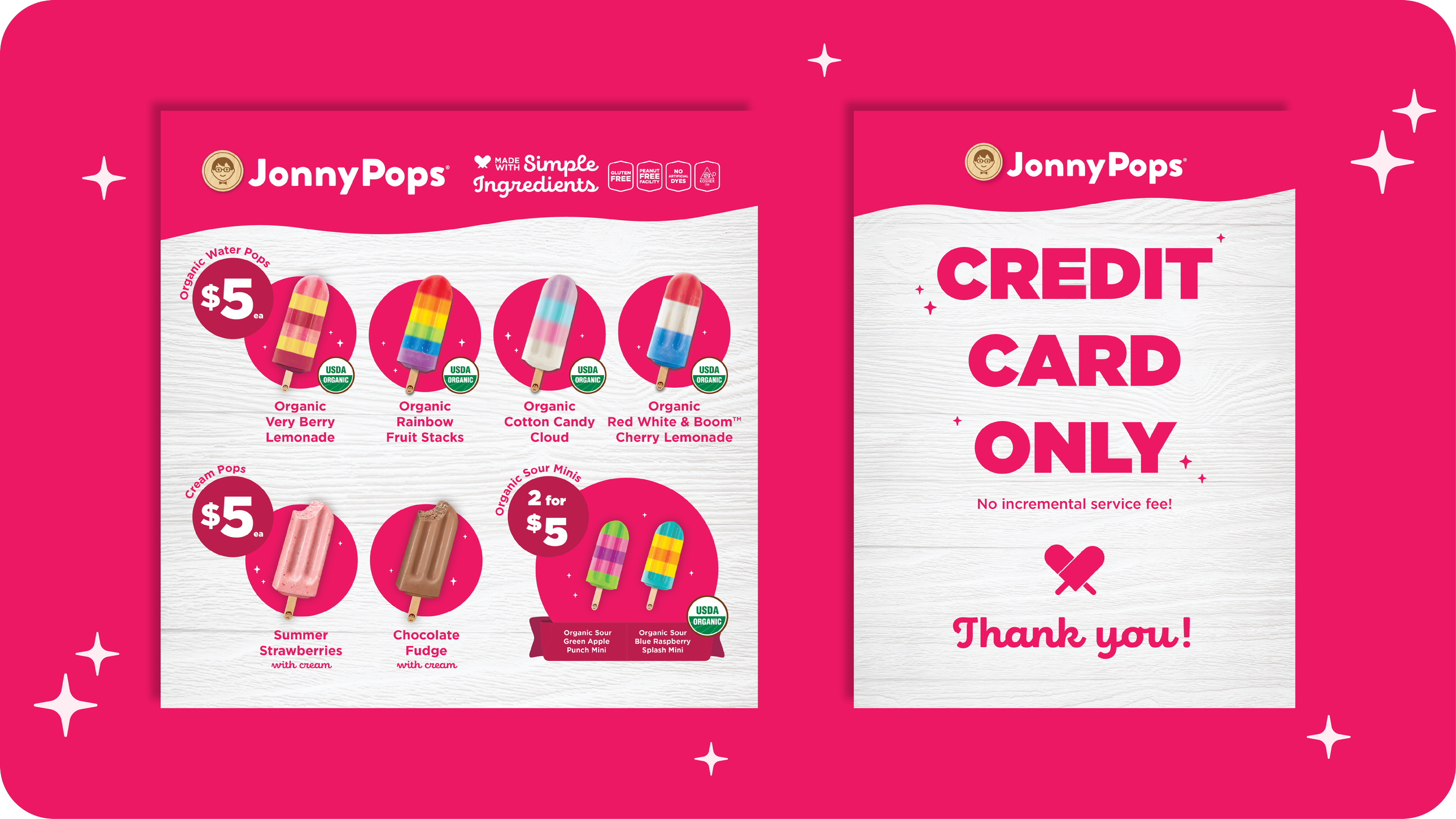
This year's Minnesota State Fair menu design started in black and white, a deliberate first step in the creative process. The belief driving it: if a layout doesn't work in black and white, it won't work in color. Stripping out color forces layout and hierarchy to succeed on structure and contrast alone, before color has the chance to mask weak decisions. It also makes it immediately clear whether the most important information (product, call to action, brand name) actually stands out, ensuring the design's foundation is strong before any color is applied.
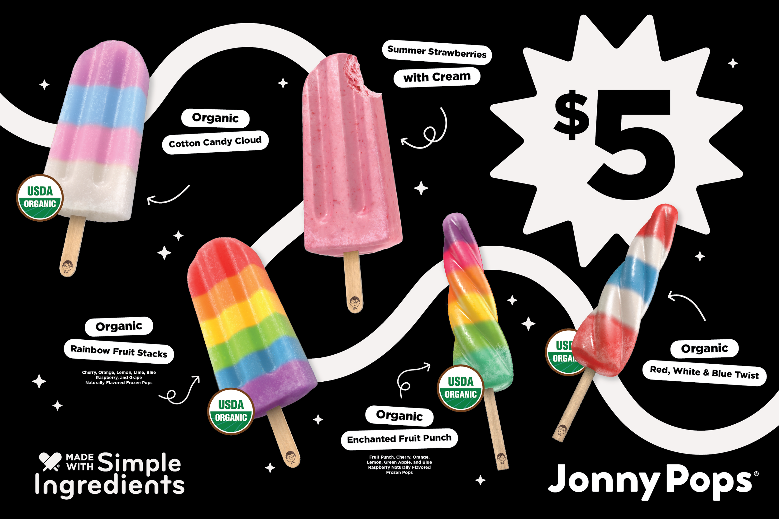
Menu Design - Creative Process & Strategy
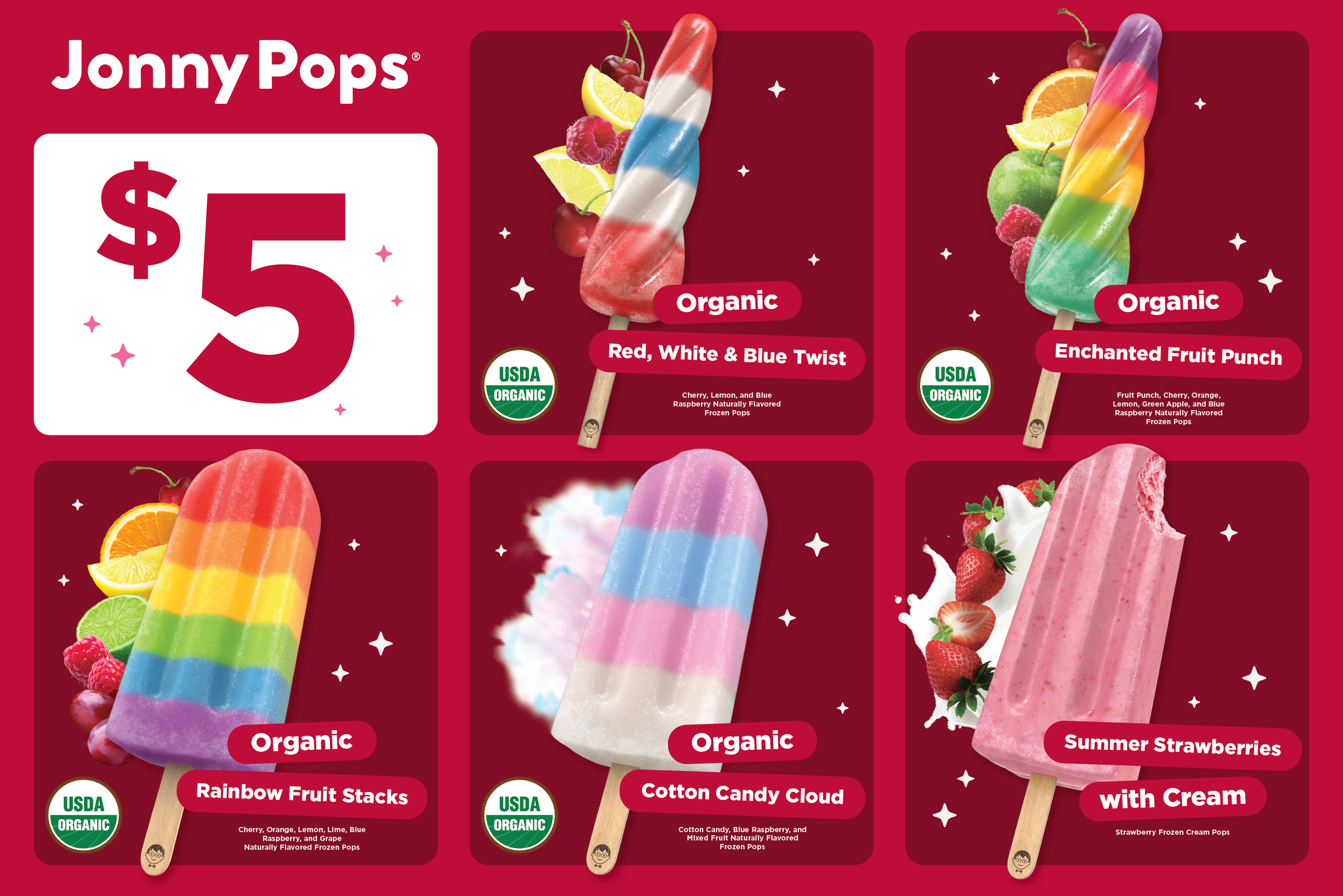
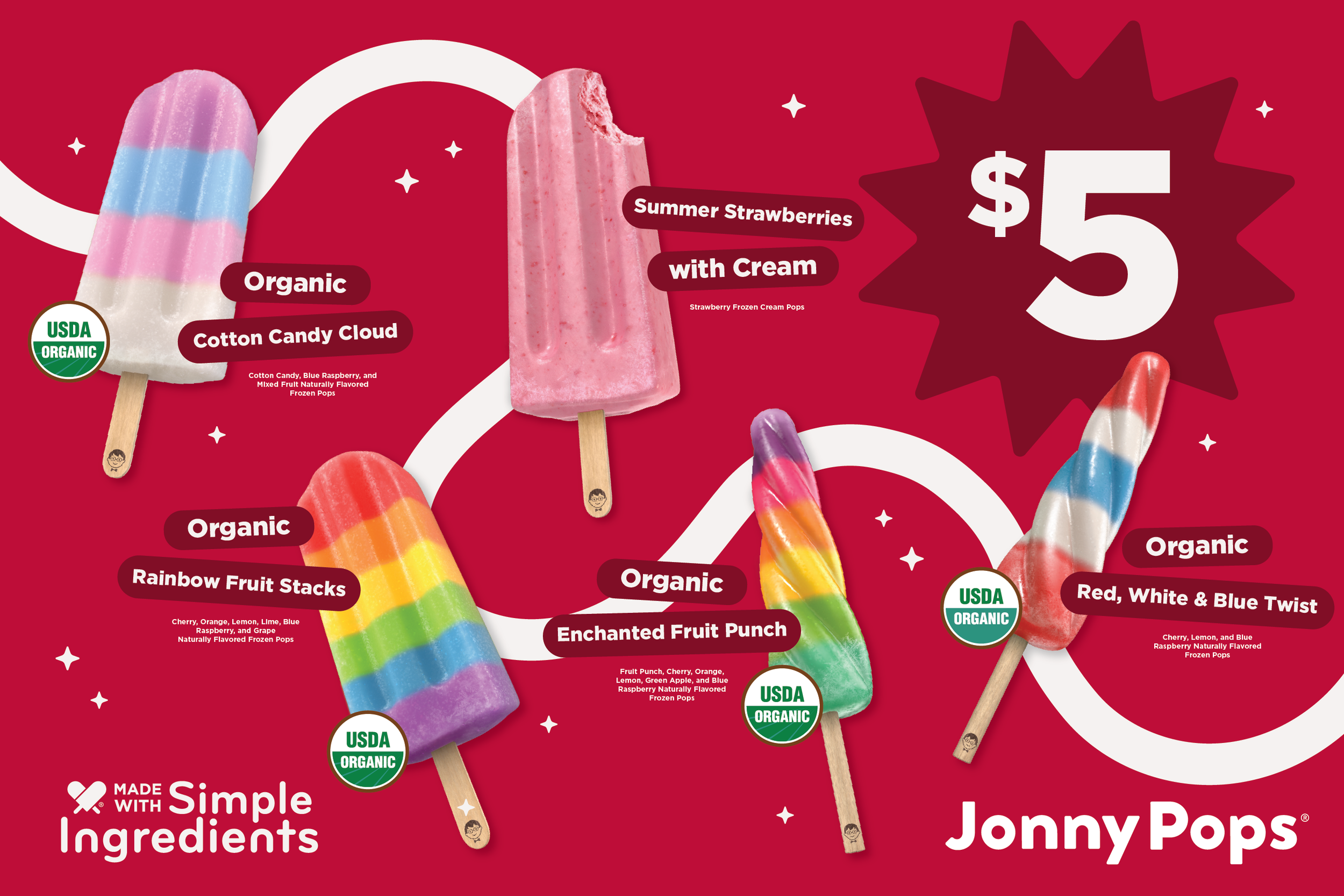
Once the black-and-white layout held up on its own, color came next, not as decoration, but as another round of testing. Different palettes were layered in and evaluated against the same question: does this help the pops and key information stand out, or does it work against them? Some color choices accentuated the product and hierarchy already built into the layout; others diminished it, pulling attention away from the pops or burying the call to action. Only combinations that strengthened what black and white had already proven made it into the final menu design.
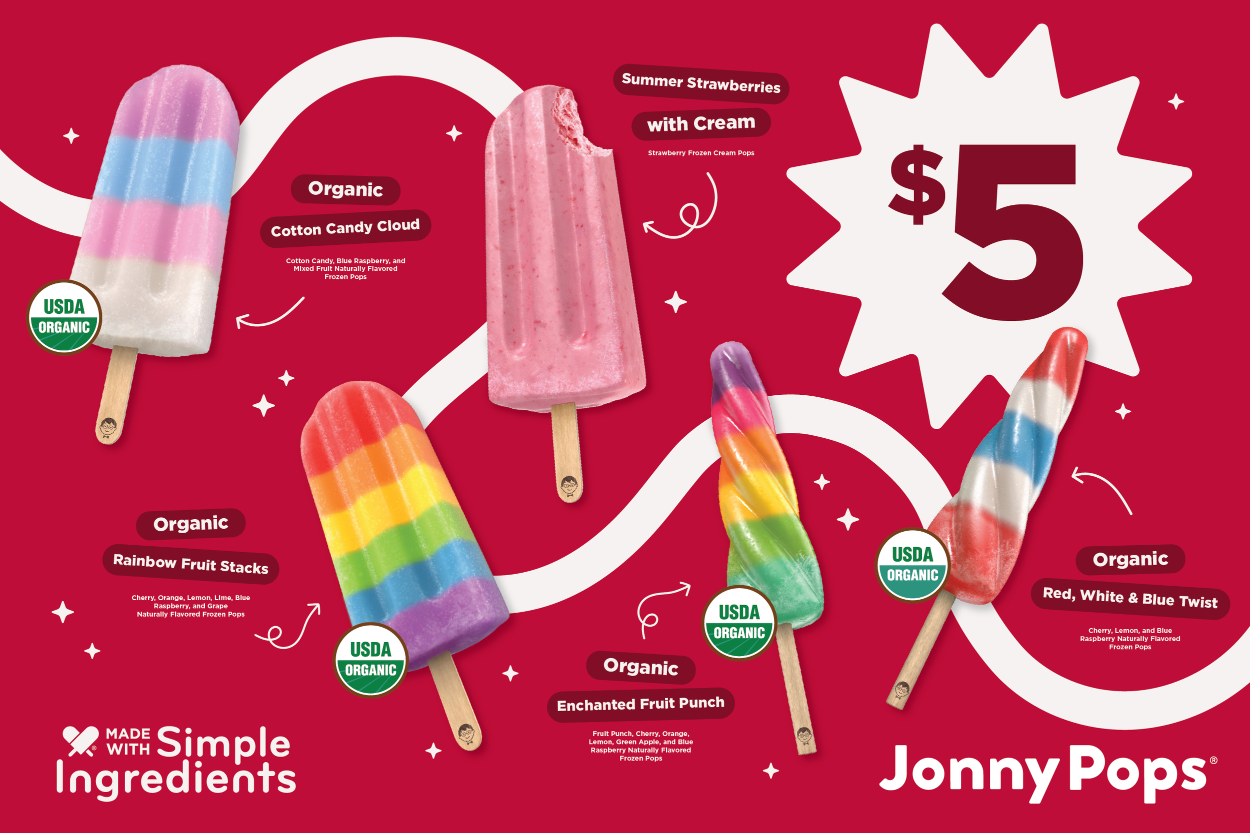
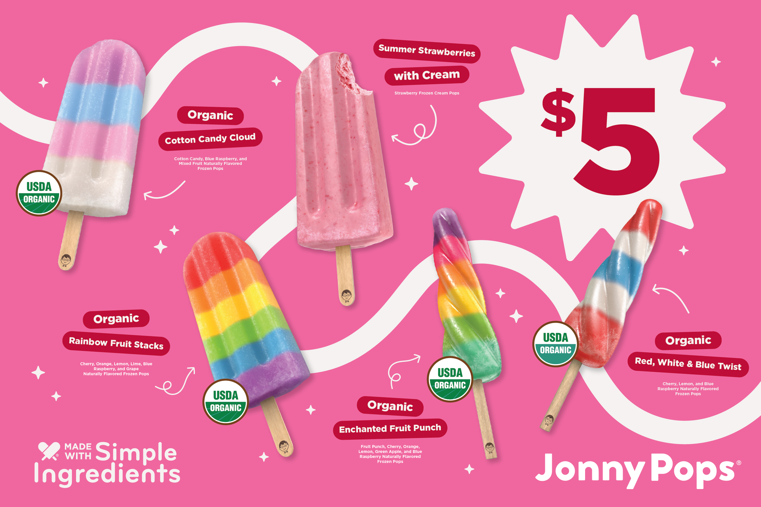
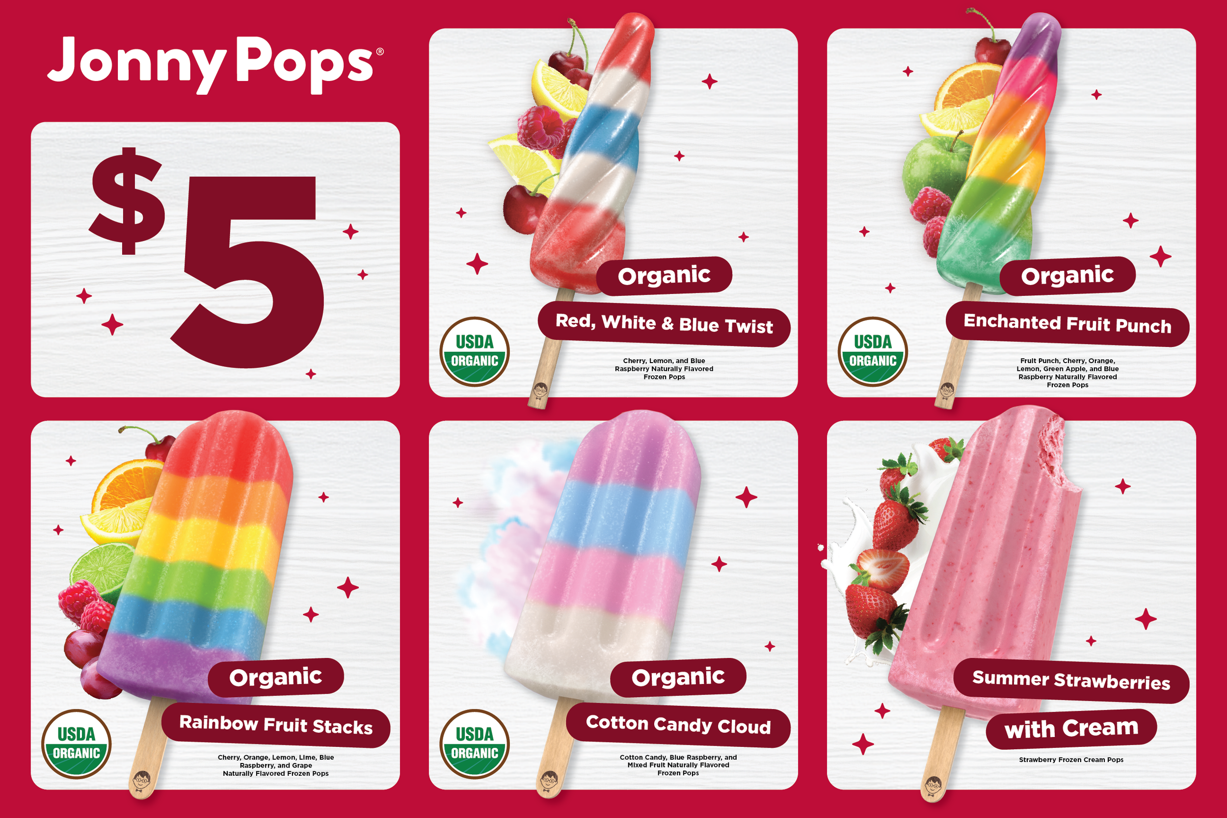
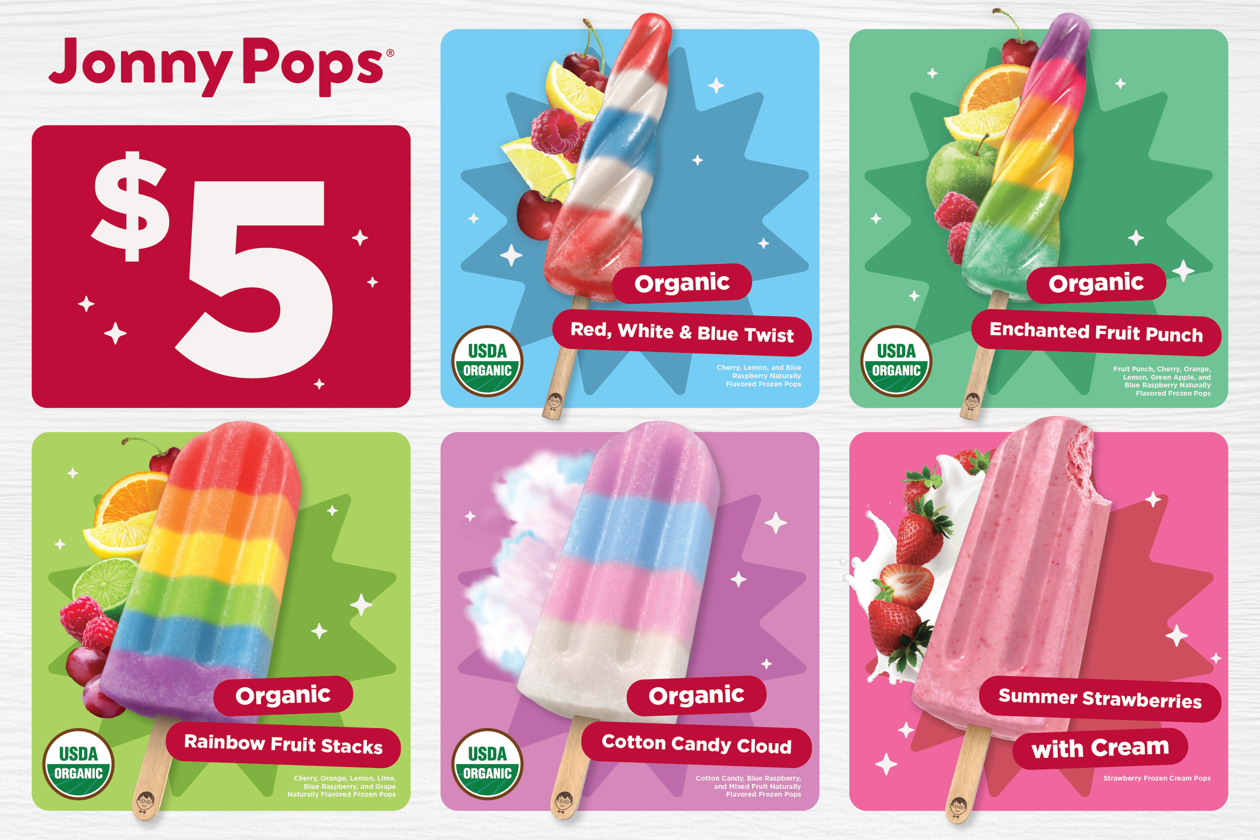
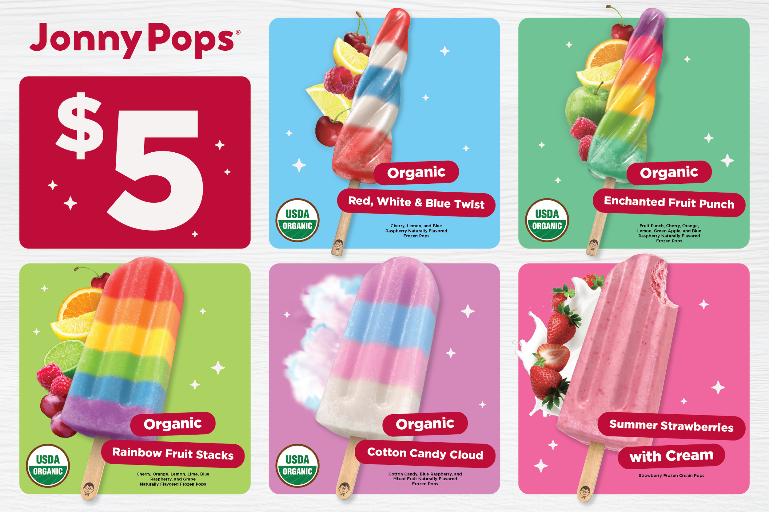
The final design iteration was chosen for how well it balanced boldness with restraint, leaning into vibrant, brand-true color to represent JonnyPops' fun, playful identity at the fair, while avoiding the trap of a maximalist layout that could crowd out the message. Every element was tested against one standard: Does it keep the main communication points (product, price, and call to action) instantly clear at a glance. The result is a menu that feels unmistakably JonnyPops, bold enough to catch attention in a crowded fair environment without sacrificing clarity.
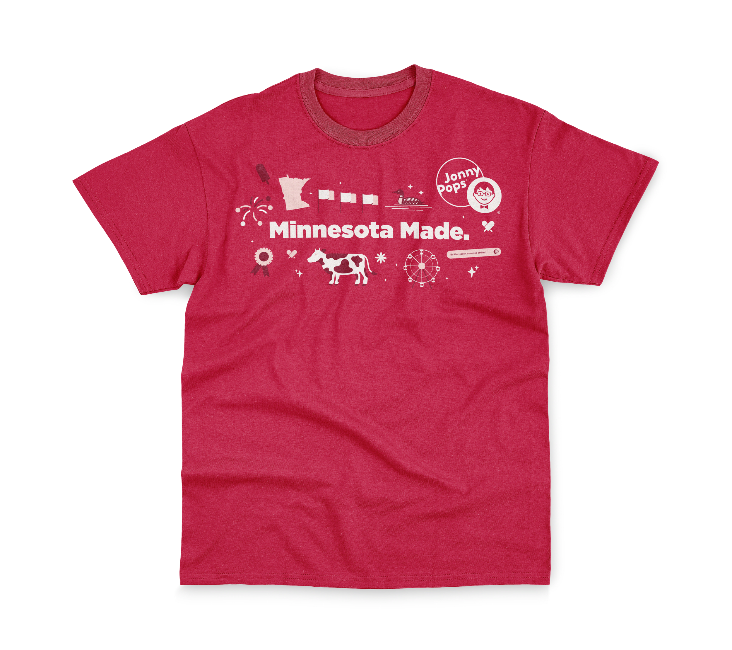
T-Shirt Design - Creative Concept
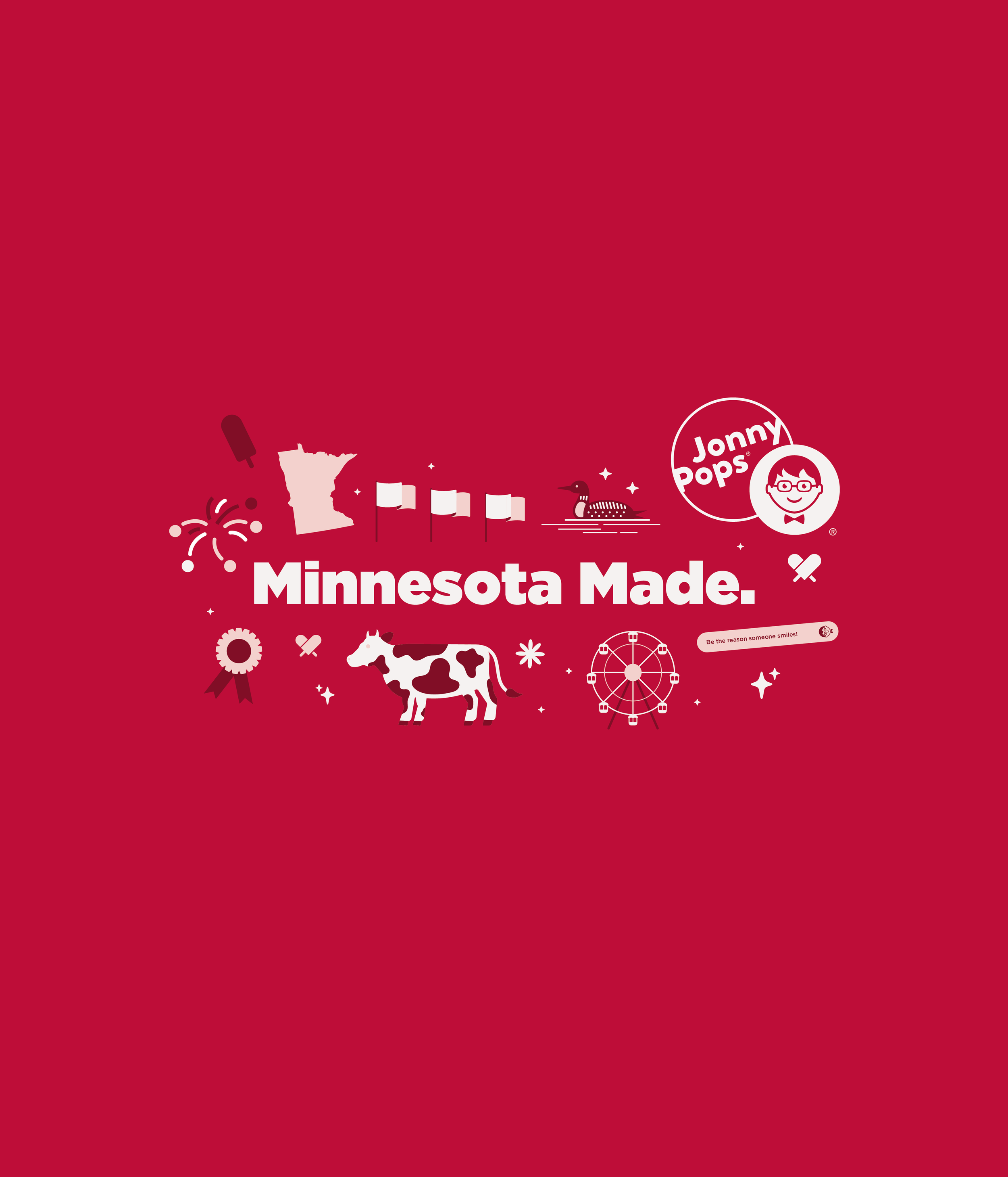
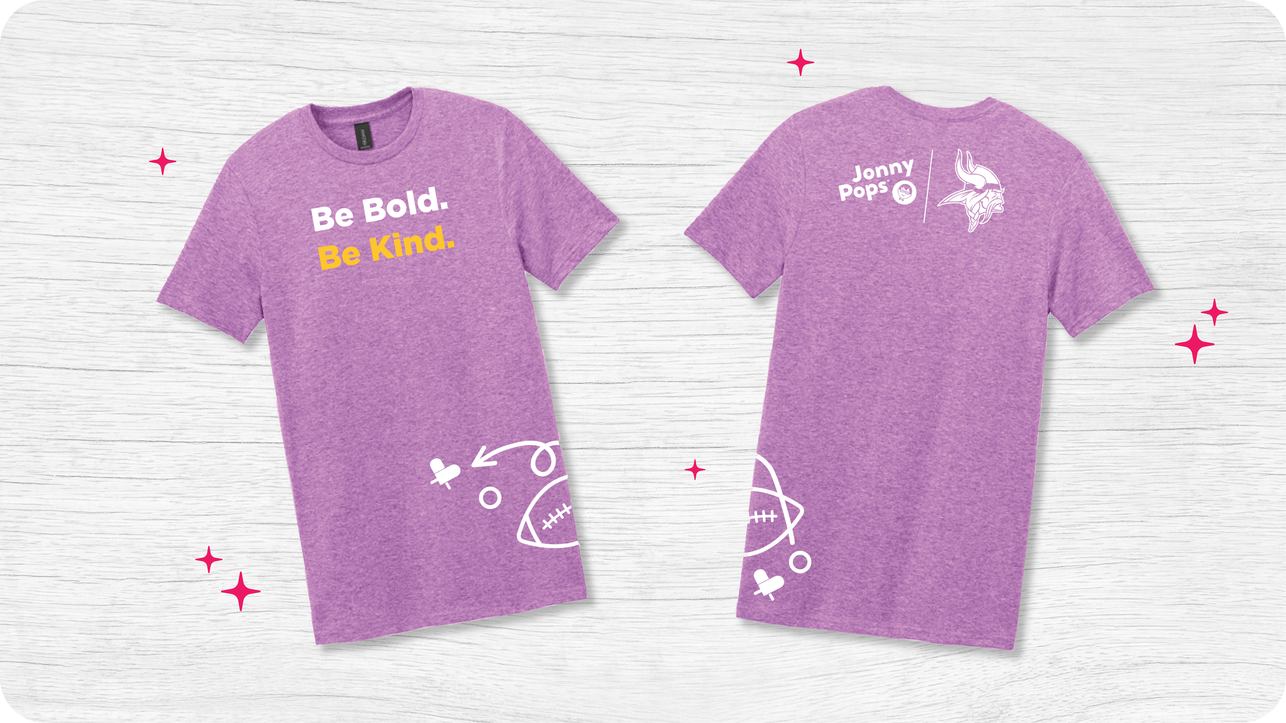
This year's Minnesota State Fair t-shirt concept is built around JonnyPops' roots in the state, a brand born in a Minnesota college dorm and now made in Elk River, MN. The design weaves together fair imagery and Minnesota iconography to tell that story visually, giving fans a wearable reminder of JonnyPops' deep ties to the community and to the fair itself, not just a product to grab and go.
Crown Design - Refreshing Assets
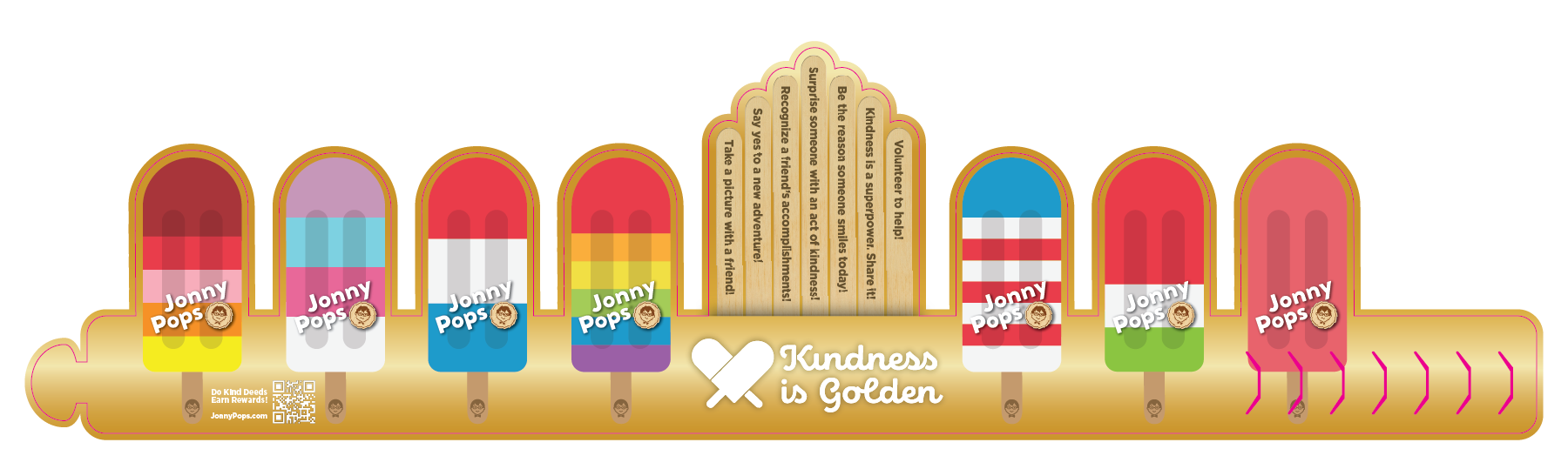
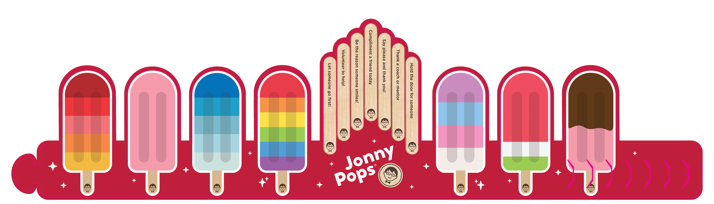
The iconic pop crown got a refresh this year to bring it in line with JonnyPops' new brand identity. Updated colors, typography, and detailing carry the current brand refresh into a beloved piece of fair merchandise, keeping the crown feeling fresh and current while staying true to the playful spirit that made it a fair staple in the first place.
2024
2026
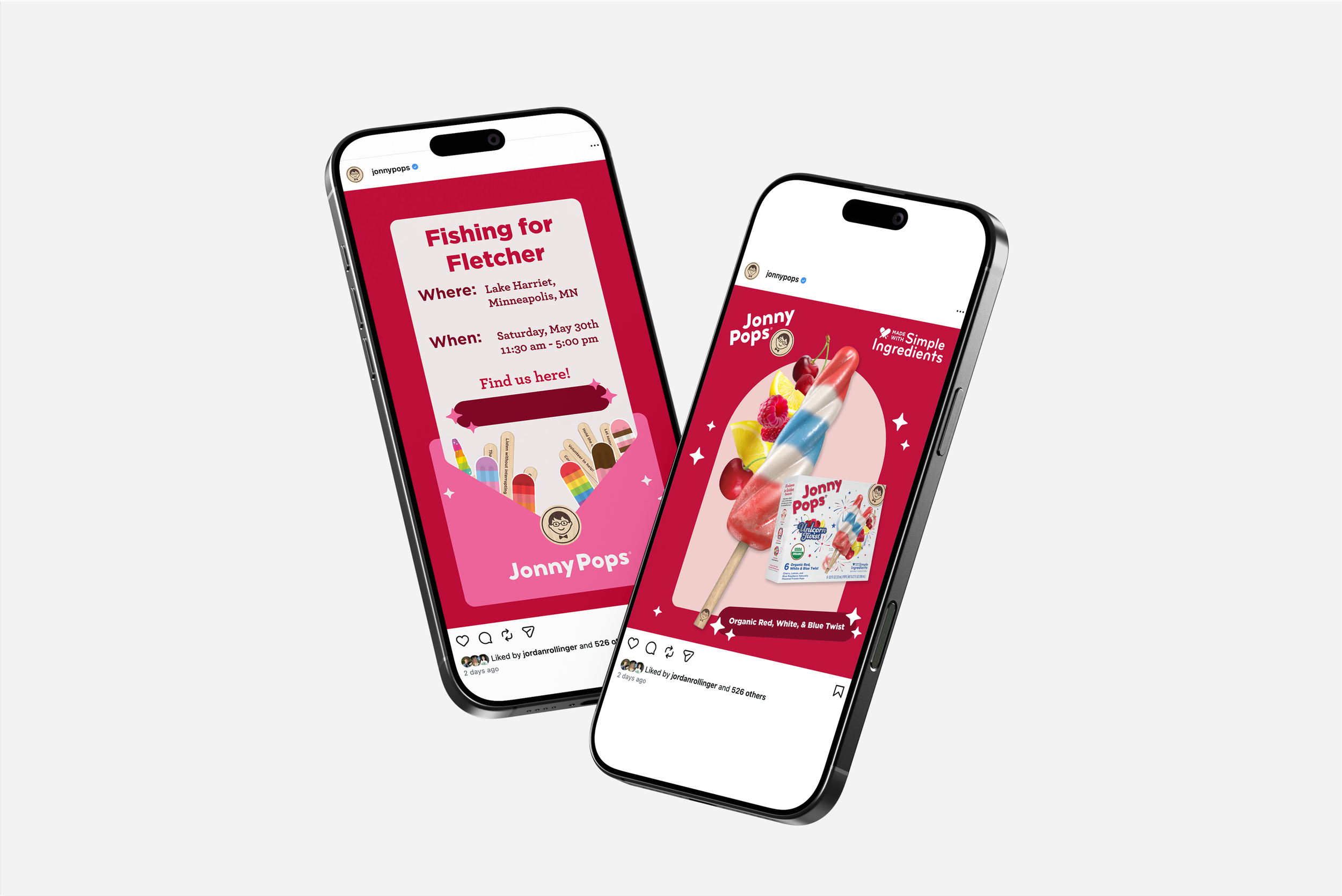
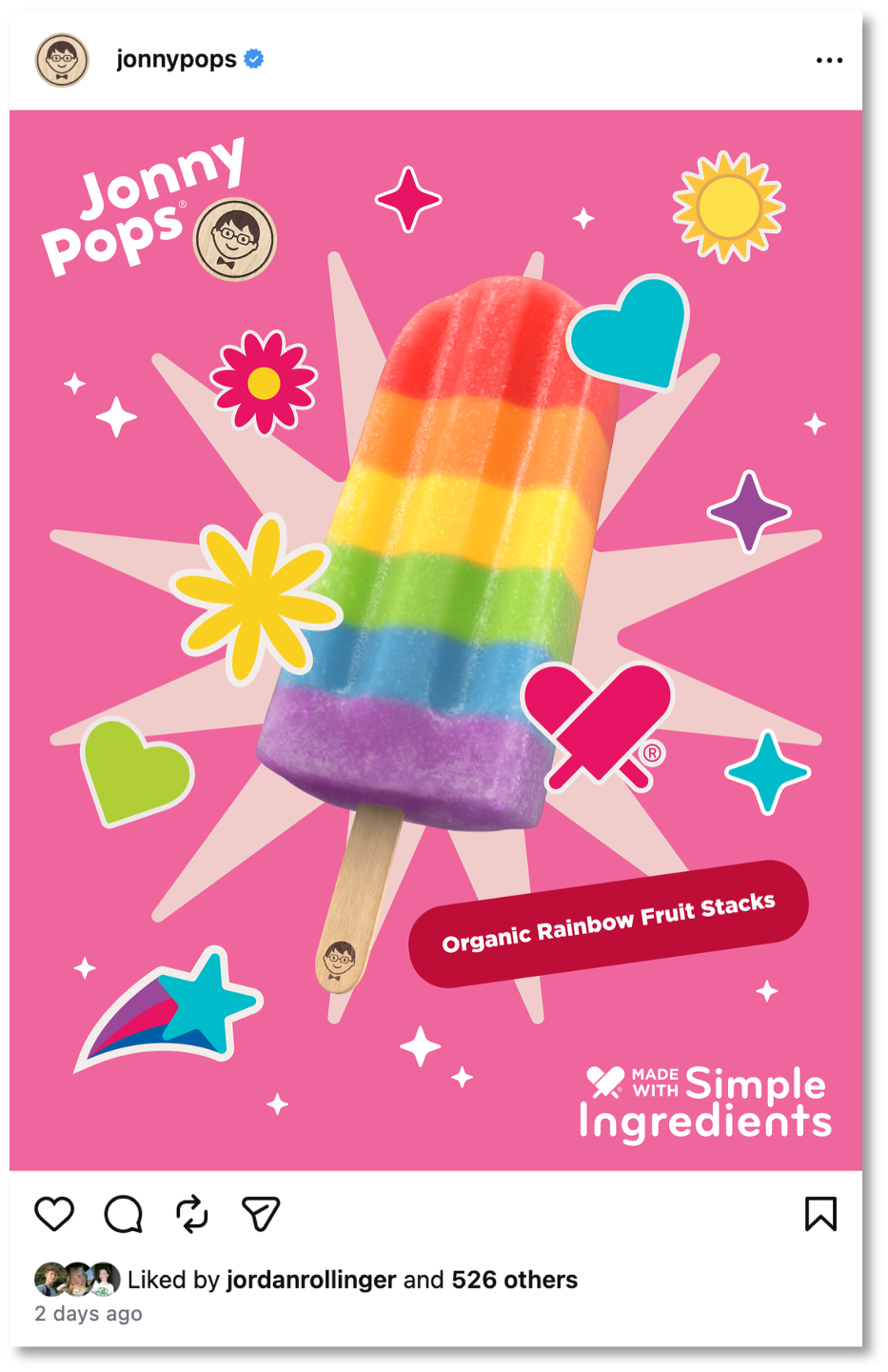
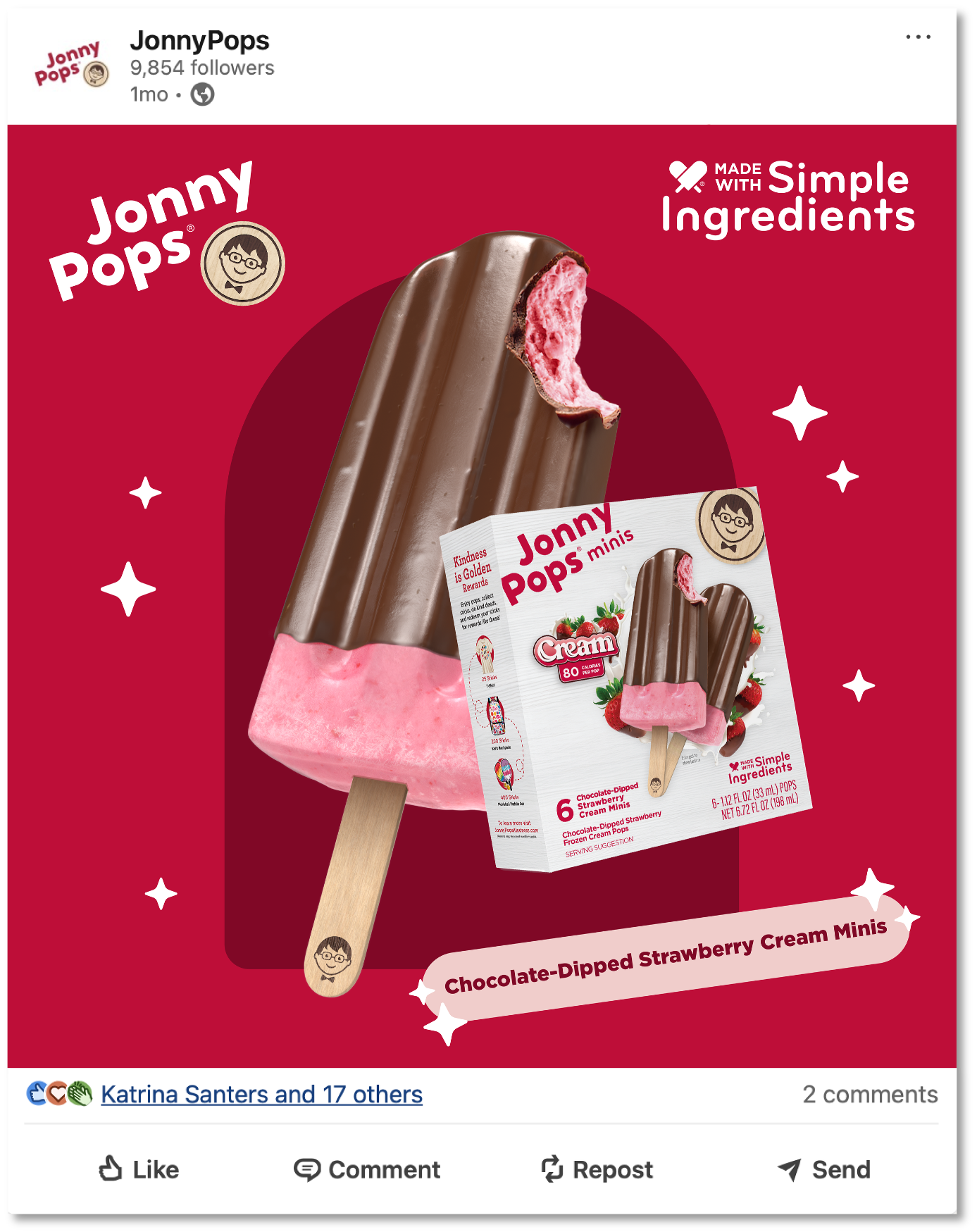
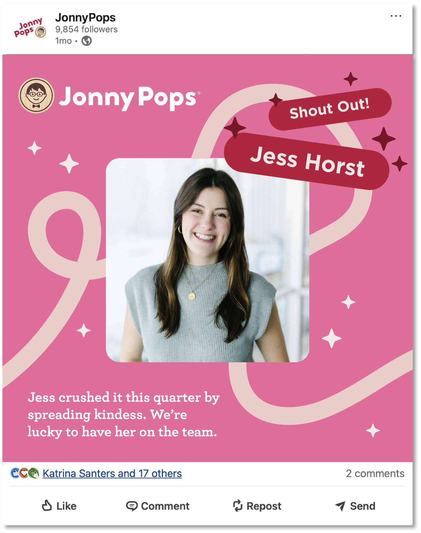
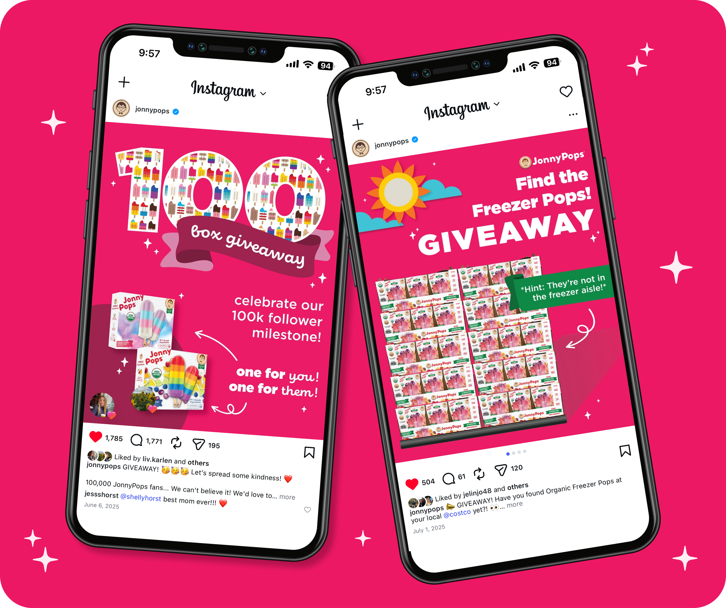
Social media templates built for JonnyPops' broader team to use without design expertise. Focused on reusability and efficiency, the templates gave non-creative team members a fast, on-brand way to post across social channels, reducing bottlenecks on the creative team while keeping every post consistent with brand guidelines.
Social Templates
Producing social assets can be slow and inefficient, with no easy way for other departments to create posts without starting from scratch each time.
Problem
Built reusable social templates covering a variety of post types, designed for non-creative departments to use easily in Canva.
Solution
Faster, more efficient social content production allowing other departments to create on-brand posts independently, without relying on the creative team for every asset.
Outcome
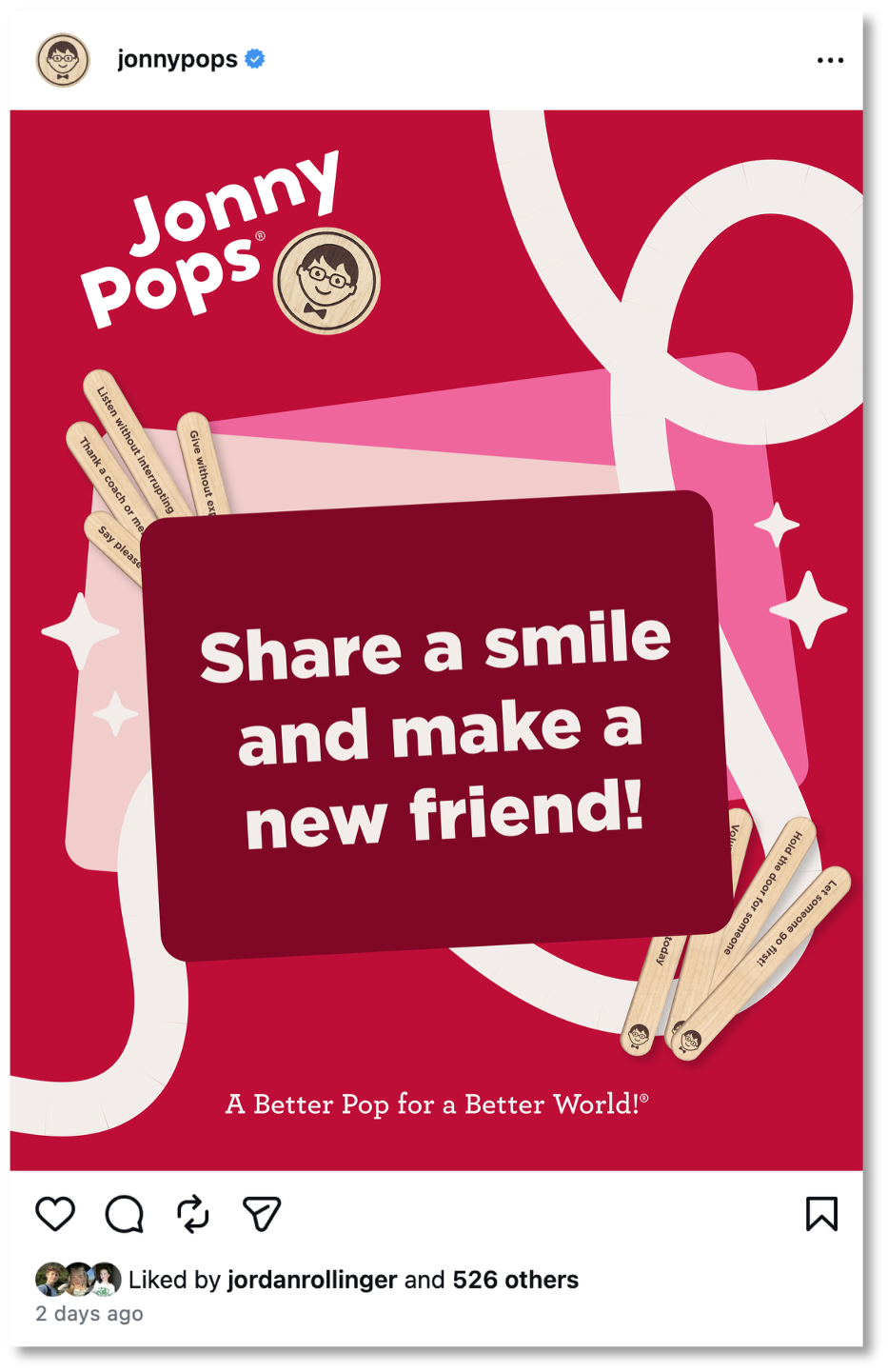
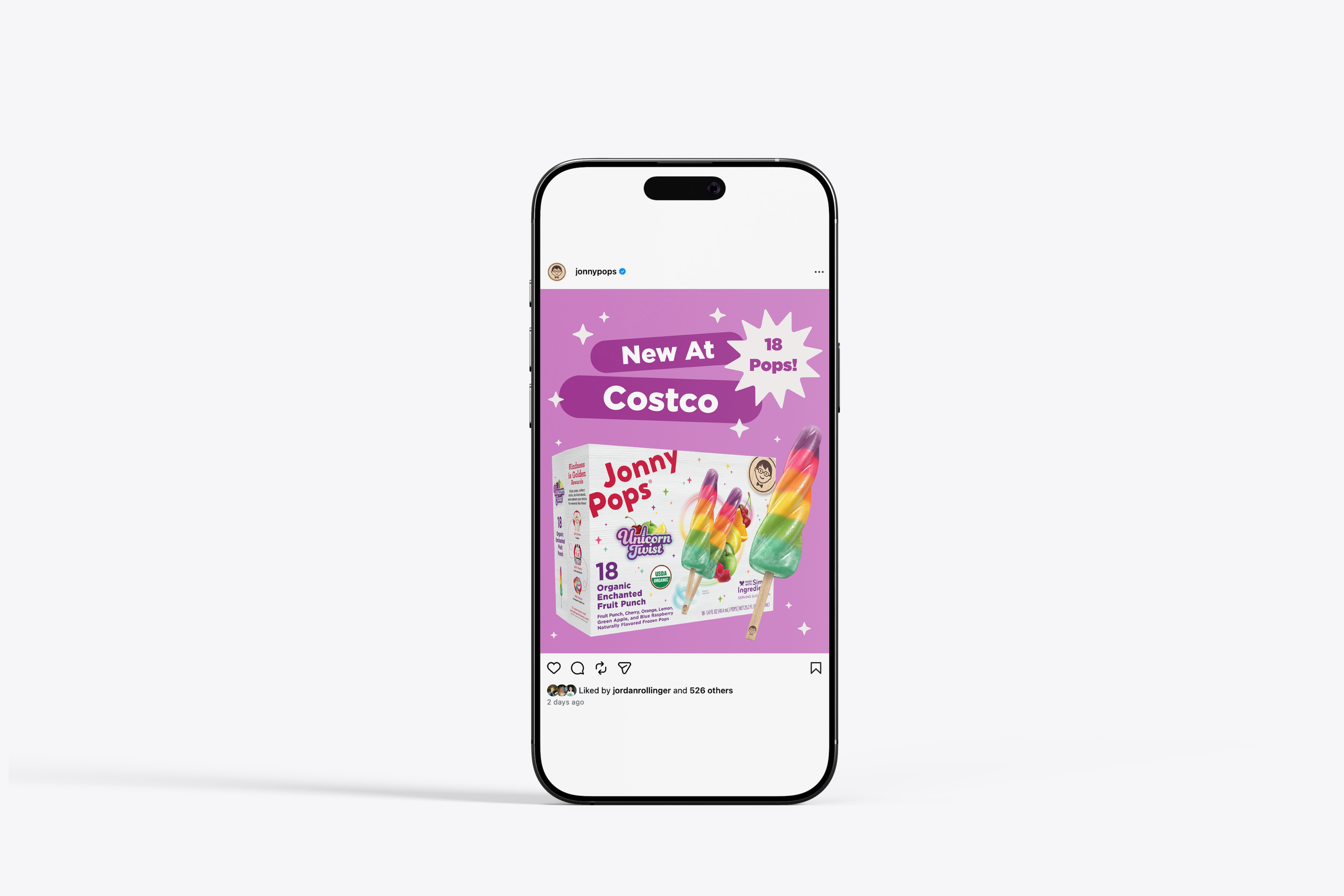
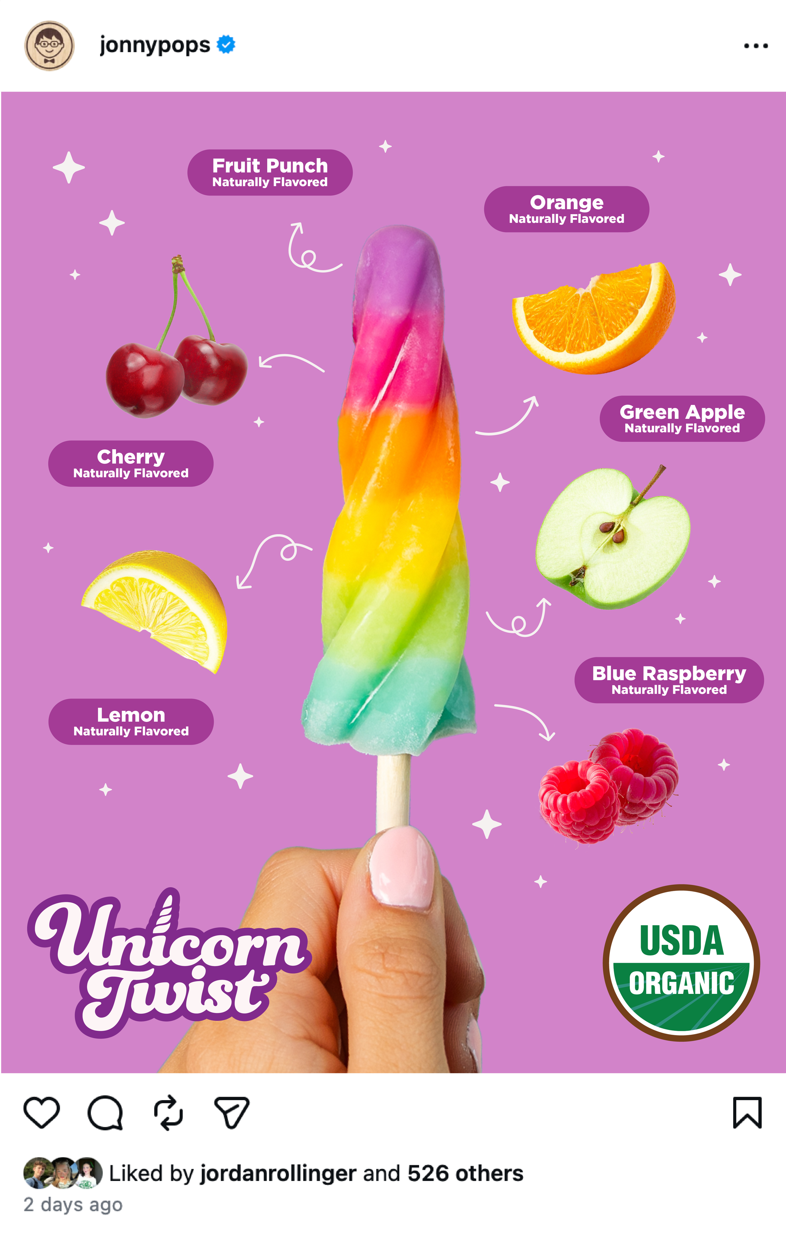
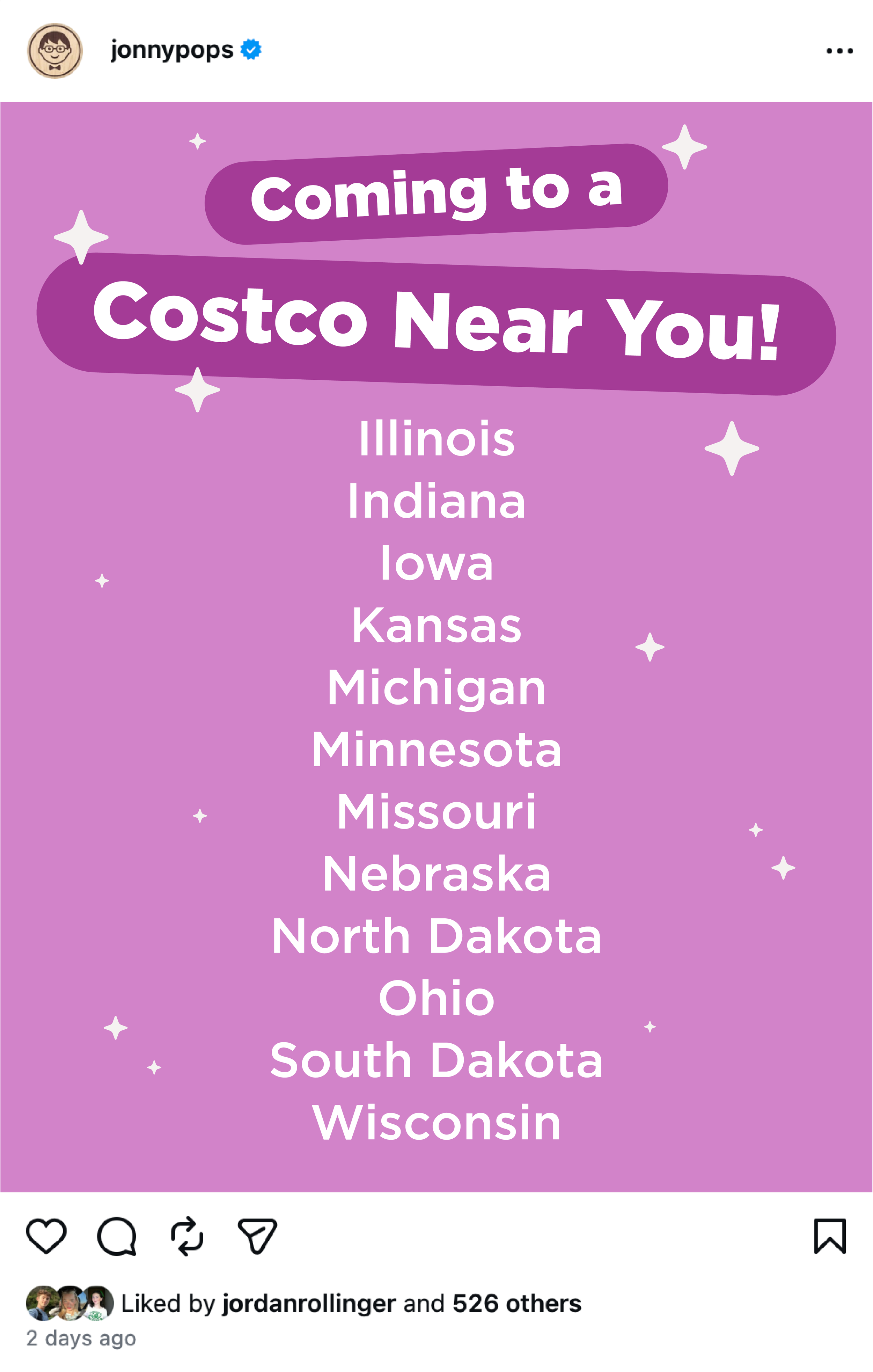
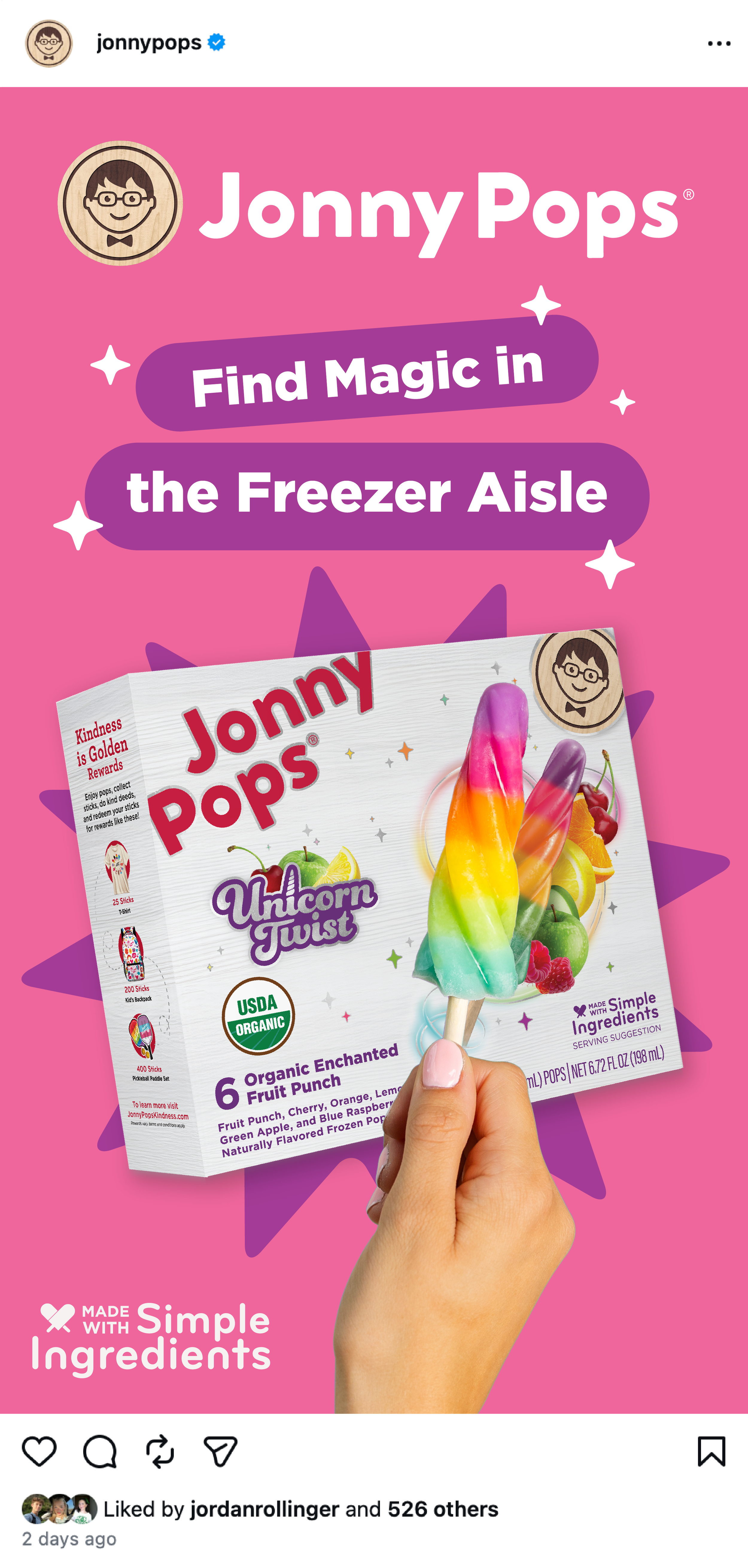
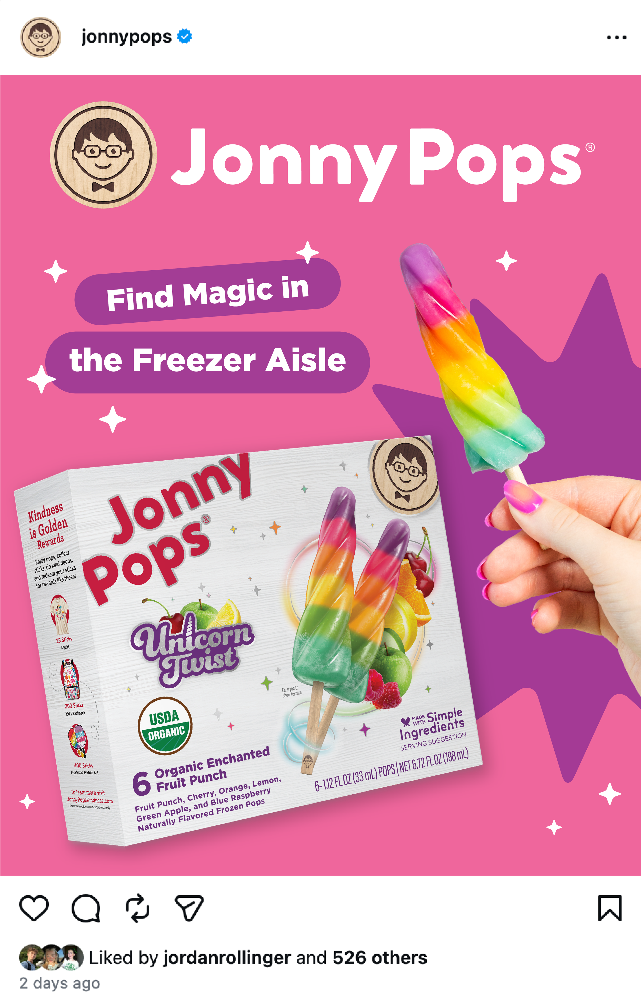
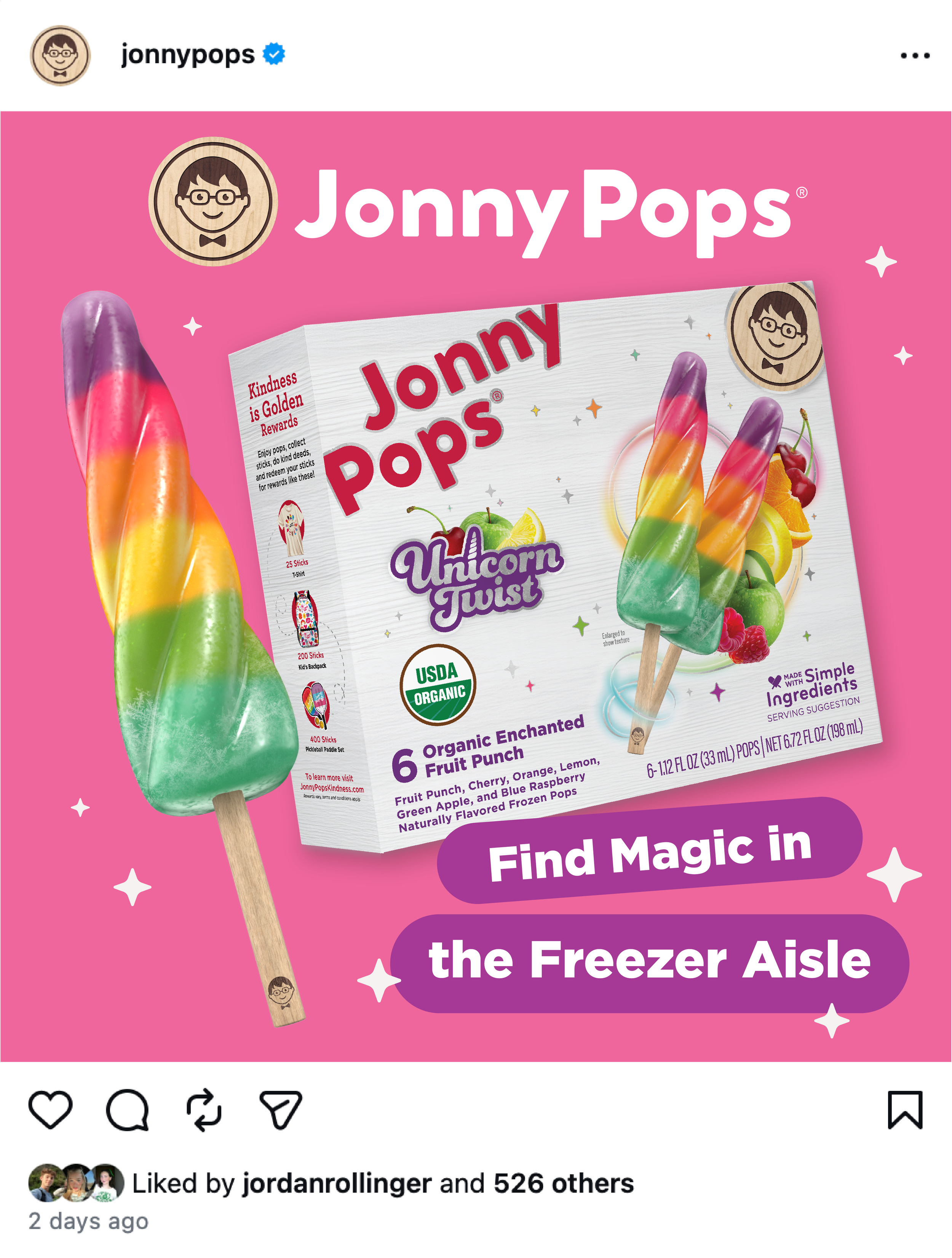
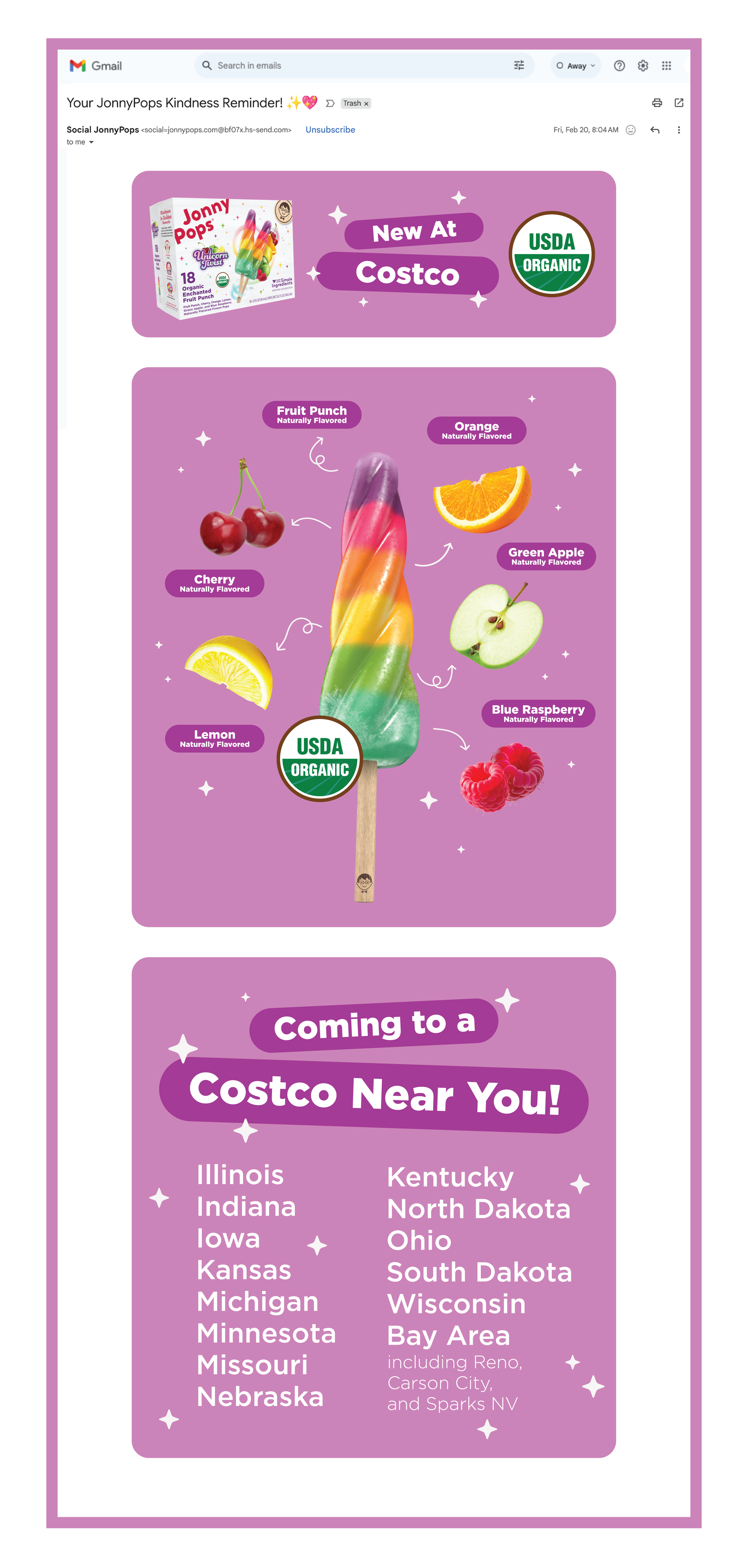
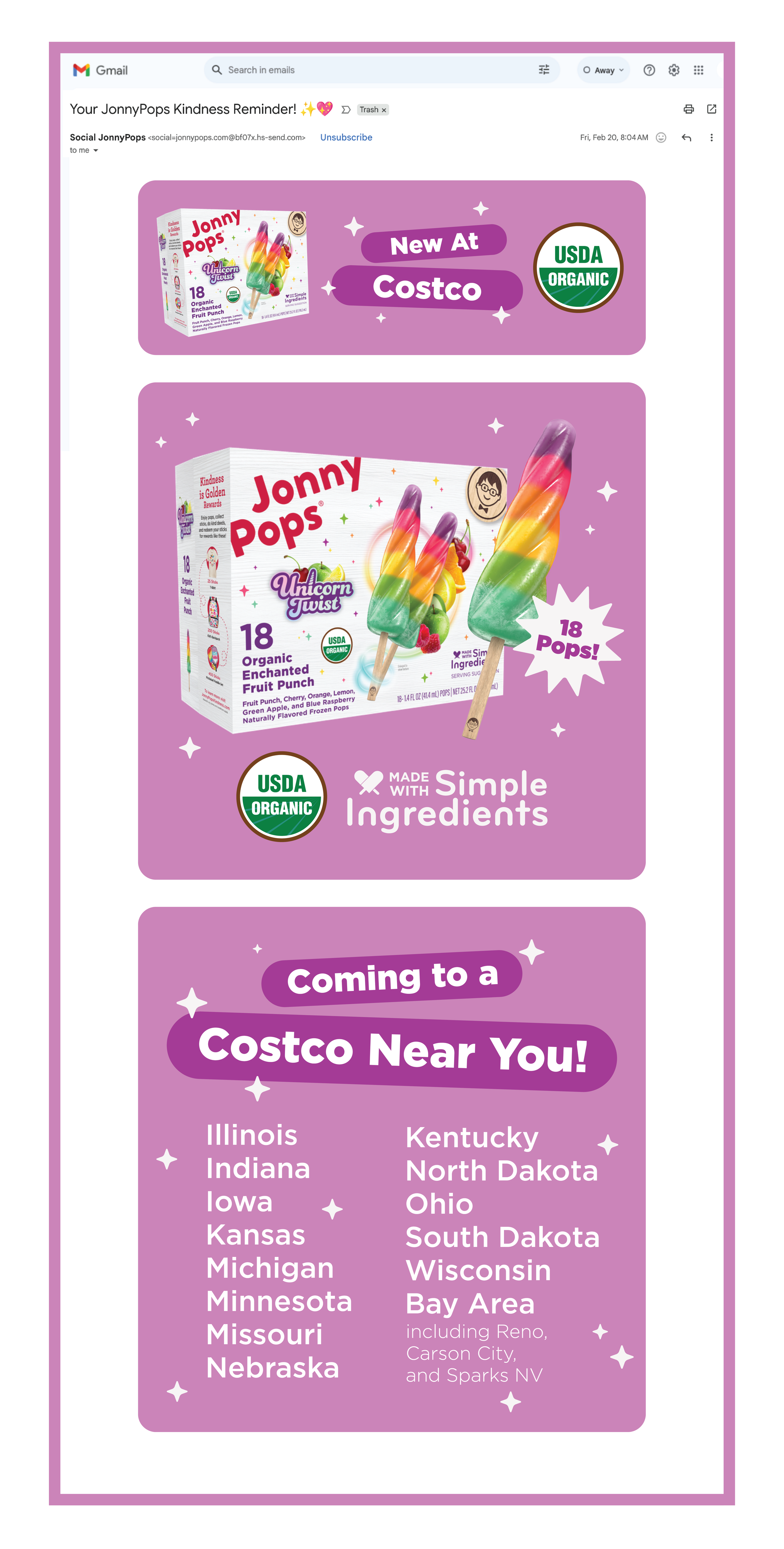
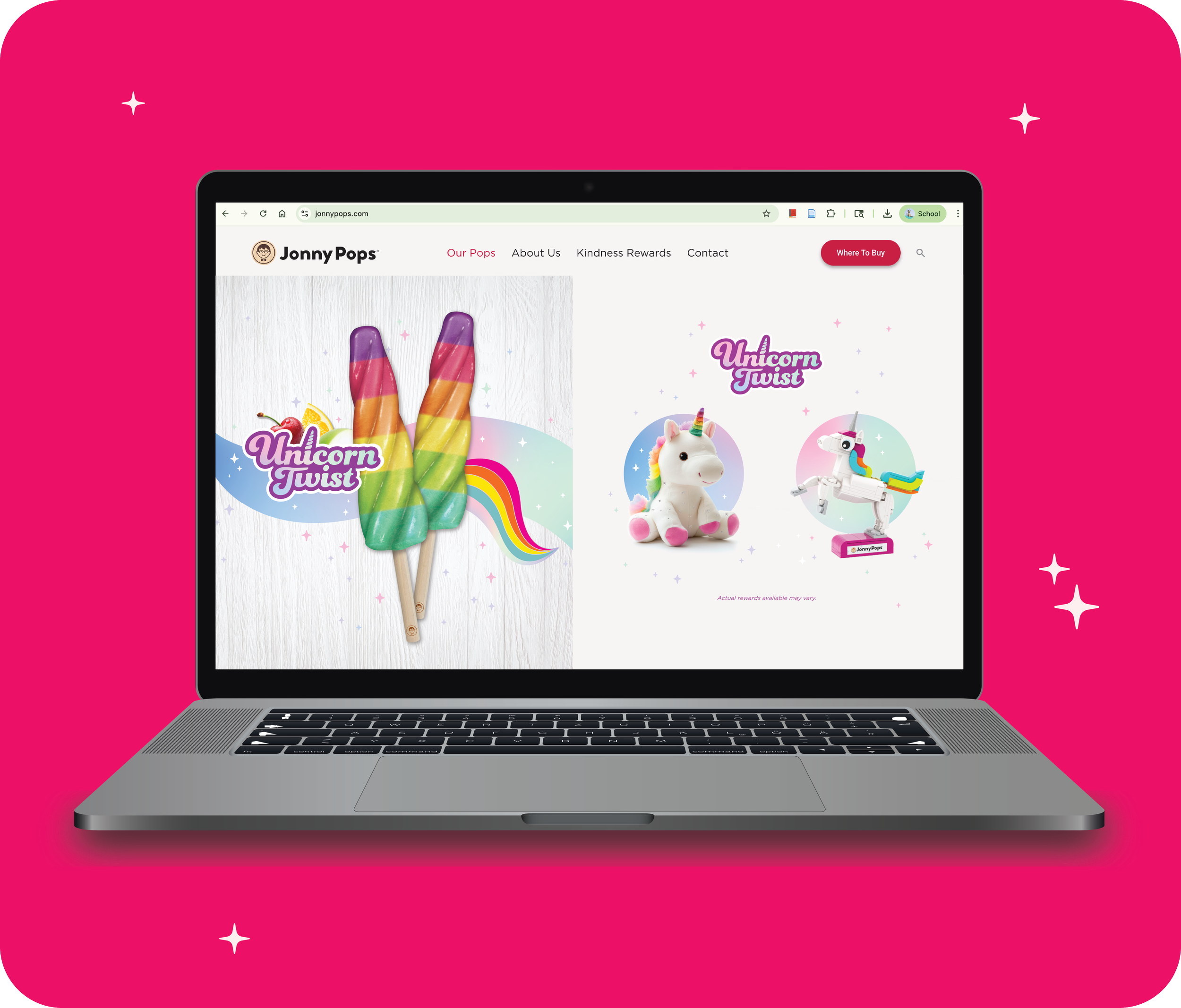
Helped shape creative for the Costco launch of Unicorn Twist, developing assets across three channels: Paid Meta ads, social, and email. Creative was built to support a strategically important push into a new club retailer. The launch was central to JonnyPops' household penetration growth, pairing a proven fan-favorite product with the reach of a new national account.
Costco Unicorn Twist Launch
JonnyPops needed to launch Unicorn Twist into Costco while continuing to grow household penetration, but had no creative centered around the 18ct box offering, and a tight timeline to build assets across three very different channels.
Problem
Designed a cohesive creative assets spanning paid Meta ads, organic social, and email, adapting one core campaign concept to each channel's format and audience while keeping messaging consistent with the Unicorn Twist brand.
Solution
Delivered a unified, multi-channel launch that supported JonnyPops' household penetration goals and gave the brand a strong first showing in a major new retail channel while highlighting the product’s unique flavor profile.
Outcome
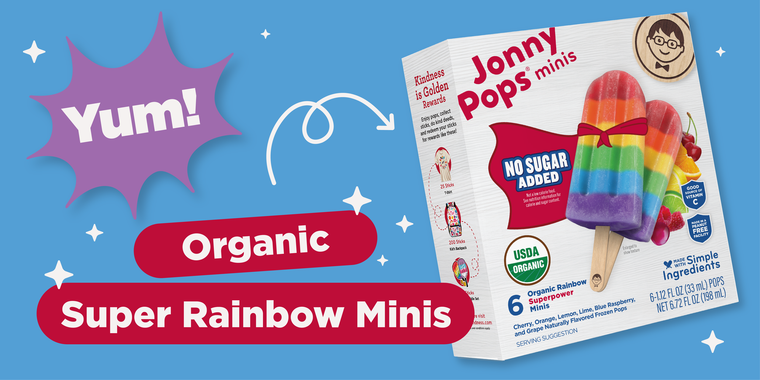
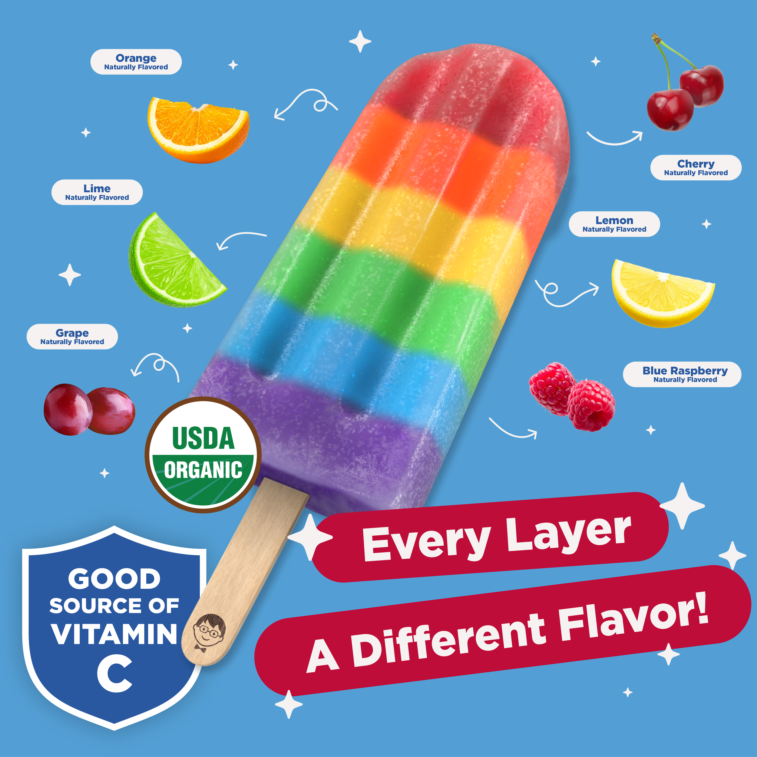
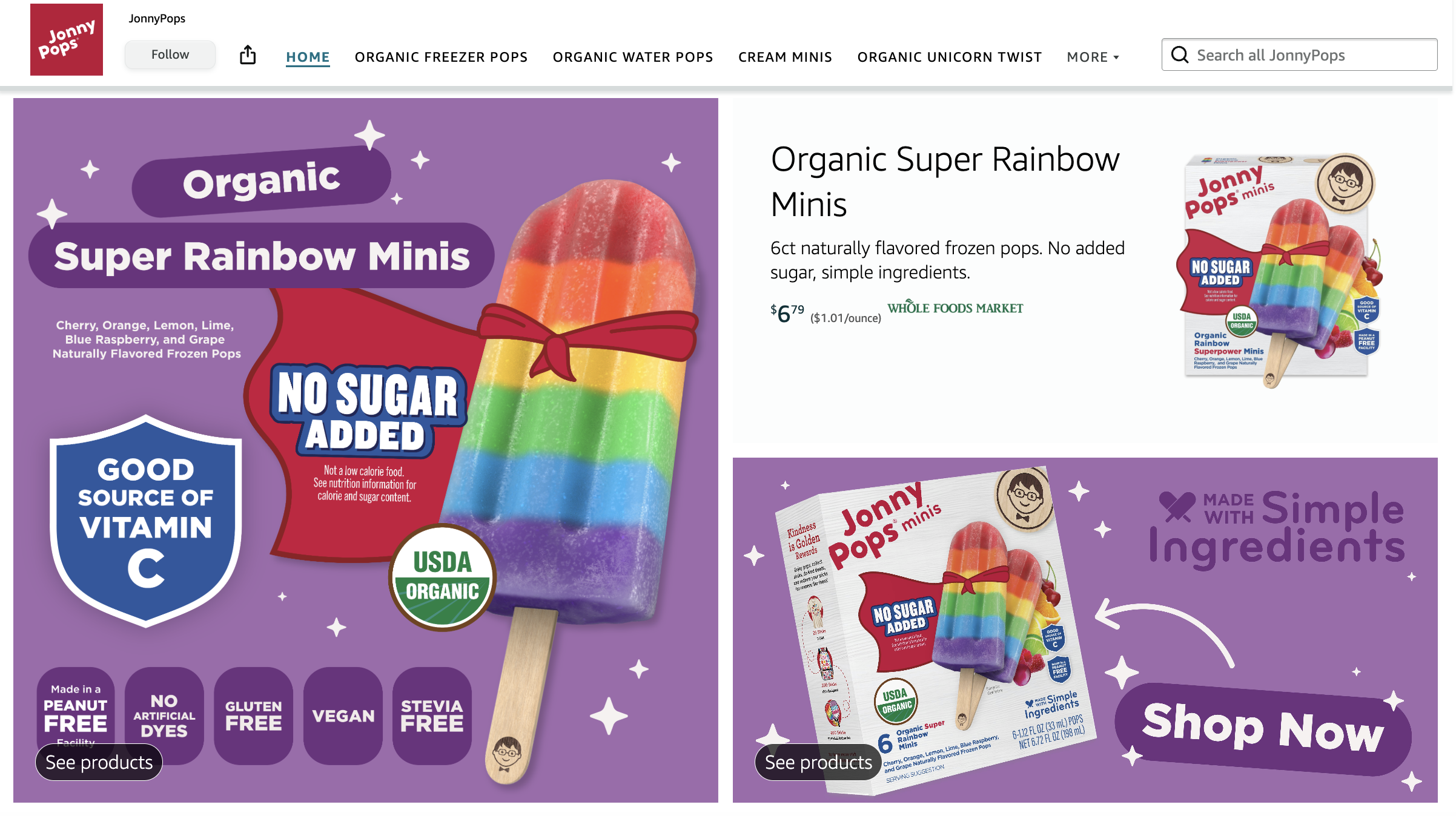
JonnyPops' Amazon store page is a high-traffic storefront that, for many shoppers, is their first impression of the brand, making strong creative essential to converting browsers into buyers. I designed the graphics advertising our No Sugar Added Minis for the page, translating key product benefits into visuals built to stand out in a crowded search results page.
Amazon Storefront
JonnyPops had no dedicated Amazon graphics for Organic Super Rainbow Minis, leaving key product features like No Sugar Added invisible to shoppers scanning a crowded search results page.
Problem
Designed a set of product-specific graphics for the Amazon store page that visually called out No Sugar Added alongside the product's other core benefits.
Solution
Gave Organic Super Rainbow Minis a clear, feature-forward presence on Amazon, helping the product compete for attention and convert high-intent shoppers on one of JonnyPops' highest-traffic channels.
Outcome
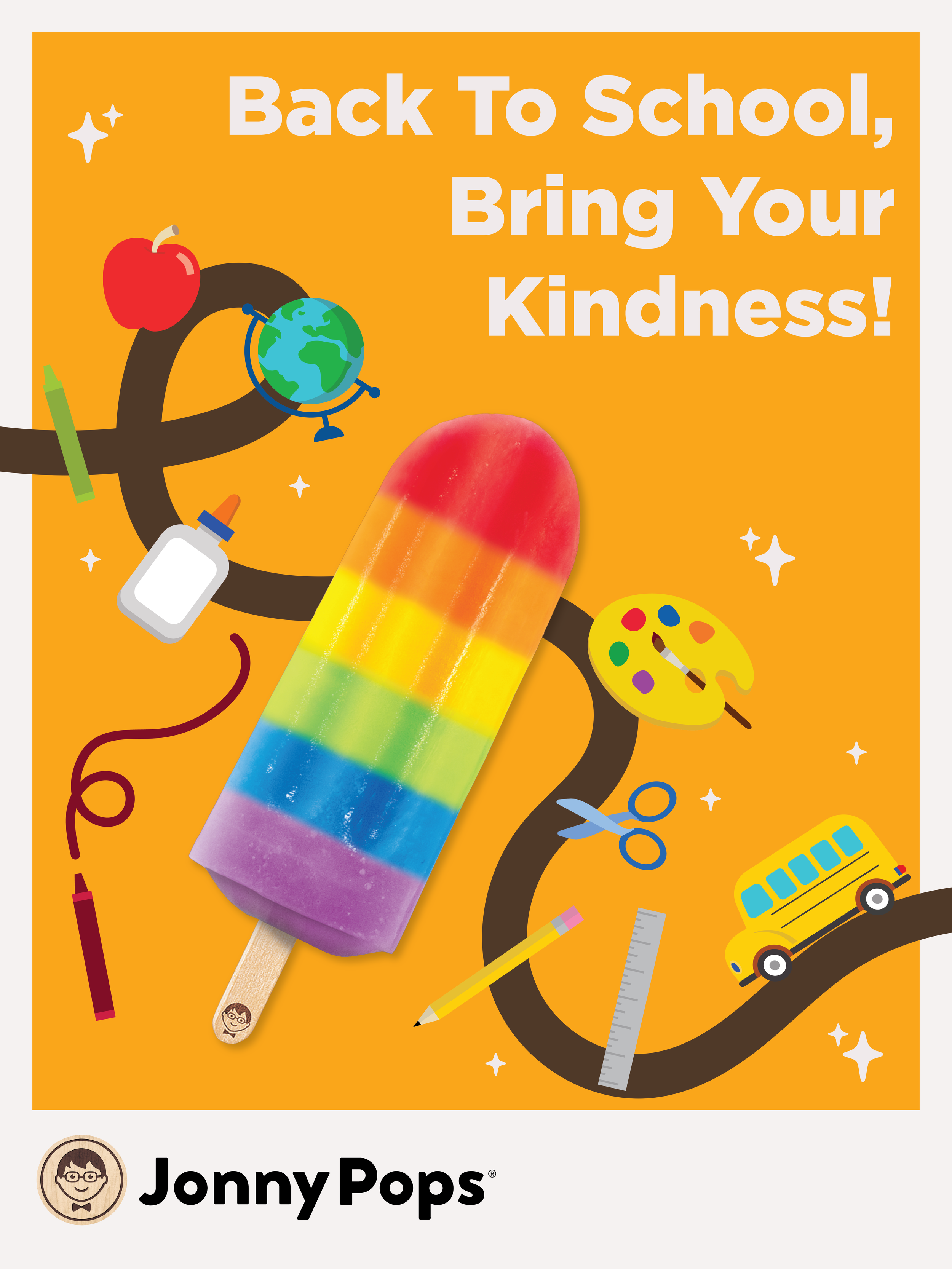
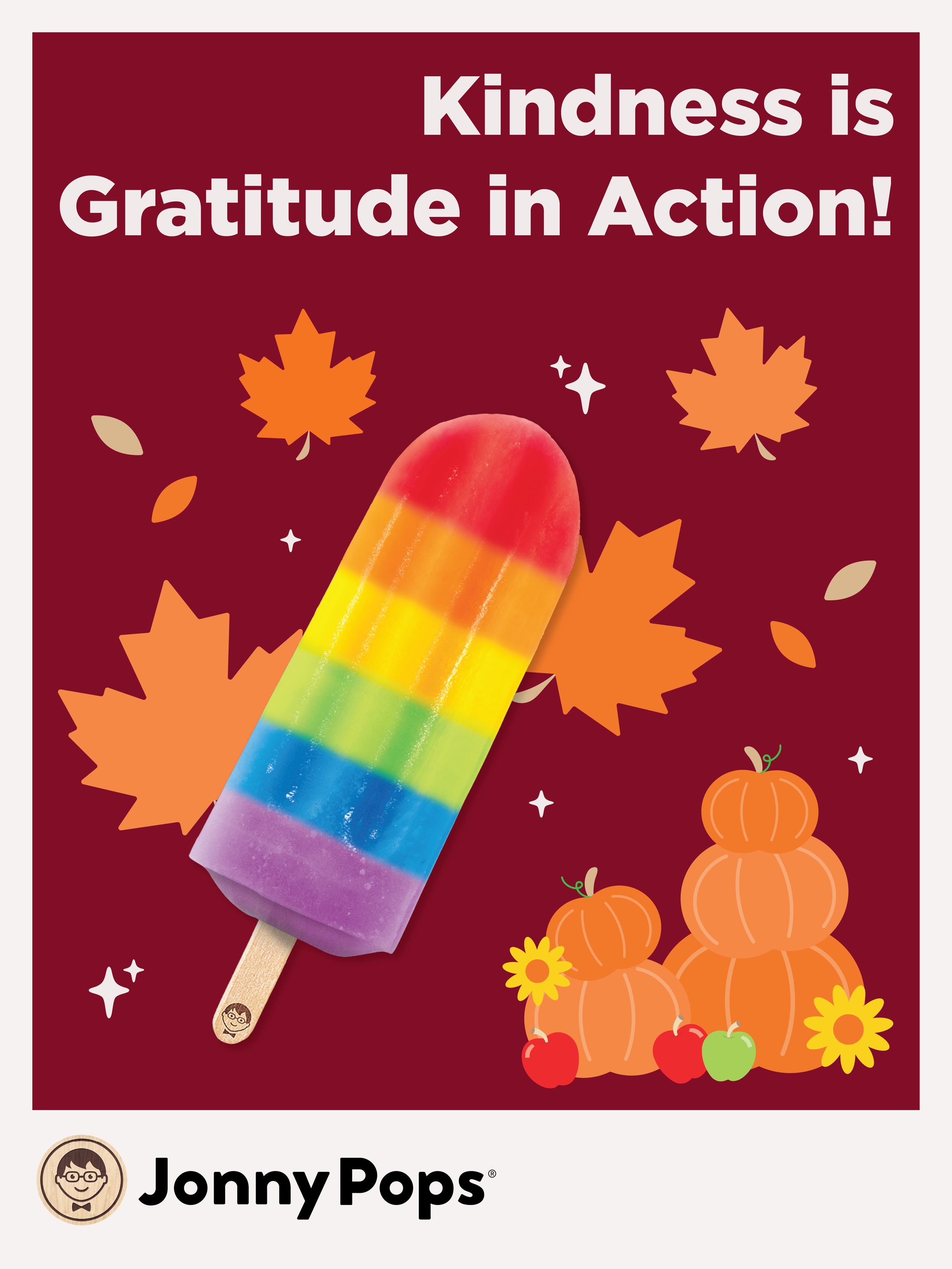
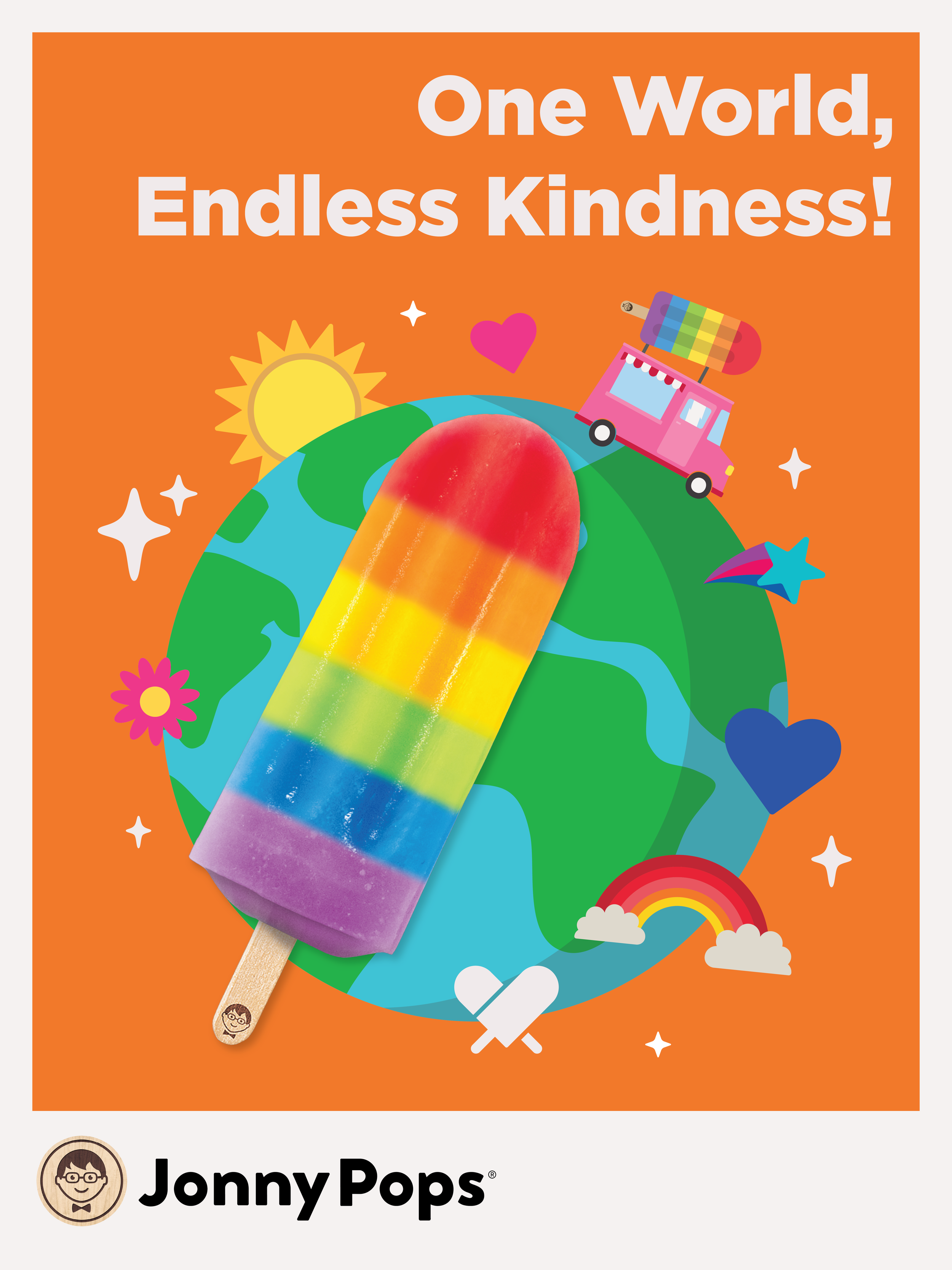
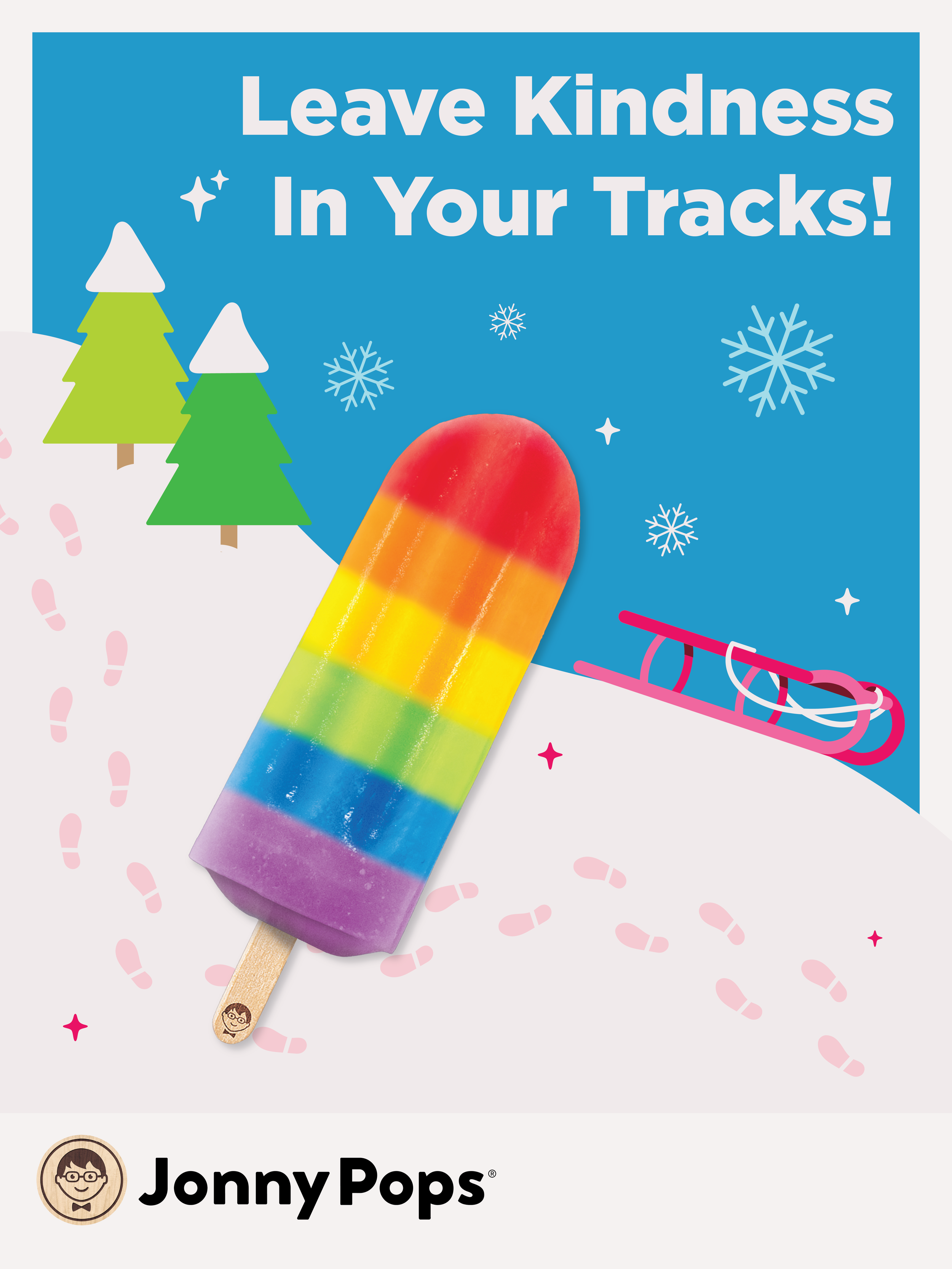
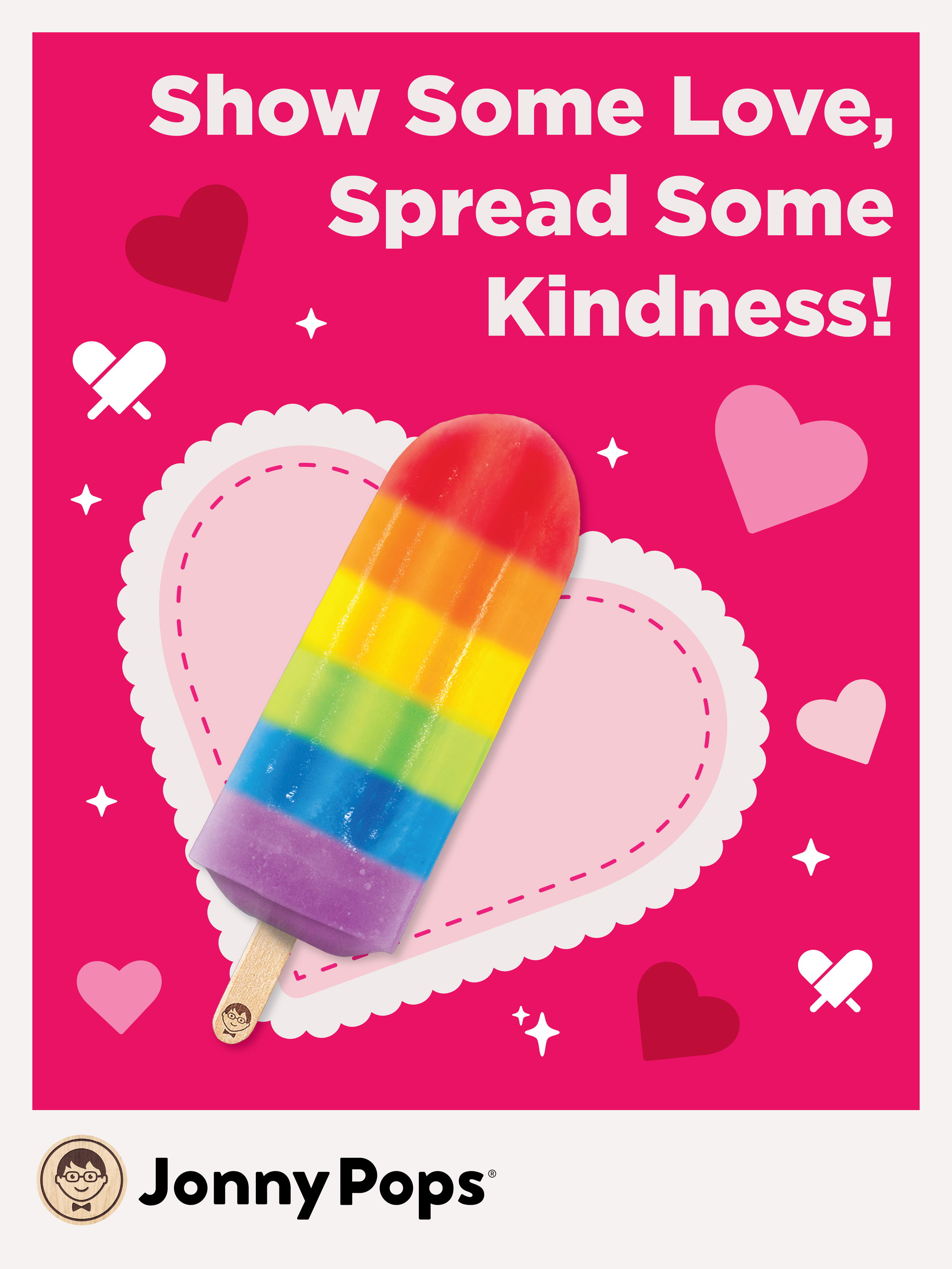
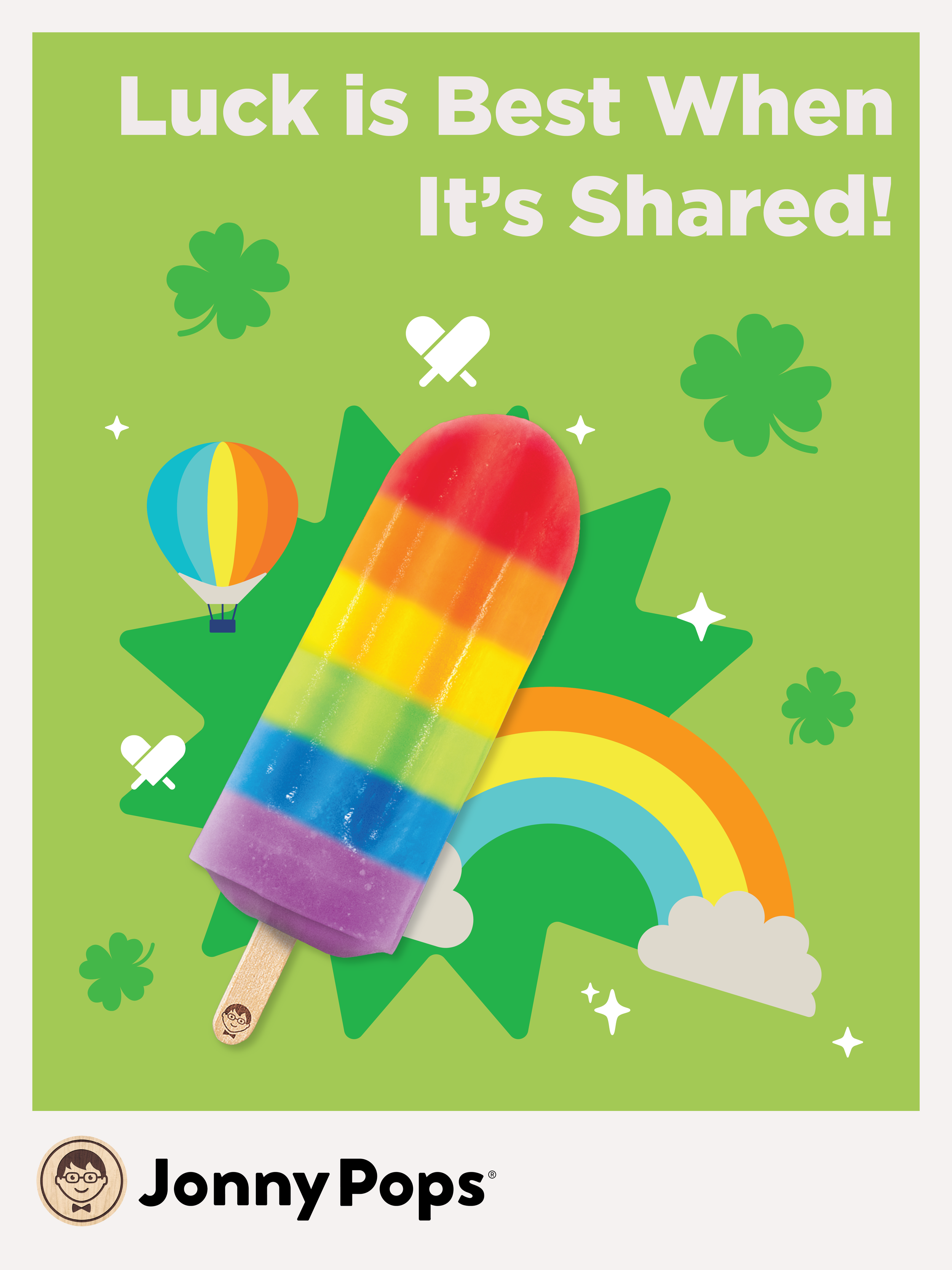
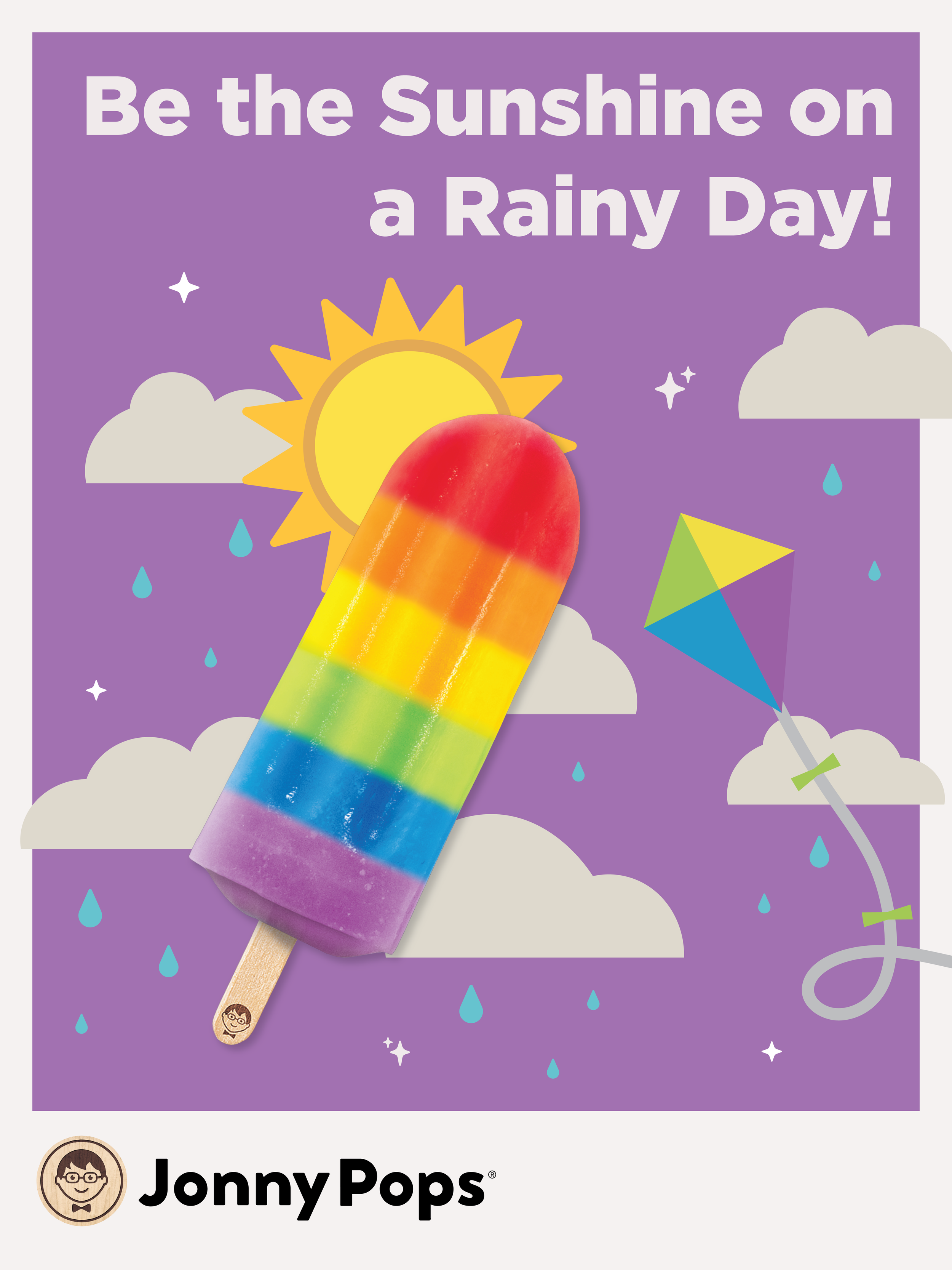
JonnyPops is on the menu for more than 13 million students annually, with products built to meet USDA Smart Snacks nutritional standards, simple ingredients kids recognize, portioned for school service. Beyond nutrition compliance, JonnyPops extends its kindness mission into the classroom through a complimentary Kindness Toolkit of posters and stickers that help educators teach and empower students to spread kindness. Schools access product through a dedicated foodservice portal, making K12 a channel where JonnyPops' mission and business model directly overlap.
K12 Partnerships
JonnyPops' classroom poster set for schools was outdated and didn't fully reflect the brand's relationship with K12 or the products it provides through the foodservice channel.
Problem
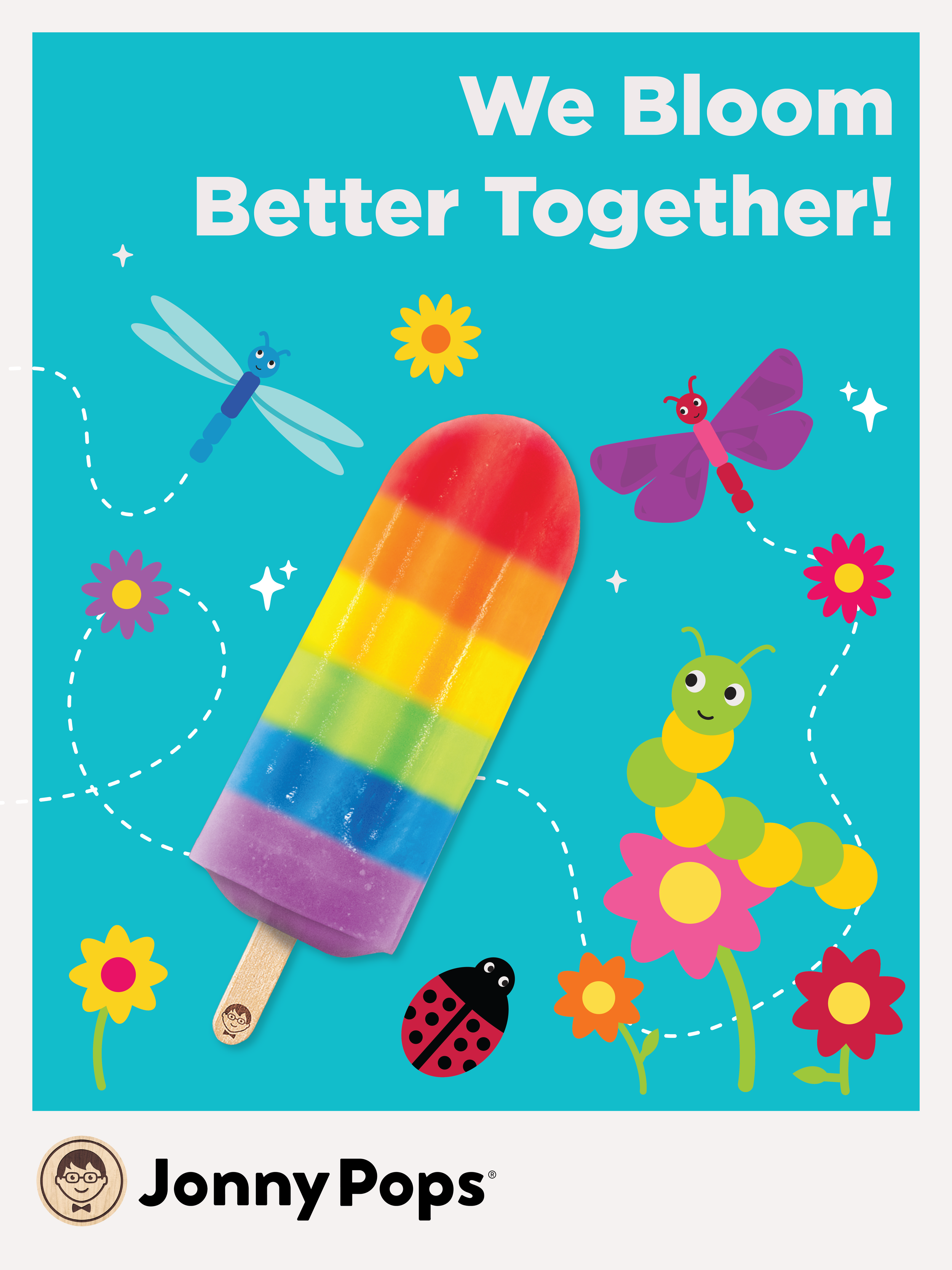
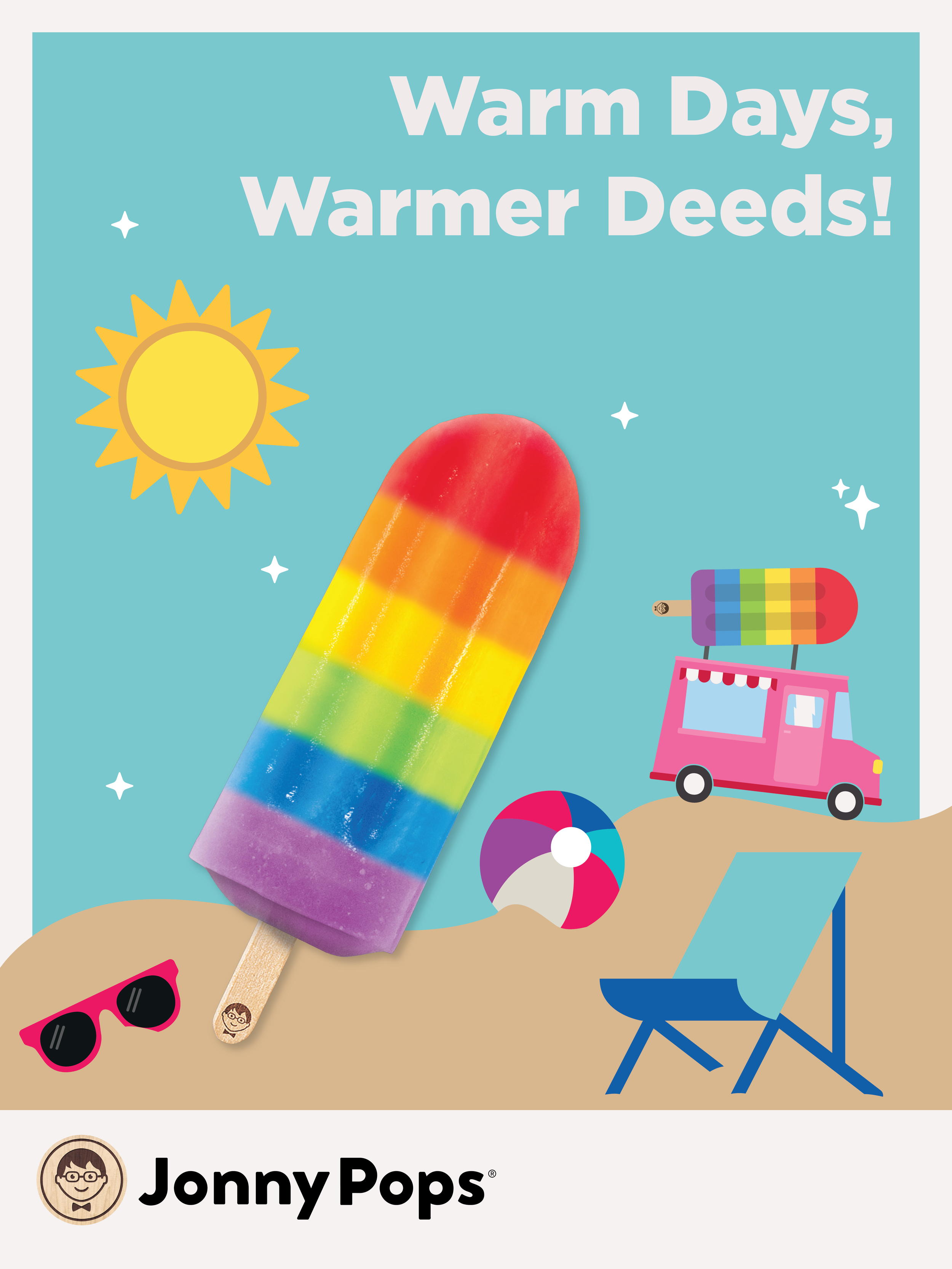
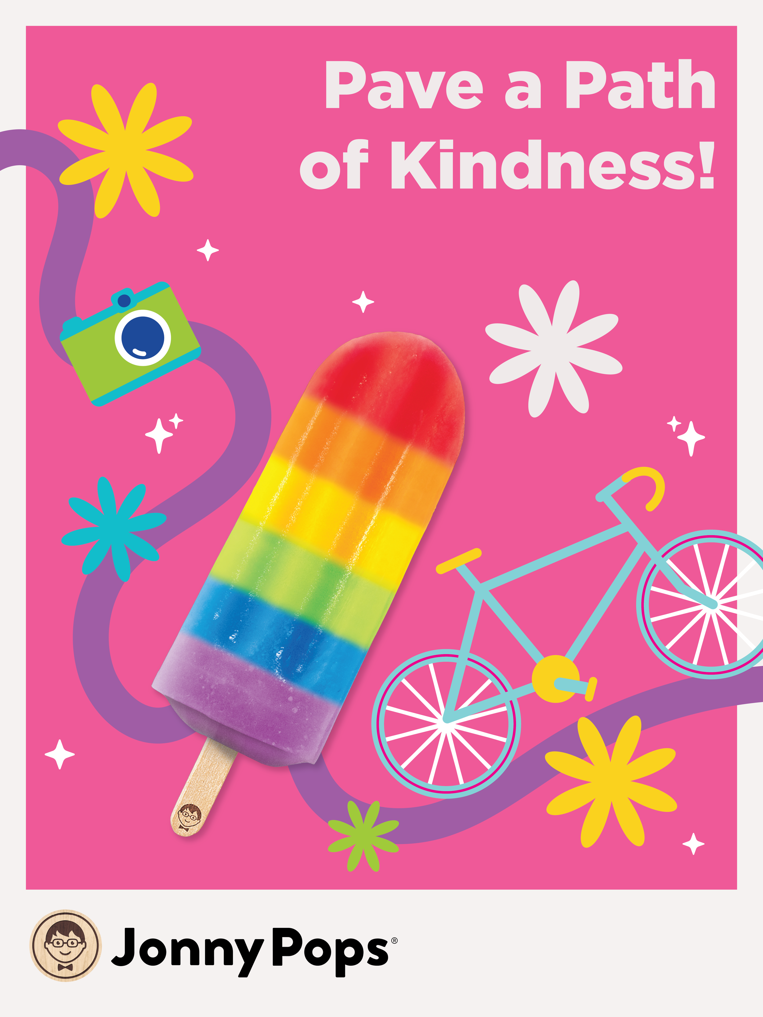
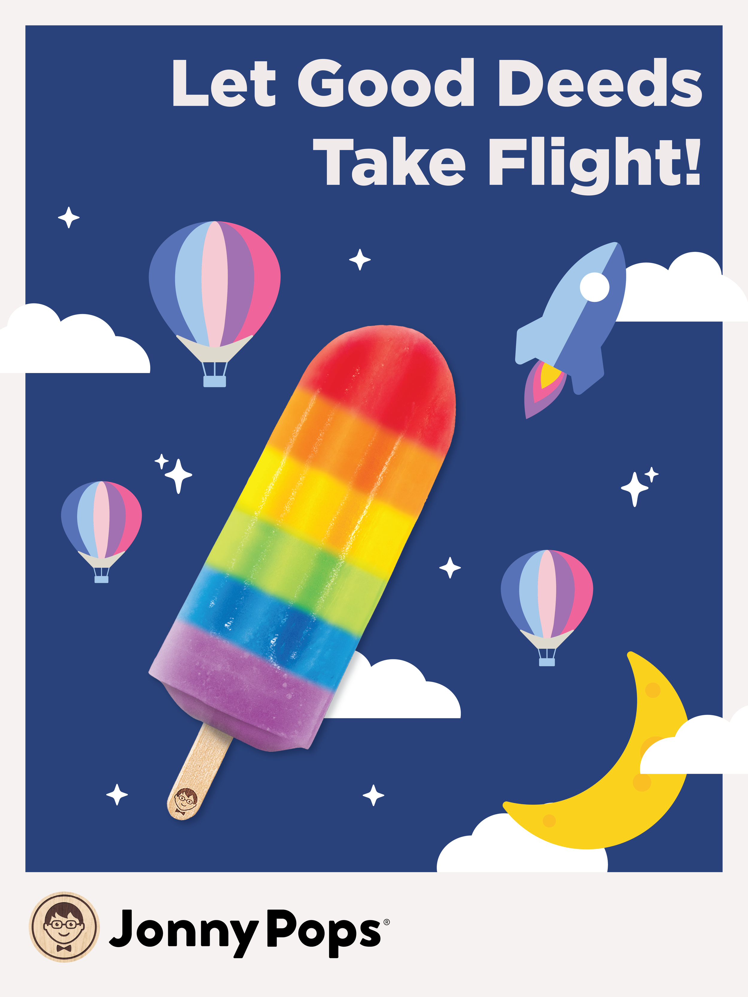
Designed a refreshed set of 12 classroom posters that promoted JonnyPops' presence in schools alongside its kindness mission, giving educators updated, on-brand materials to display.
Solution
Outcome
Delivered a cohesive, refreshed poster set that strengthened JonnyPops' visibility and relationship with the 13M+ students it reaches annually through the K12 channel.

R&D sits within JonnyPops' Operations org, driving the innovation pipeline that fuels the brand's growth. But new products only land with shoppers if the creative representing them is just as strong as the innovation itself. Partnering with R&D early means Creative isn't just illustrating what marketing needs, it's helping translate product development into visuals that make a new flavor or format immediately understandable on shelf, online, or in a school cafeteria. It's a reminder that Creative's role at JonnyPops extends well beyond Marketing, supporting any team whose work eventually needs to reach a customer.
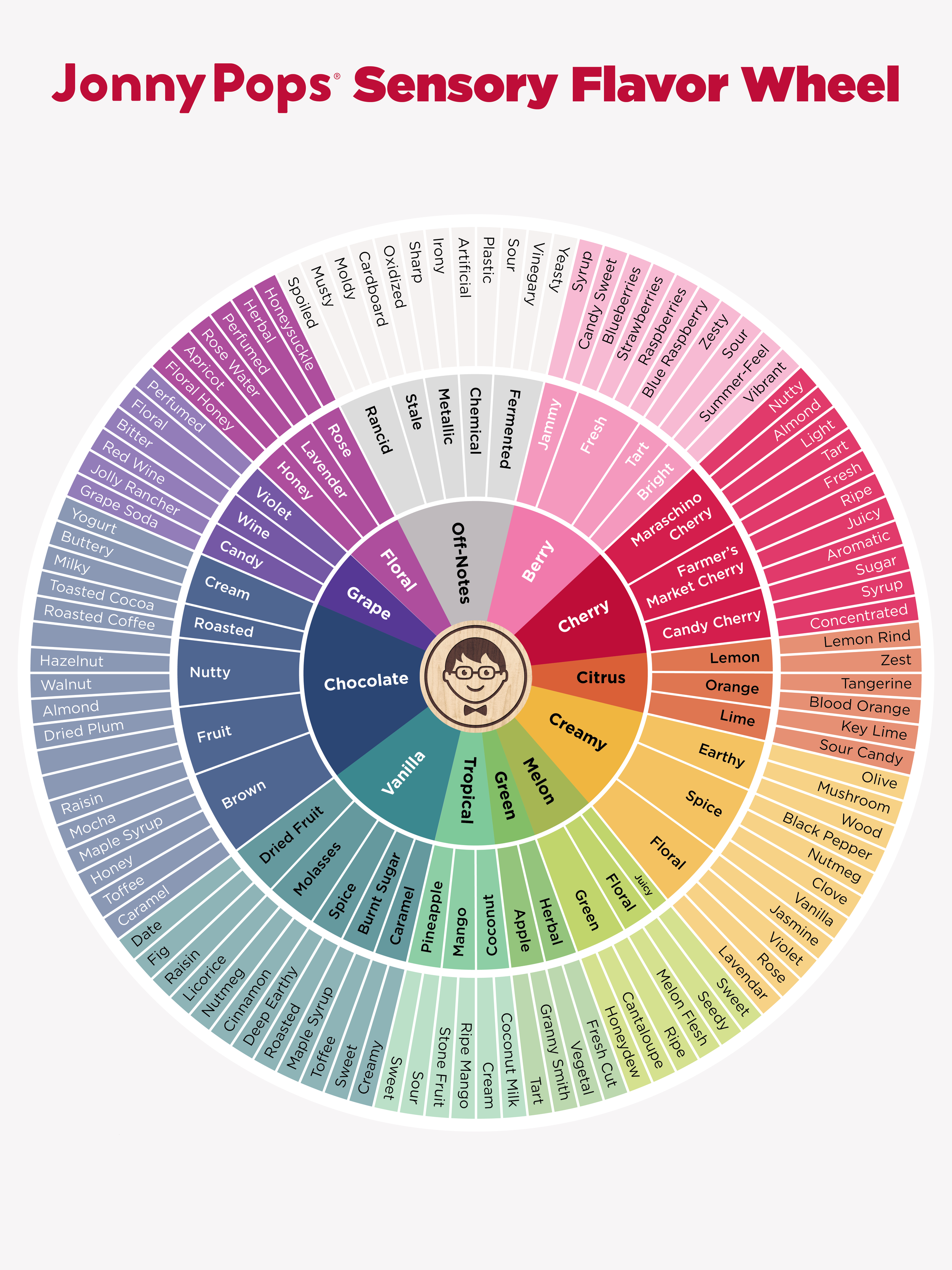
R&D Flavor Wheel
R&D needed a way to categorize and label pop flavors consistently during tastings, but lacked a shared visual reference, leading to inconsistent language and slower evaluation.
Problem
Created a flavor wheel giving the team a standardized way to categorize and describe flavors It was built for large-format printing, with readability prioritized for a non-creative department use.
Solution
Increased efficiency in the R&D process, with a clear, shared reference that speeds up evaluation and decision-making.
Outcome
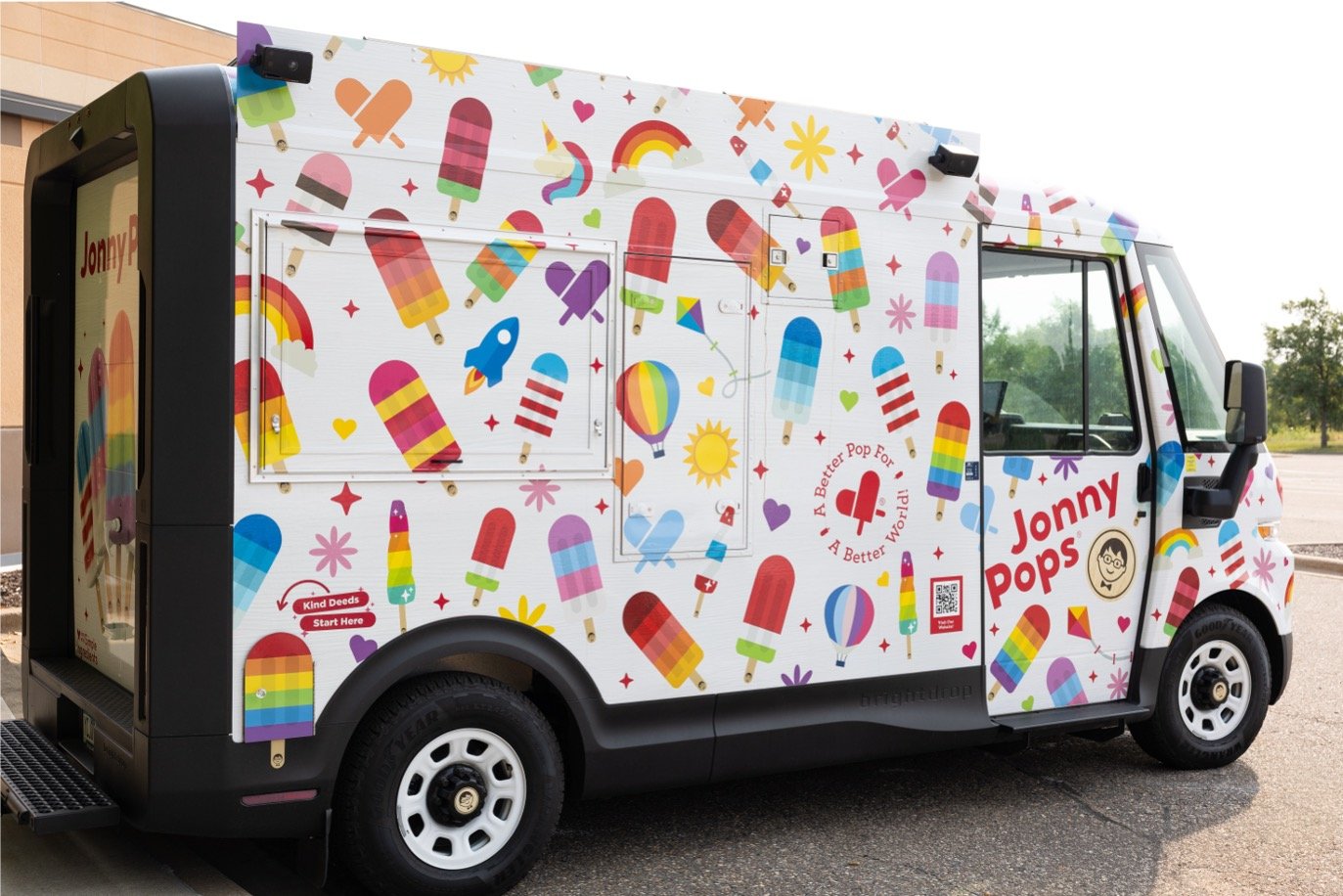
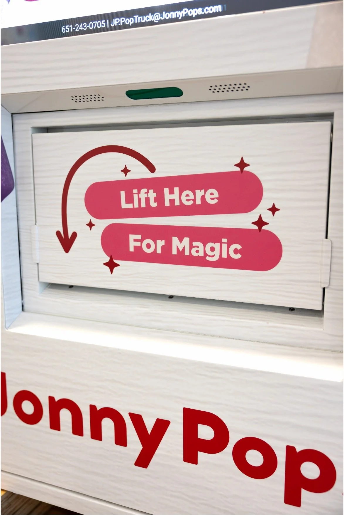
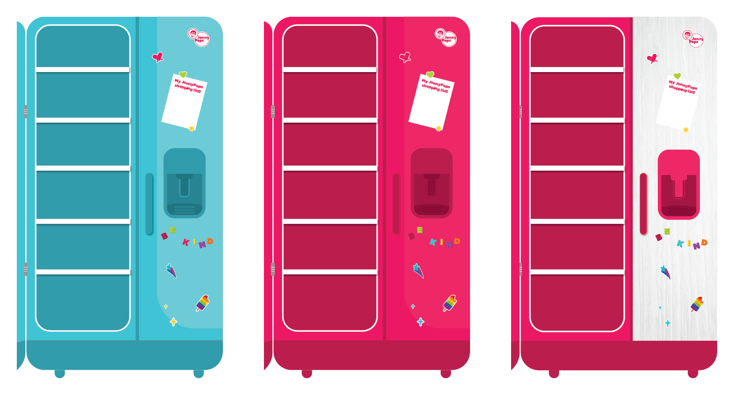
JonnyPops is expanding its physical footprint across Minnesota with a branded pop truck and a growing network of vending machines, meeting people directly at parks, events, and everyday stops rather than waiting for them to find the brand on a store shelf. Both efforts are built to widen local awareness and put JonnyPops (and its kindness mission) directly in front of new households across the brand's home state, turning Minnesota into a proving ground for grassroots brand-building.
Pop Truck &
Vending
New pop truck and vending machine channels needed menu and door assets, but without accessible, easy-to-use templates, other departments couldn't produce them on their own.
Problem
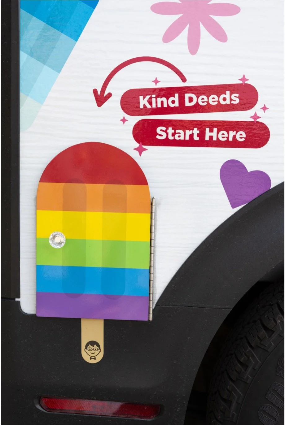
Built customizable menu templates and vending machine and pop truck door assets that anyone can use without design support, all aligned with brand standards.
Solution
Consistent, on-brand look across the pop truck and vending machines, even when built by non-designers.
Outcome



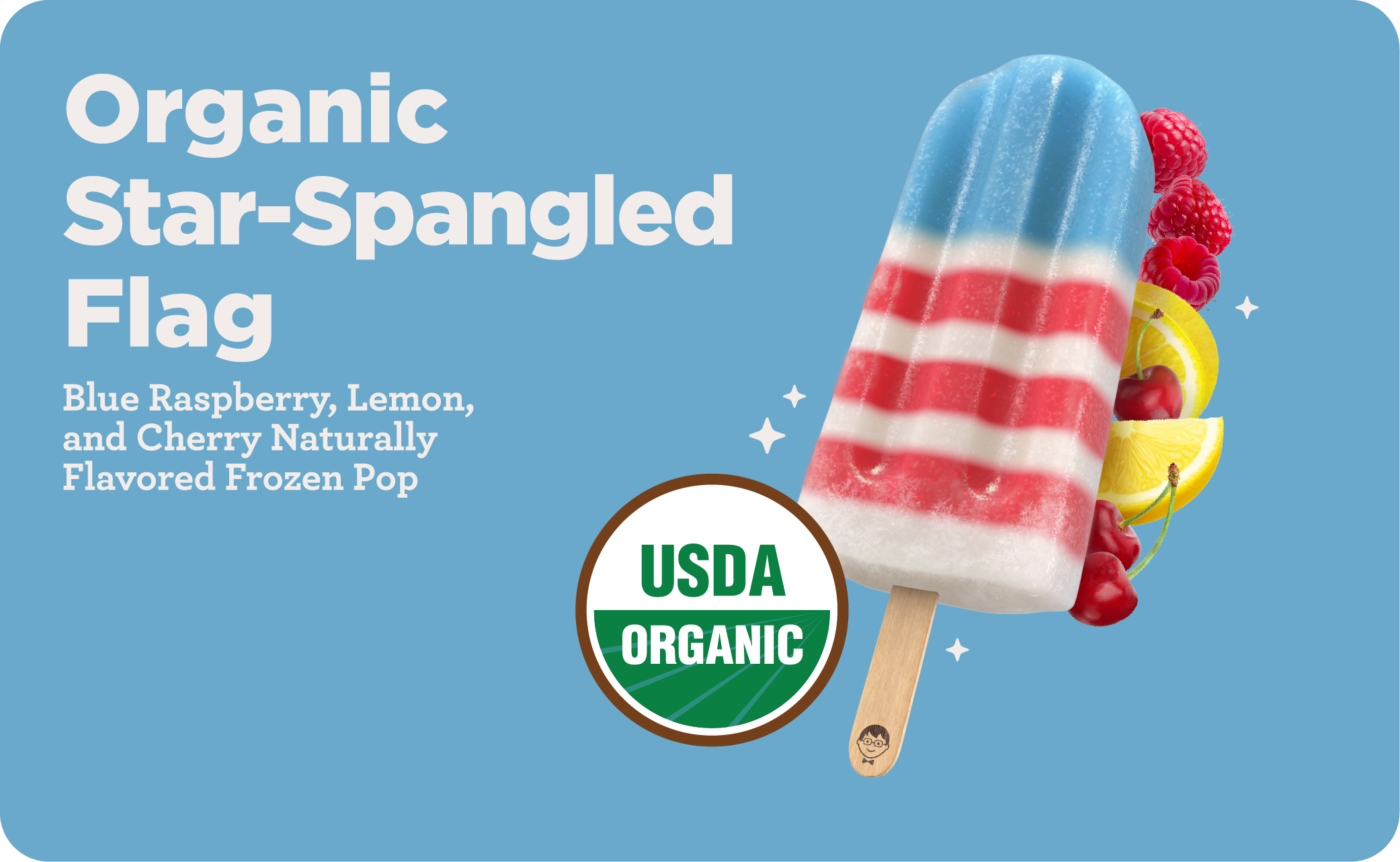


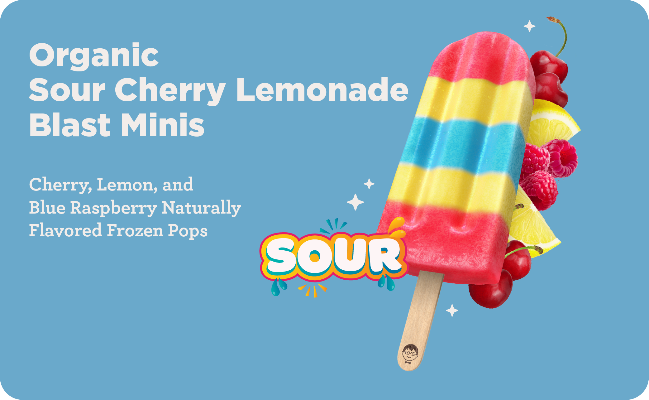
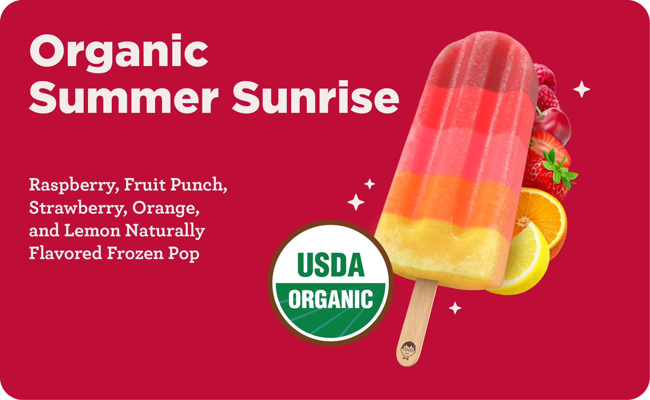


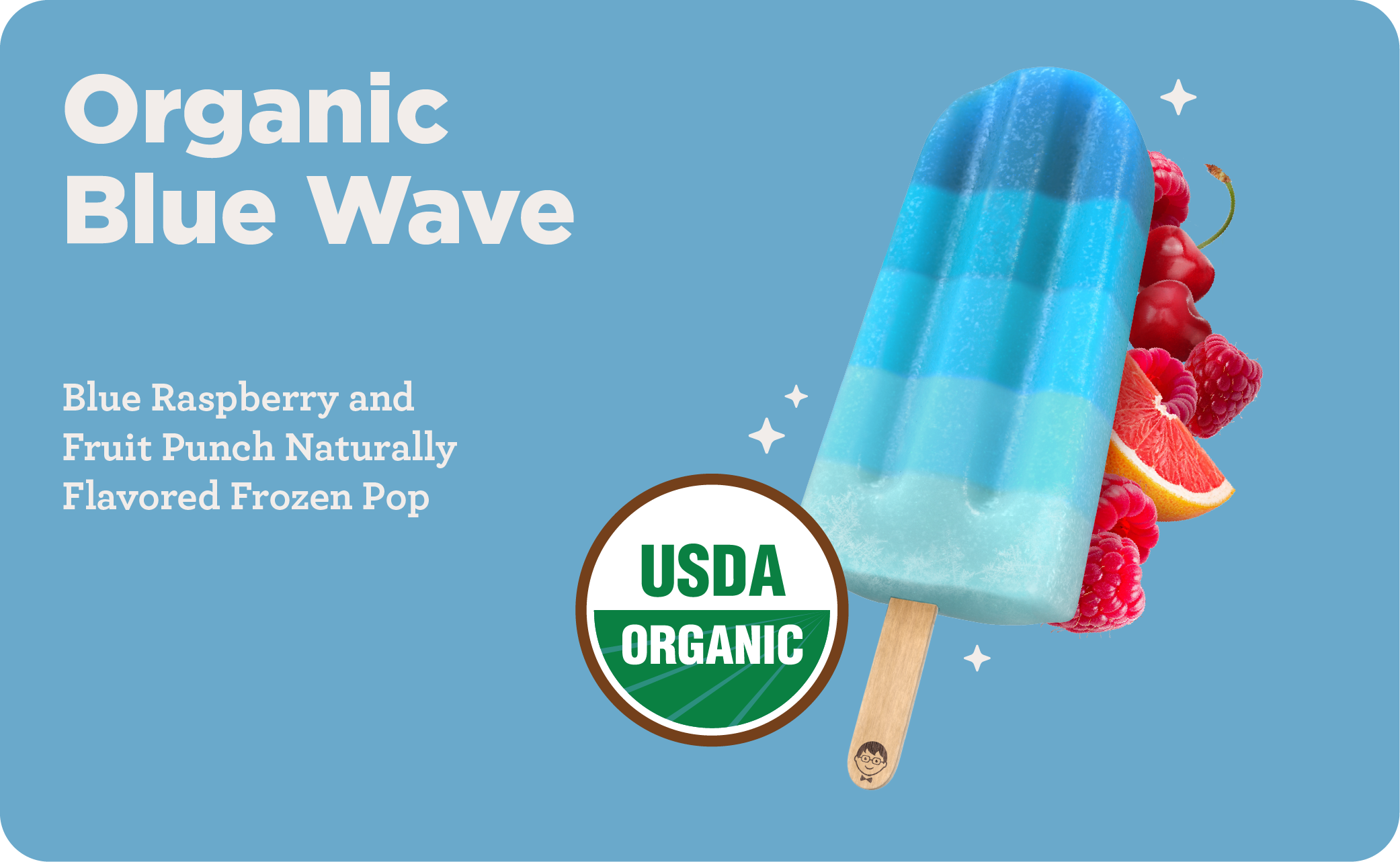


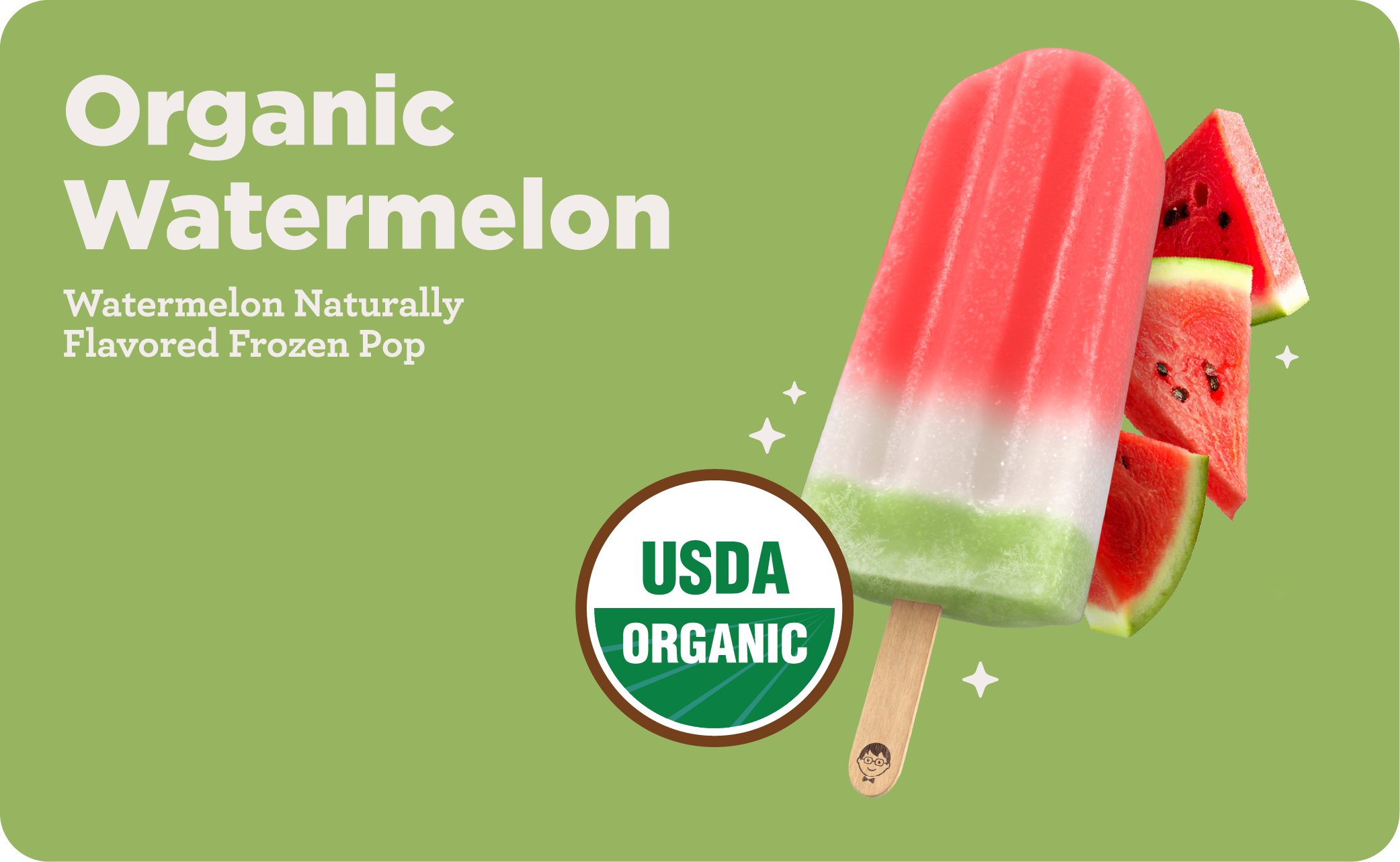
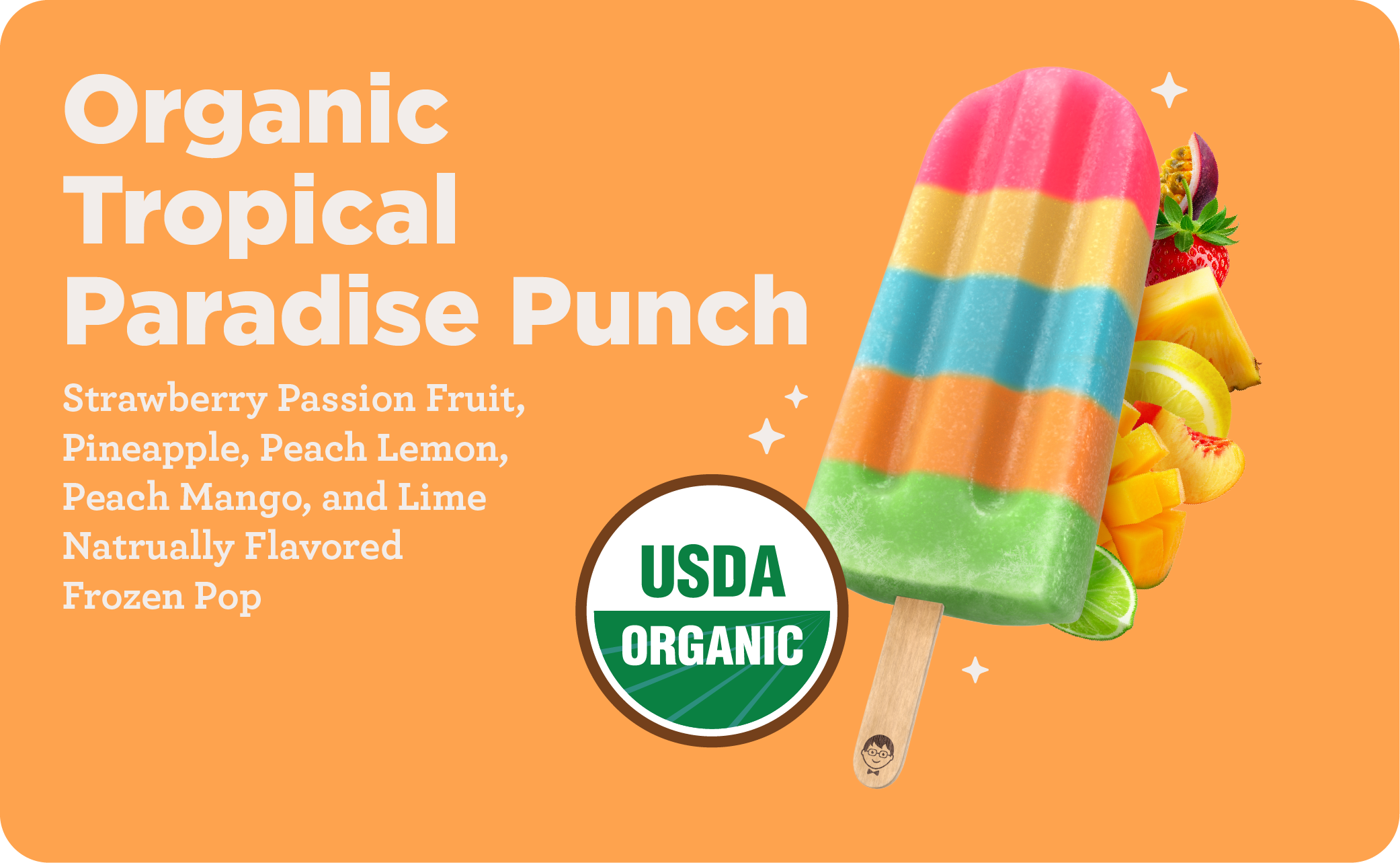
Pop Truck Menu Cards
Pop Truck menu cards are individual, plug-and-play cards for each JonnyPops product (Organic Water Pops, Unicorn Twist, Minis, Cream/Smoothie, etc.), each showing the product name, flavor, and a quick visual. Non-creative staff can mix and match cards to assemble a custom truck menu for a given event's needs, no design work required.
Pop Truck
The Pop Truck is JonnyPops' mobile vehicle for spreading kindness across Minnesota, driving to neighborhoods and local events to hand out free pops. It puts the brand's kindness mission into action in person, since every JonnyPops has a kind deed printed on the stick.
Internal communication at JonnyPops carries as much weight as anything shown to shoppers. Employees are the brand's first audience, and how the office looks and feels shapes how confidently the team represents JonnyPops to the outside world. Keeping internal materials on-brand, from office signage to team communications, reinforces the same kindness mission and visual identity customers see on-shelf, building genuine pride.
Internal Communication
Internal communications spanned many formats (corporate documents, event assets, sampling guides)and carried inconsistencies post-brand refresh
Problem
Built a suite of branded templates covering corporate documents, company picnic assets, and sampling guides, giving every department a consistent, ready-to-use format.
Solution
Faster, more efficient internal communication across departments and consistent brand presentation in every internal touchpoint, reinforcing JonnyPops' identity even in non-customer-facing materials.
Outcome
Sampling Guide
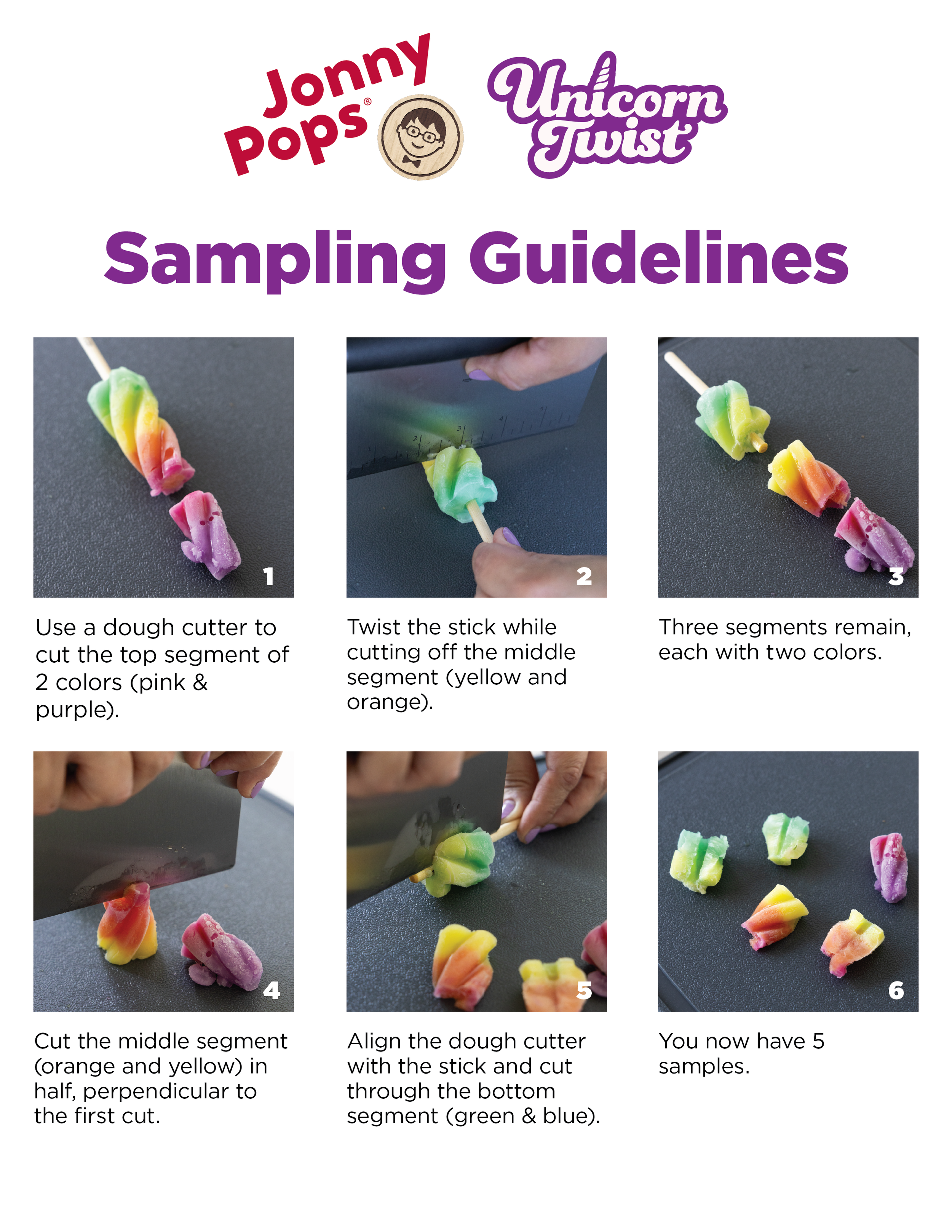
A guide designed for the Unicorn Twist Costco roadshow that is an internal, step-by-step reference for demo staff on how to safely and consistently cut Unicorn Twist pops into sample-size pieces for consumers to try in-store.
Company Picnic
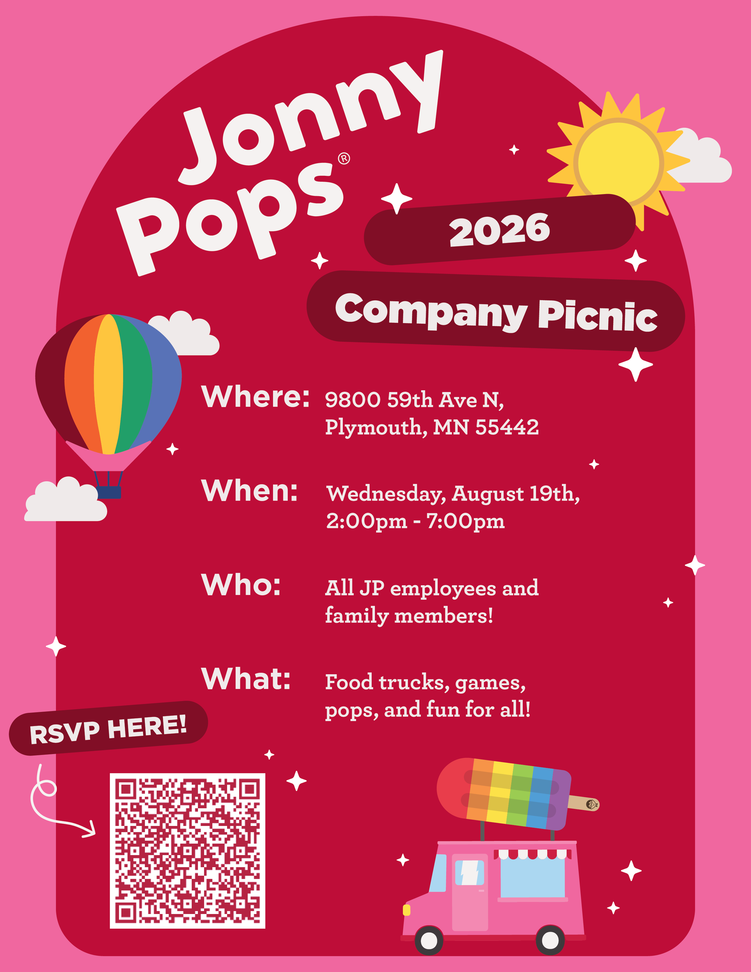
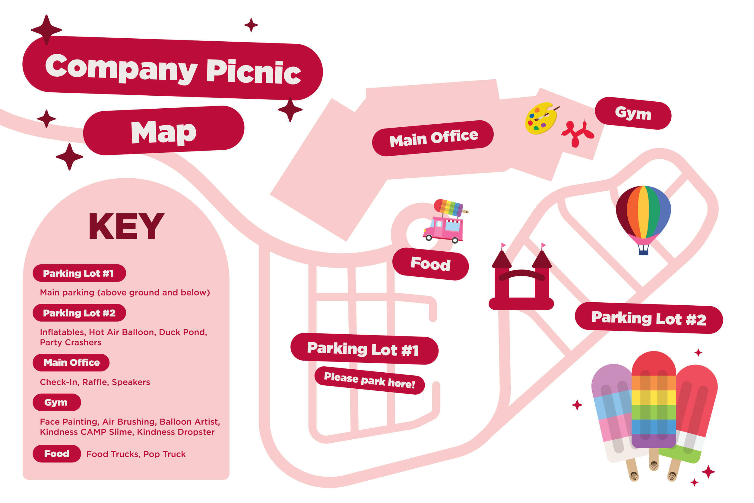
The JonnyPops Company Picnic is an annual all-team celebration bringing together employees from Elk River and Plymouth to mark the year's wins and the community the company has built. Thoughtful internal design turns the picnic from a logistics exercise into a moment that visibly reflects company culture, reinforcing employee pride and a sense of belonging.
Letters of Love
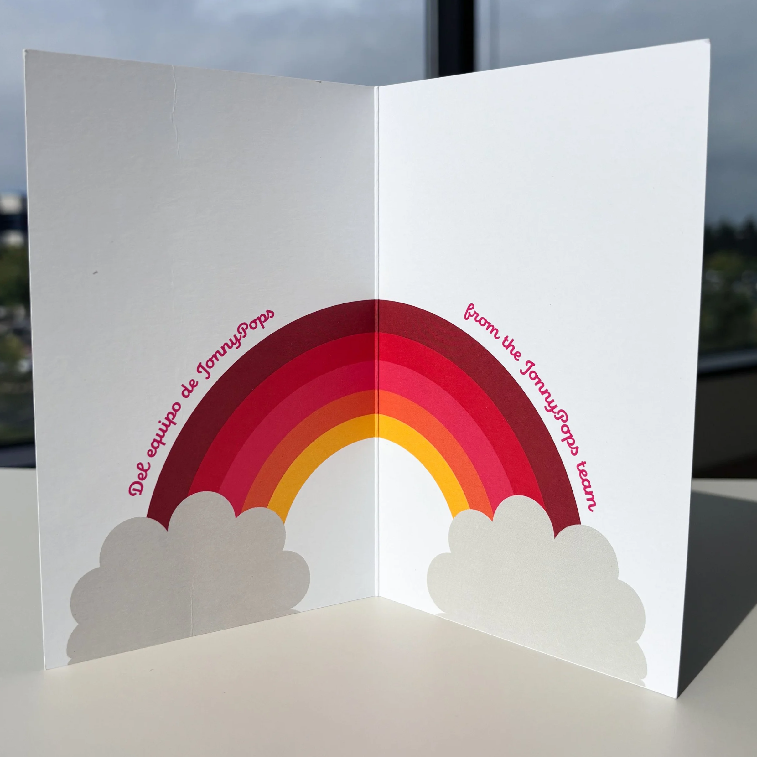
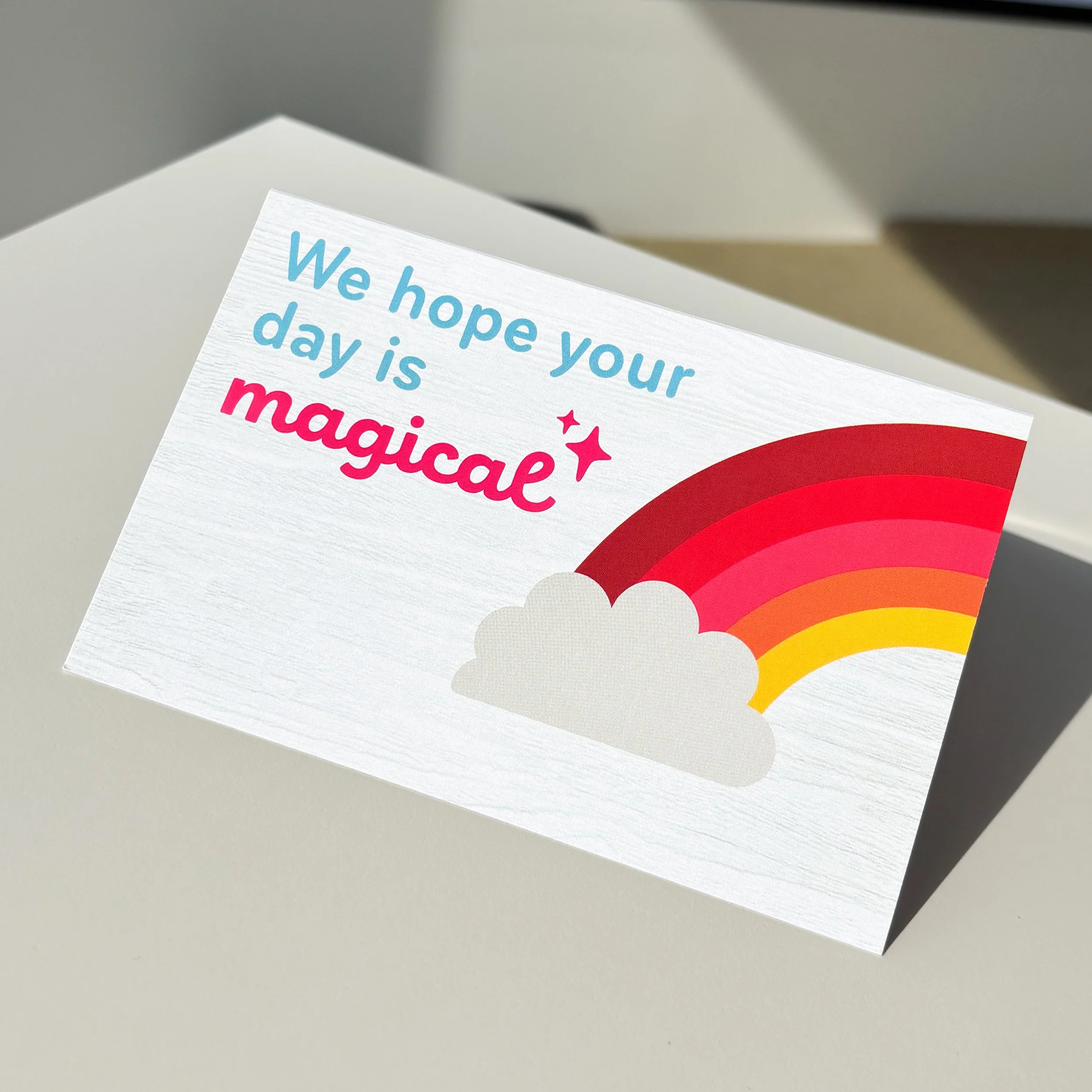
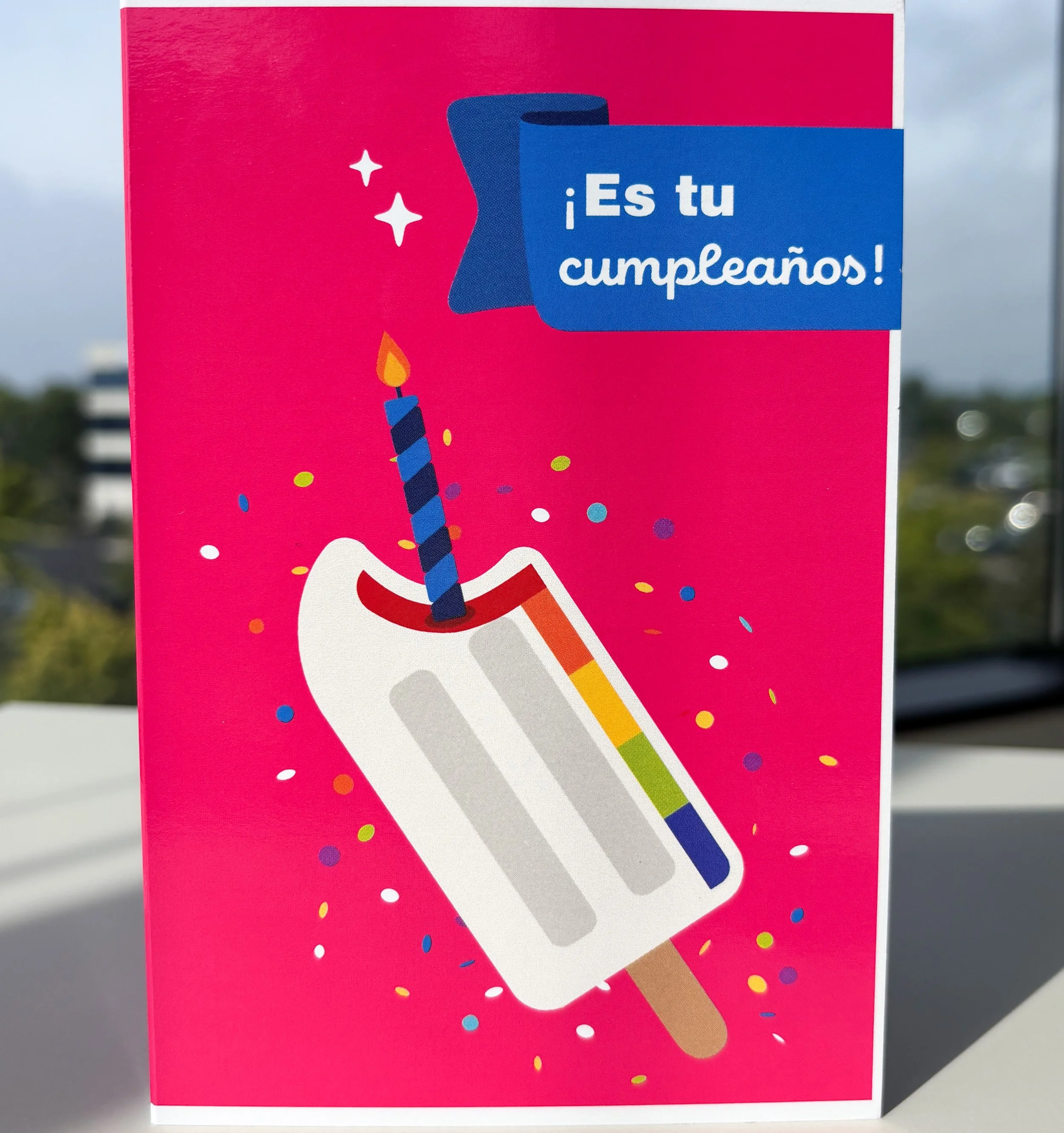
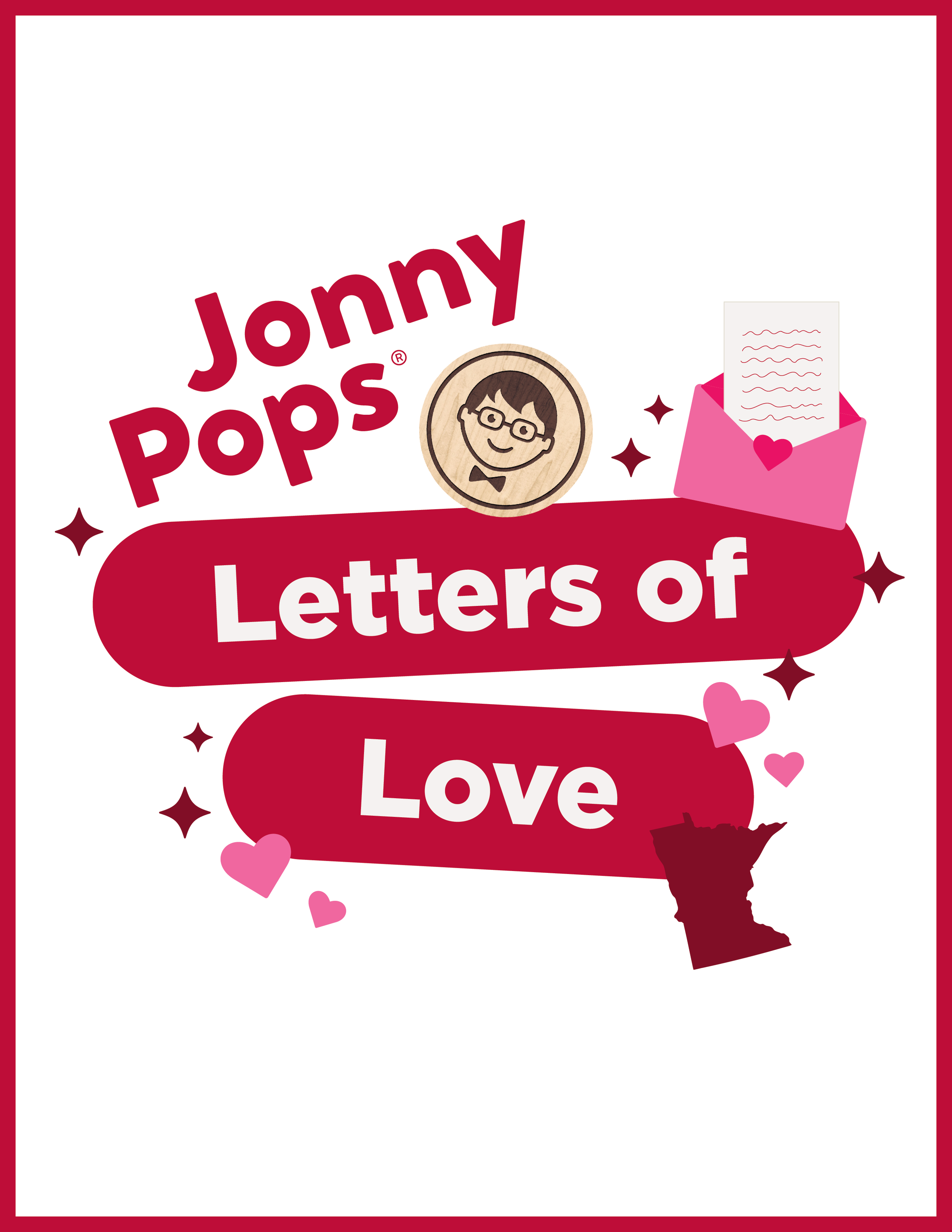
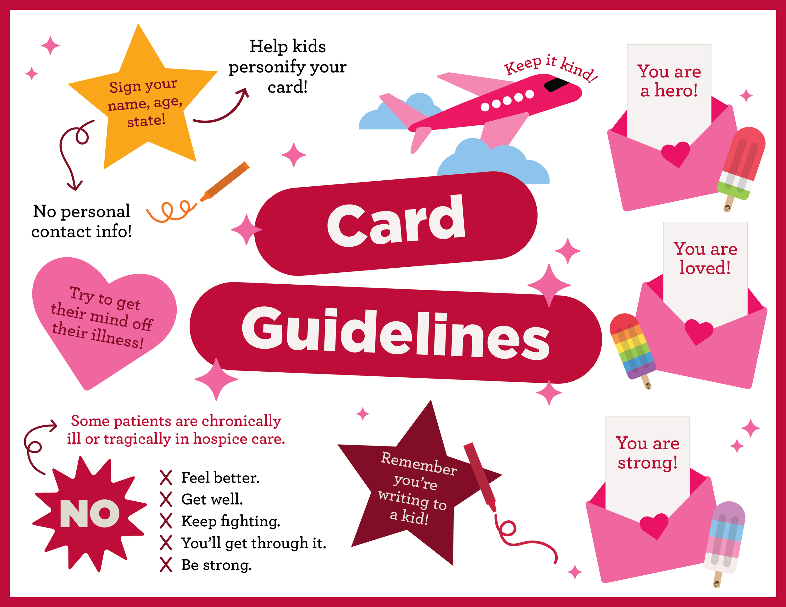
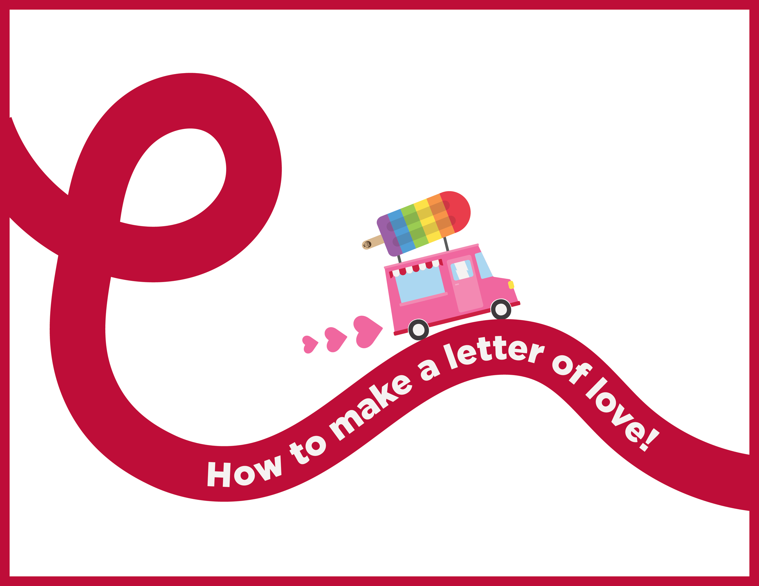
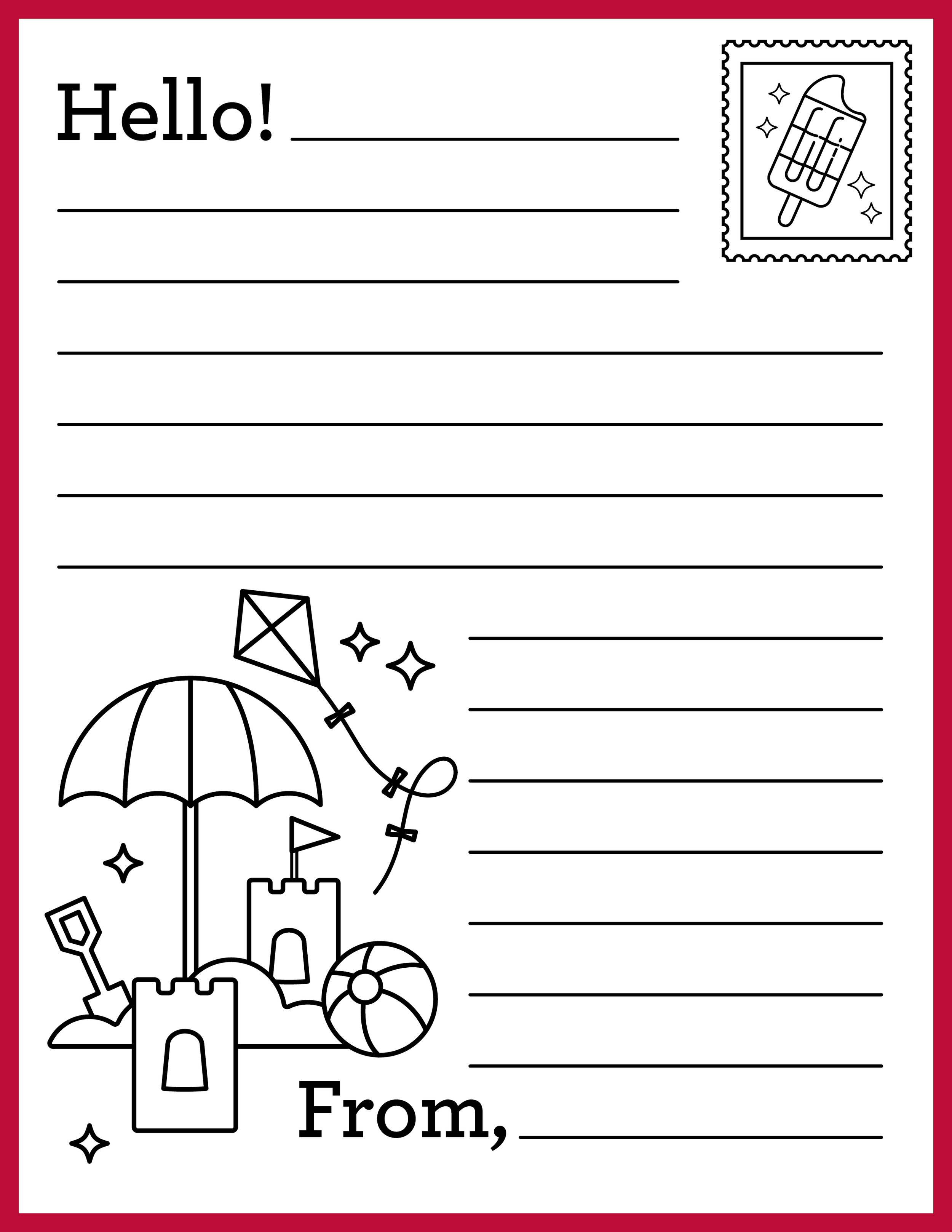
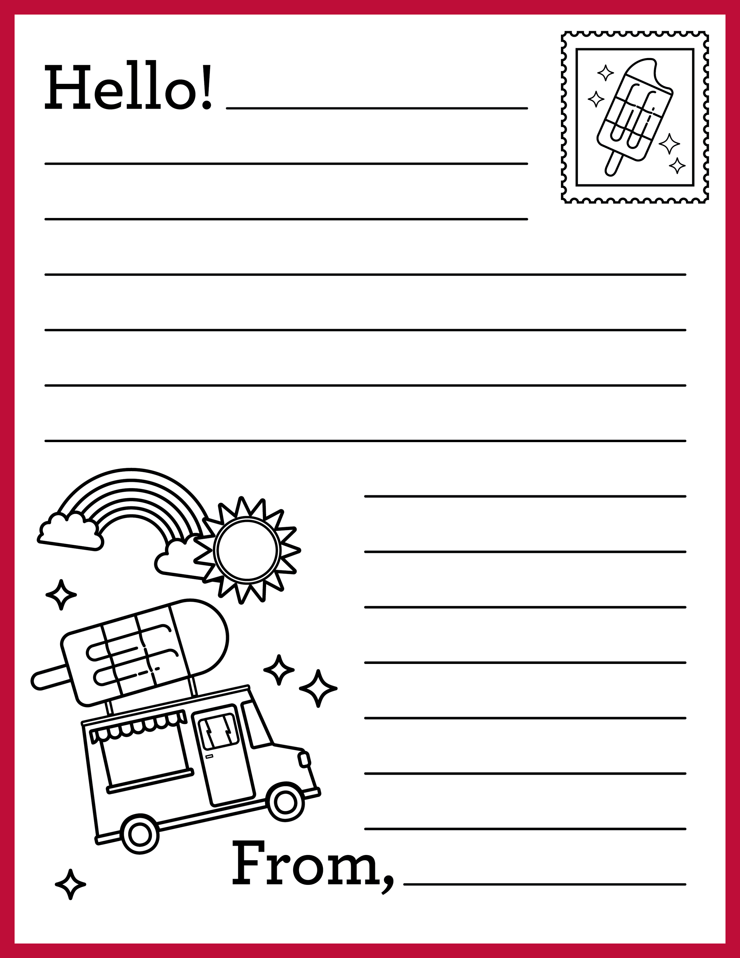
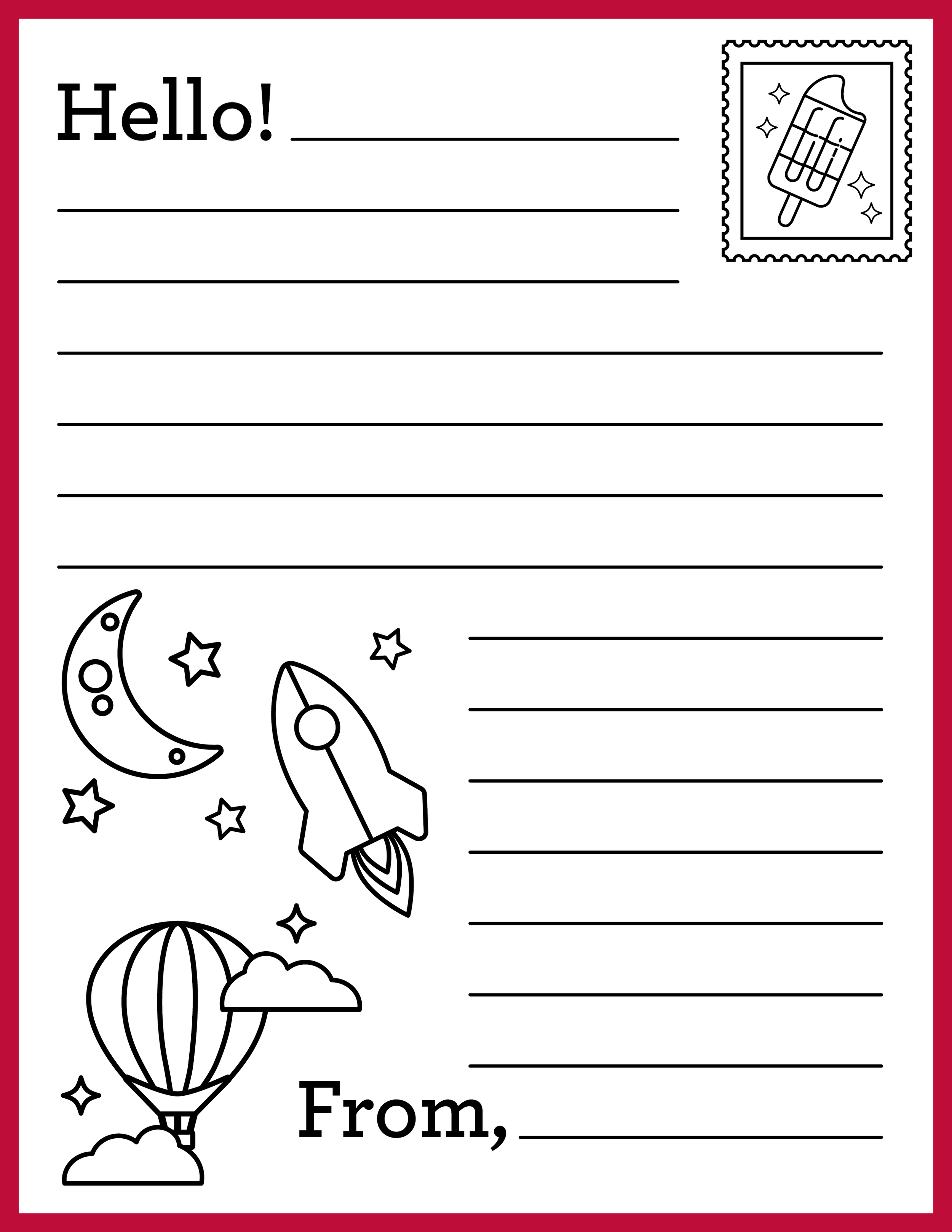
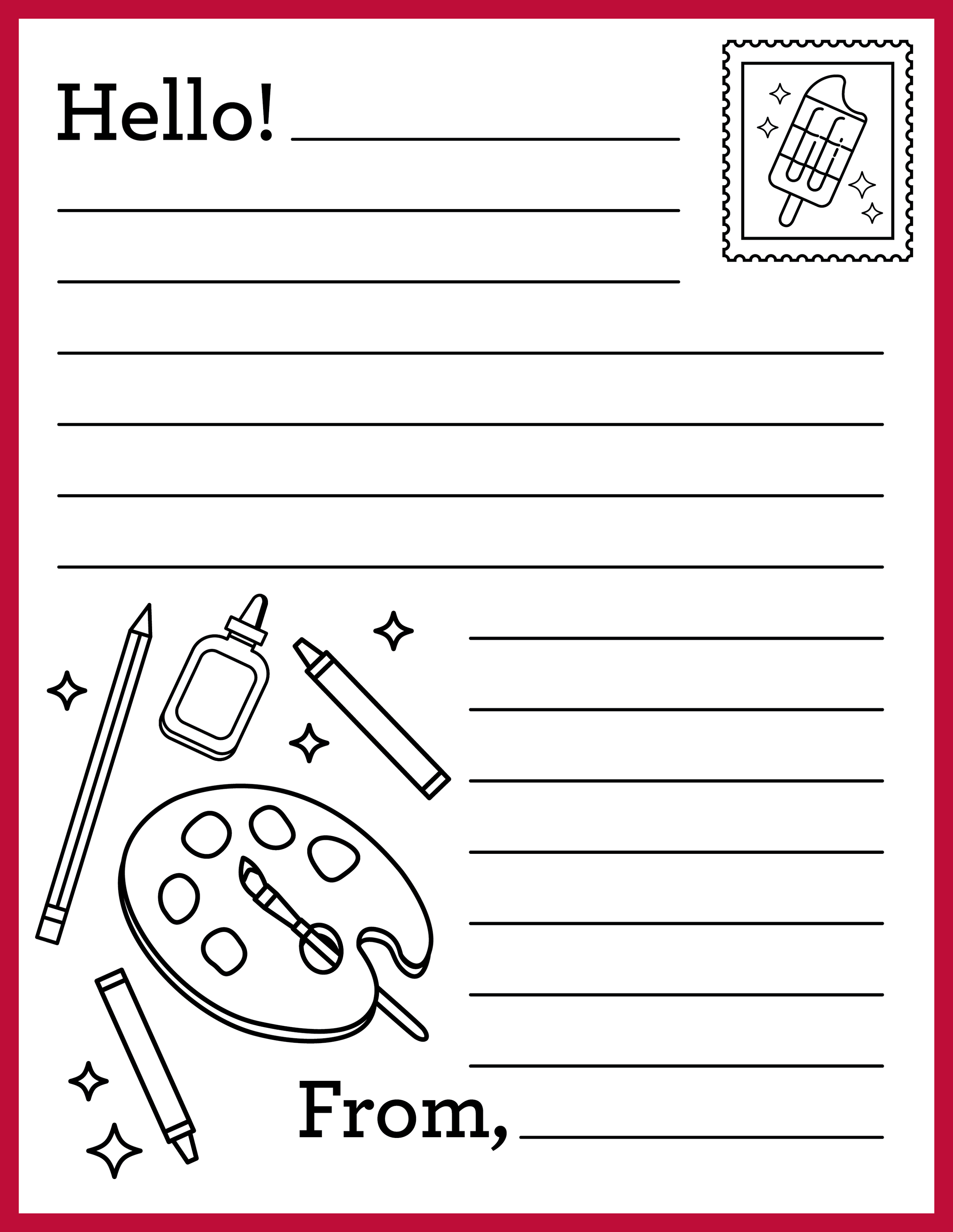
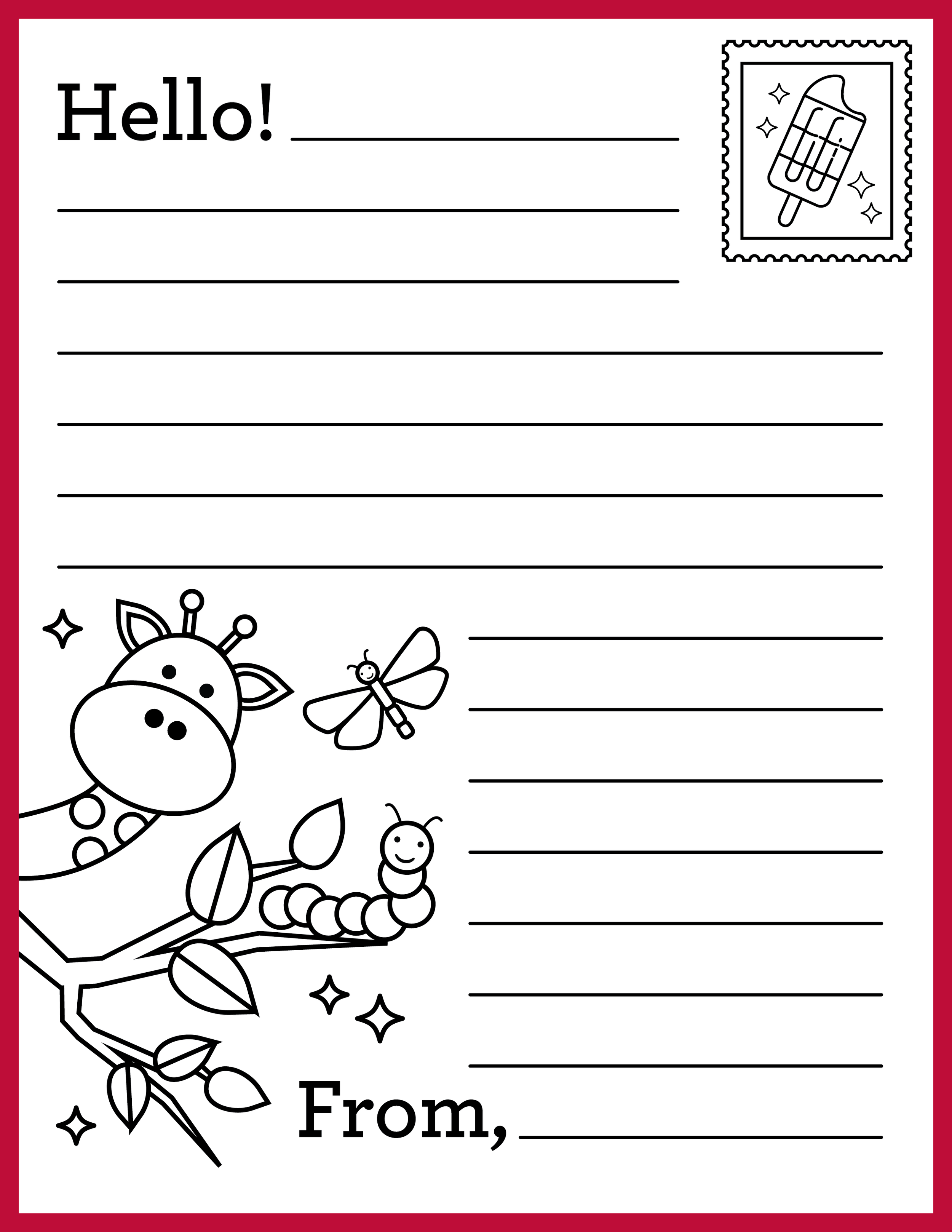
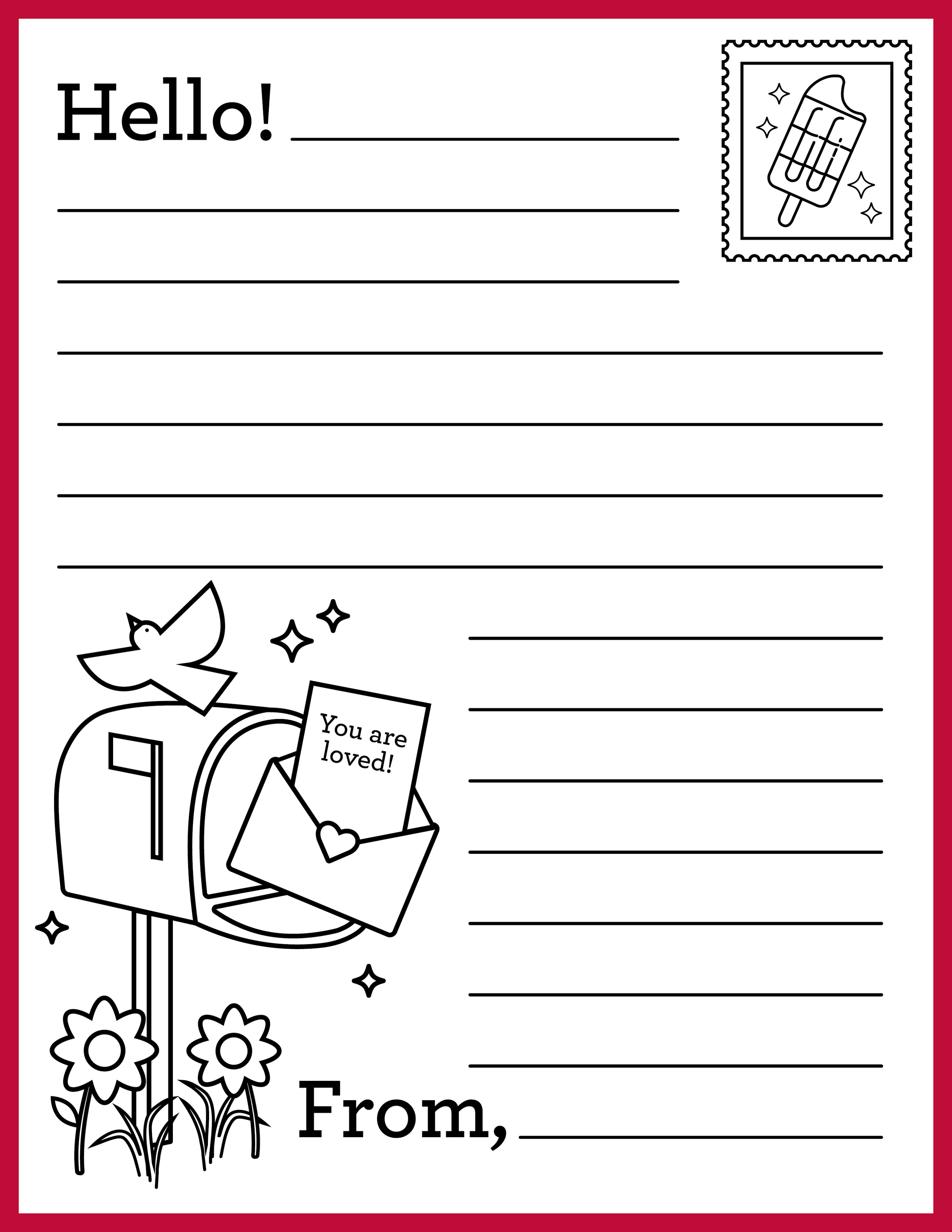
Letters of Love Kit, a set of letter-writing templates, a how-to guide, and a title card designed on JonnyPops' updated branding, supporting the Letters of Love initiative Sophia Sobhani launched at JonnyPops through her internship capstone project. Letters of Love is a nonprofit sending handmade cards of encouragement to kids battling serious illness in children's hospitals, and the kit gives JonnyPops team members an easy, on-brand way to write and send their own.
Internal Documents & Templates
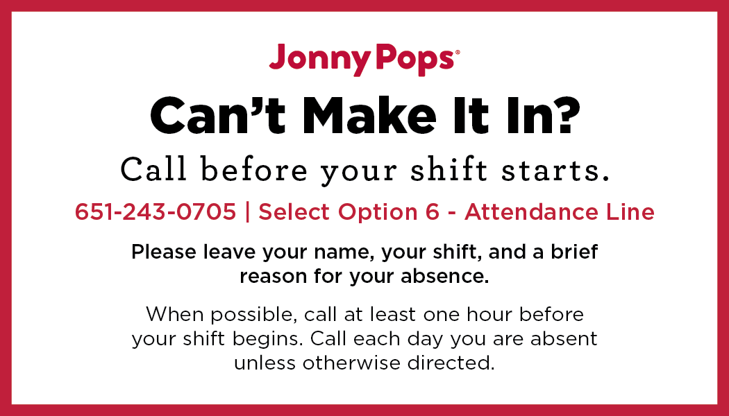
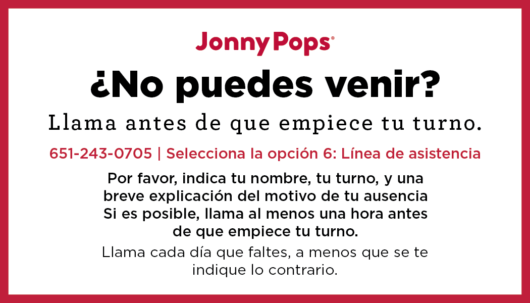
Internal communication design included a set of everyday templates and a plant absence business card updated to reflect JonnyPops' recent brand refresh. Internal materials remain visually consistent with the new look so employees have on-brand assets ready to use without needing design support.




2025
Socials
Minnesota State Fair 2025

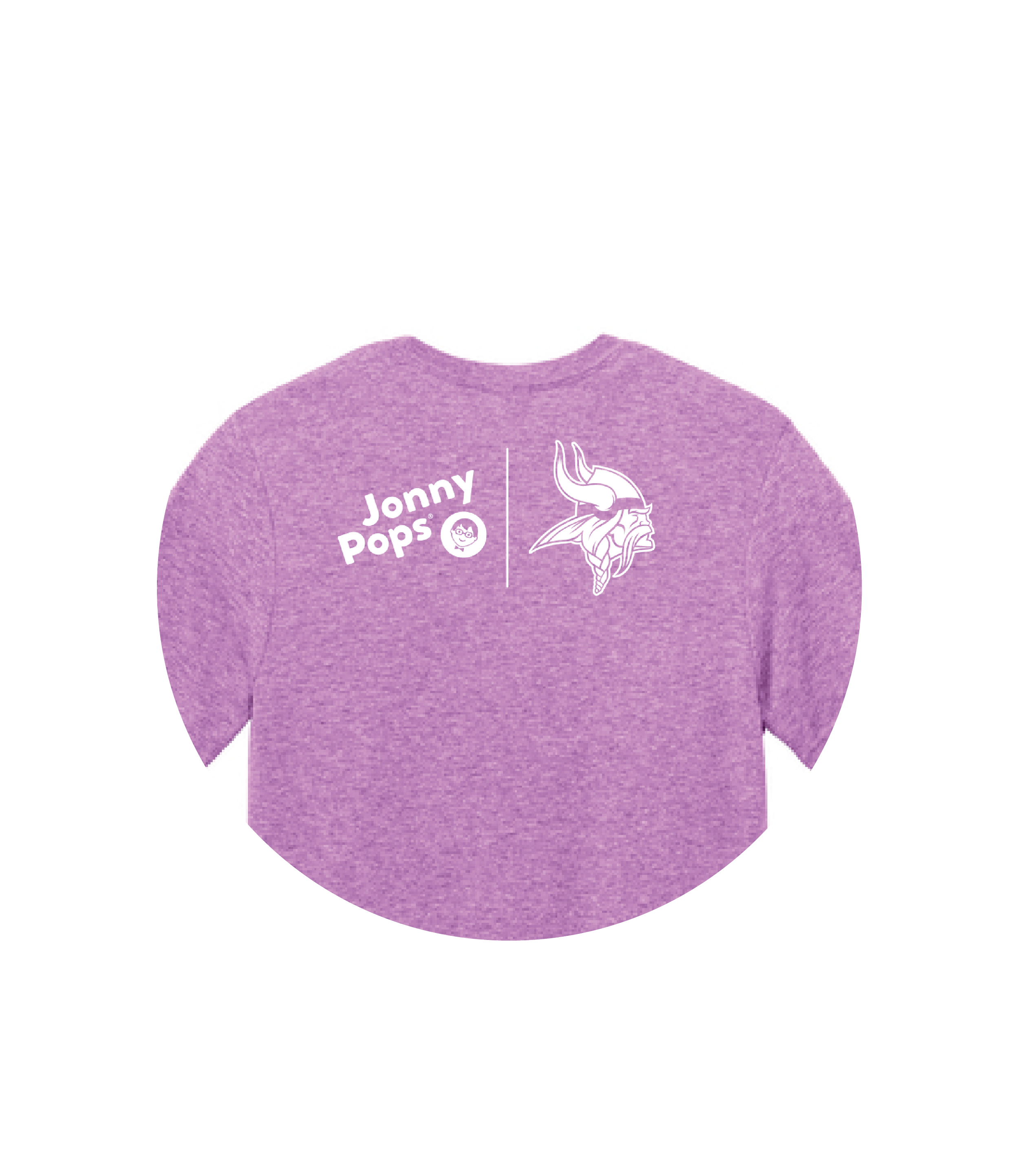
Vikings Training Camp 2025
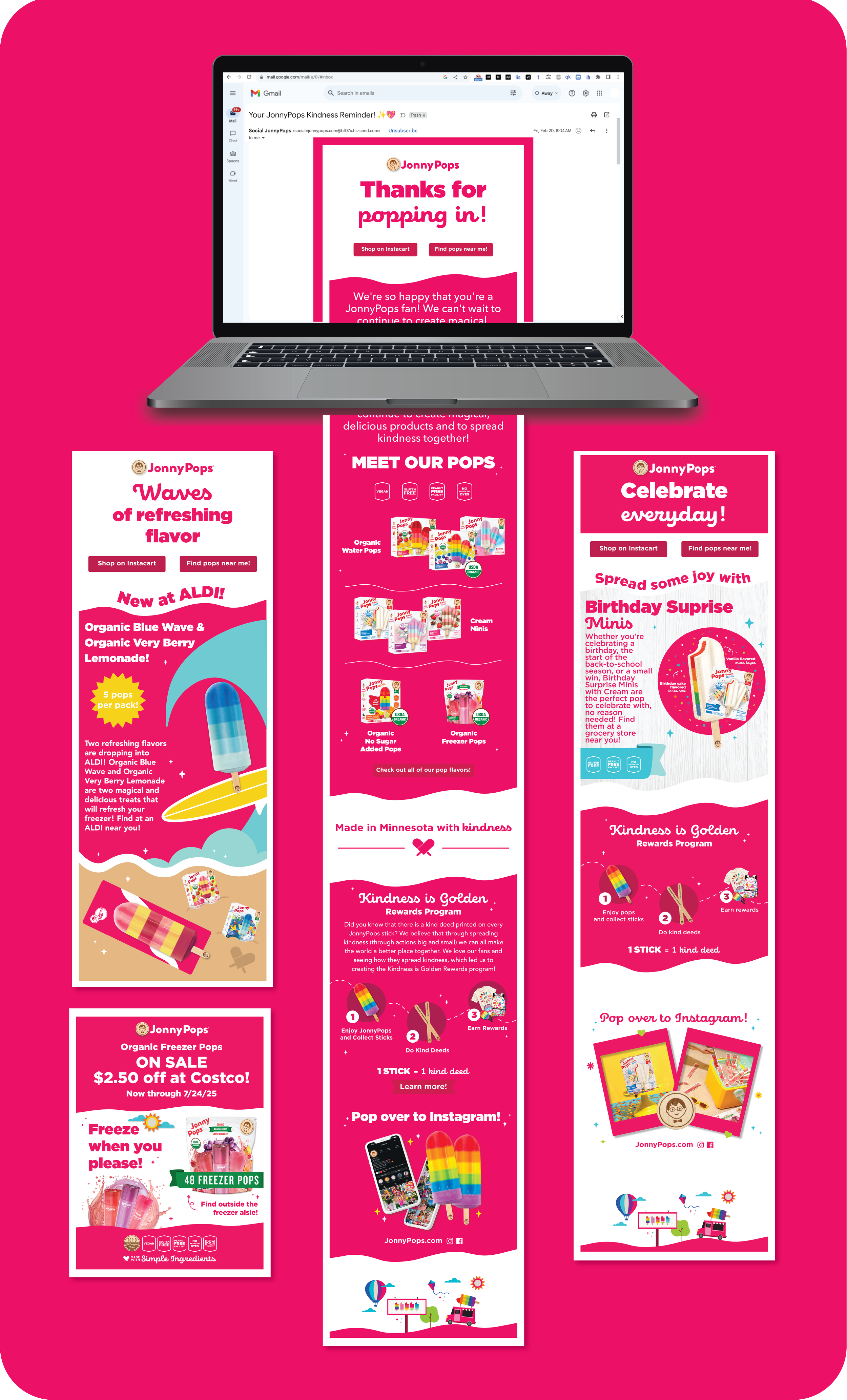
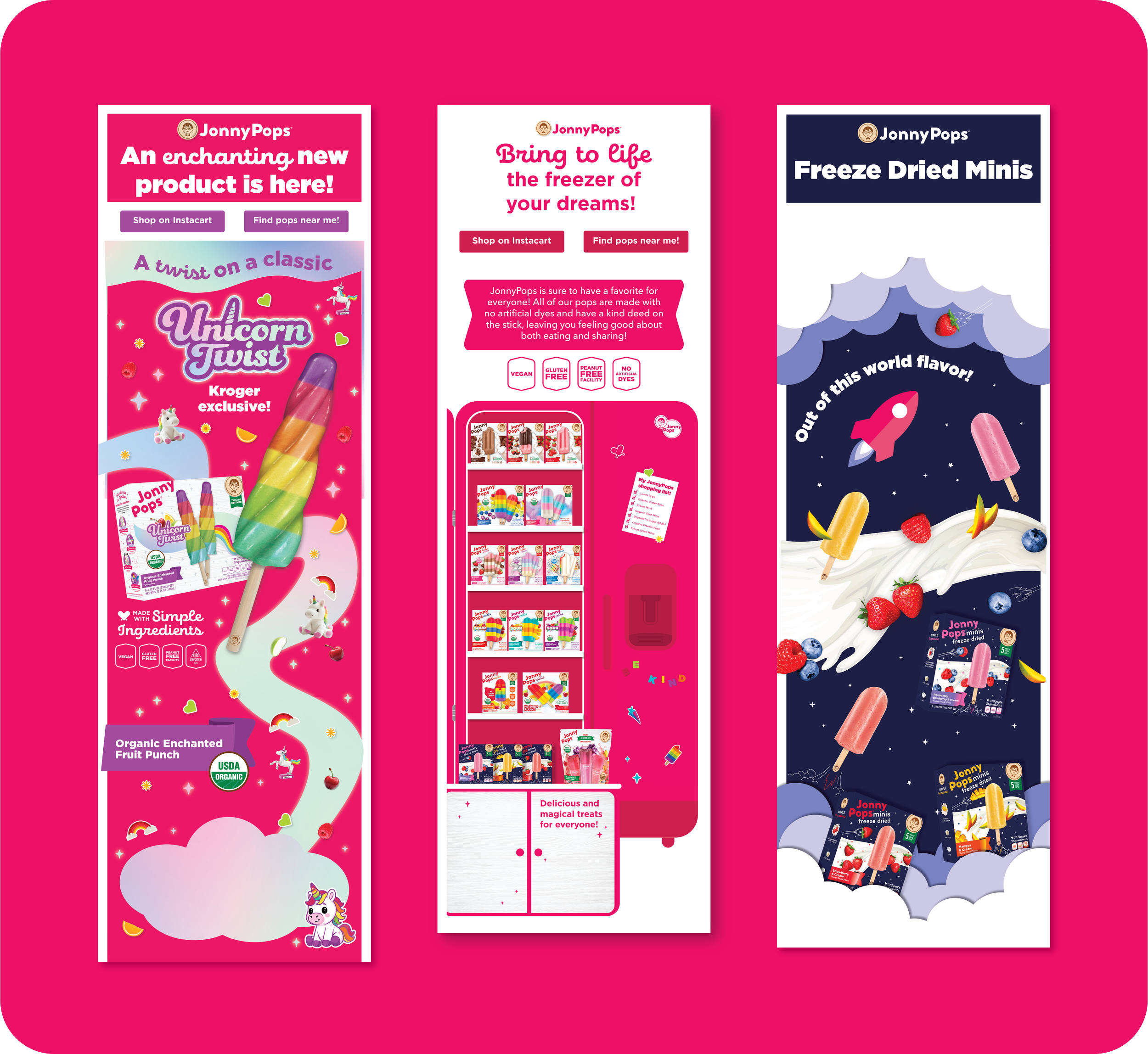
CRM Emails
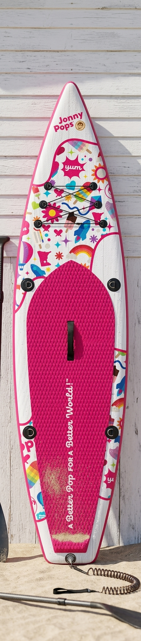
Merchandise


Internal Communication