Enjoy on desktop to learn more about the strategy behind the design.
Project Overview
The Patchwork Enterprise empowers special education students in Lodi High School's Creative Economics class to develop employment-ready skills through hands-on experience running a working recipe distribution business. Students practice real decision-making, problem-solving, and collaboration, the behaviors that drive success in competitive workplaces.
Rooted in the metaphor of a patchwork quilt, the enterprise weaves together each student's unique talents into a functioning business. More than a classroom exercise, Patchwork serves as a vocational training ground where young adults prepare for meaningful employment and discover their own direction.
Problem
Invisible to the community, The Patchwork Enterprise operated without a brand identity or strategic direction. Without visual guidelines or cohesive messaging, students had no framework to represent themselves professionally, and potential customers had no way to recognize or remember the enterprise. The vocational training was sound, but the business lacked any presence worth noticing.
Solution
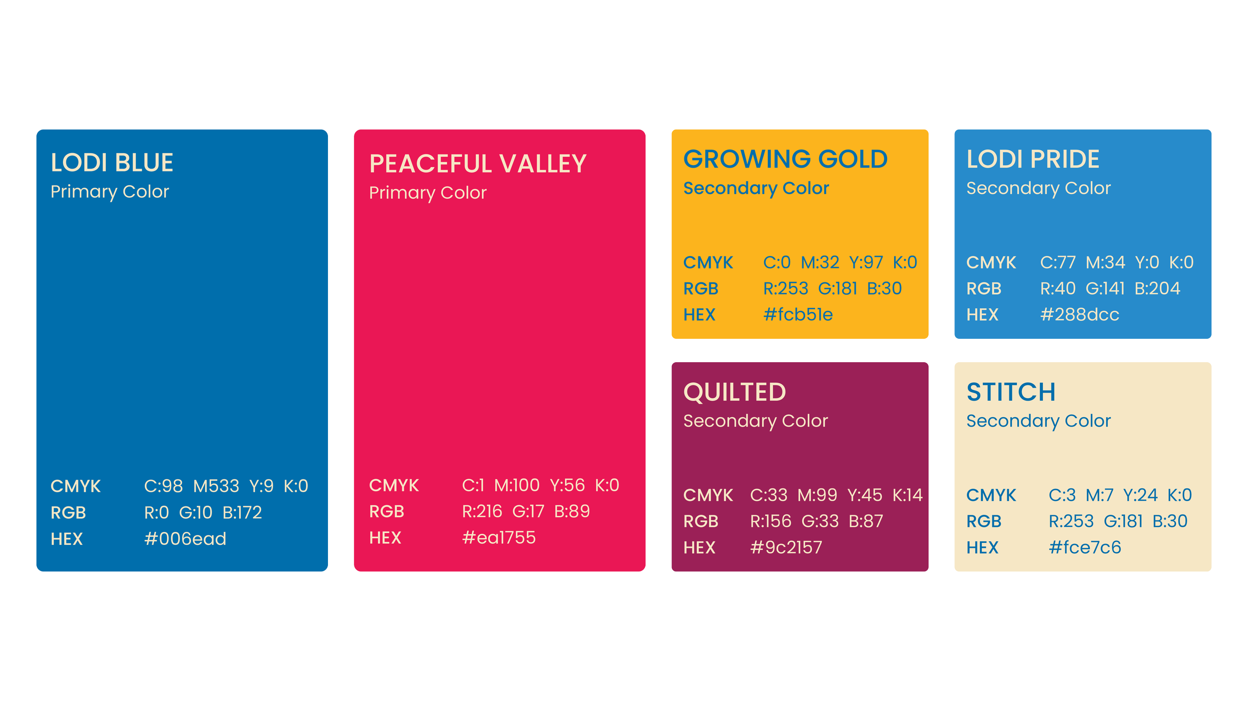
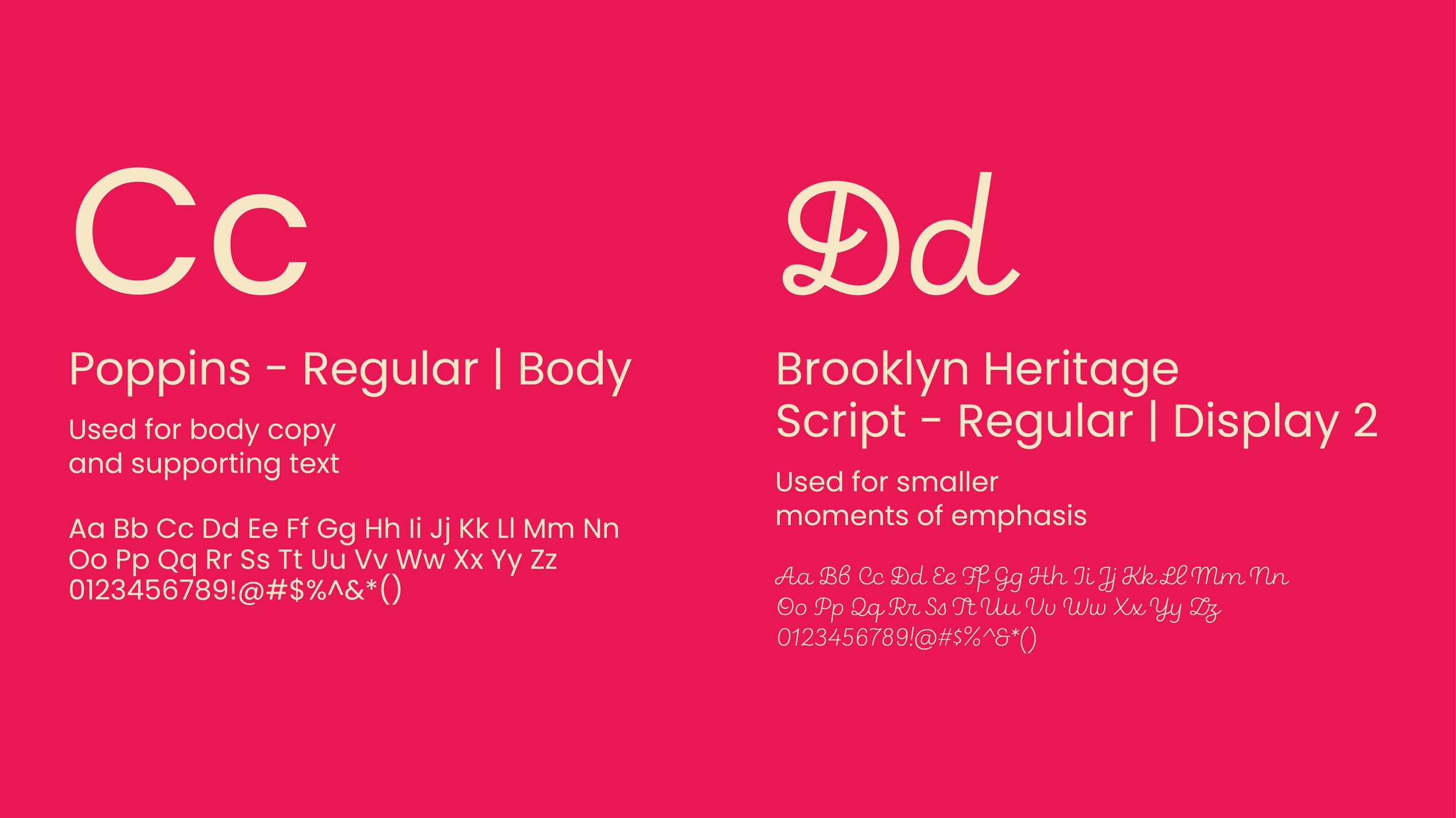
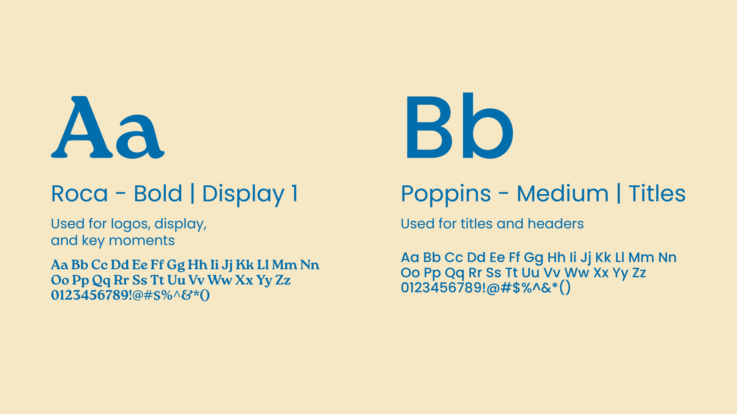
I developed a comprehensive brand guide that gave The Patchwork Enterprise a distinguished visual identity and clear strategic direction. The guide established cohesive design standards, ensuring consistency across every touchpoint the students used to represent their business. Beyond guidelines, I created original illustrations and imagery that students could apply directly to their recipe packaging, transforming products from generic to memorable and reinforcing the patchwork quilt metaphor in a way that felt authentic to their mission.
Outcome
With a cohesive brand identity and professional presence, The Patchwork Enterprise transformed how the community perceived the business. What was once an invisible student project became recognizable and memorable. Customers could identify the enterprise by its visual identity and understand its mission through its distinct voice. The business shifted from unknown to legitimate in the eyes of the surrounding community.
This recognition translated directly to increased sales. With packaging that stood out and a brand story that resonated with customers, The Patchwork Enterprise attracted genuine interest and repeat purchases. Students gained the professional tools and confidence to market their work authentically, proving that strong branding directly impacted the bottom line. The enterprise moved from struggling for visibility to thriving as a community-recognized business.

The Needle
At the heart of the brand system is a needle icon that operates on two levels. Visually, it resembles a compass needle, symbolizing the enterprise's core mission: helping students find their personal and vocational direction. Simultaneously, it echoes the appearance of a patchwork fabric piece, a direct reference to the quilt square metaphor that defines the brand. This dual meaning wasn't coincidental; it was the result of strategic design thinking that weaves together the business's mission and identity into a single, elegant mark. The needle became a powerful visual anchor that communicates both what the enterprise does and who they are, proving that thoughtful design can hold multiple meanings without sacrificing clarity.



Logo
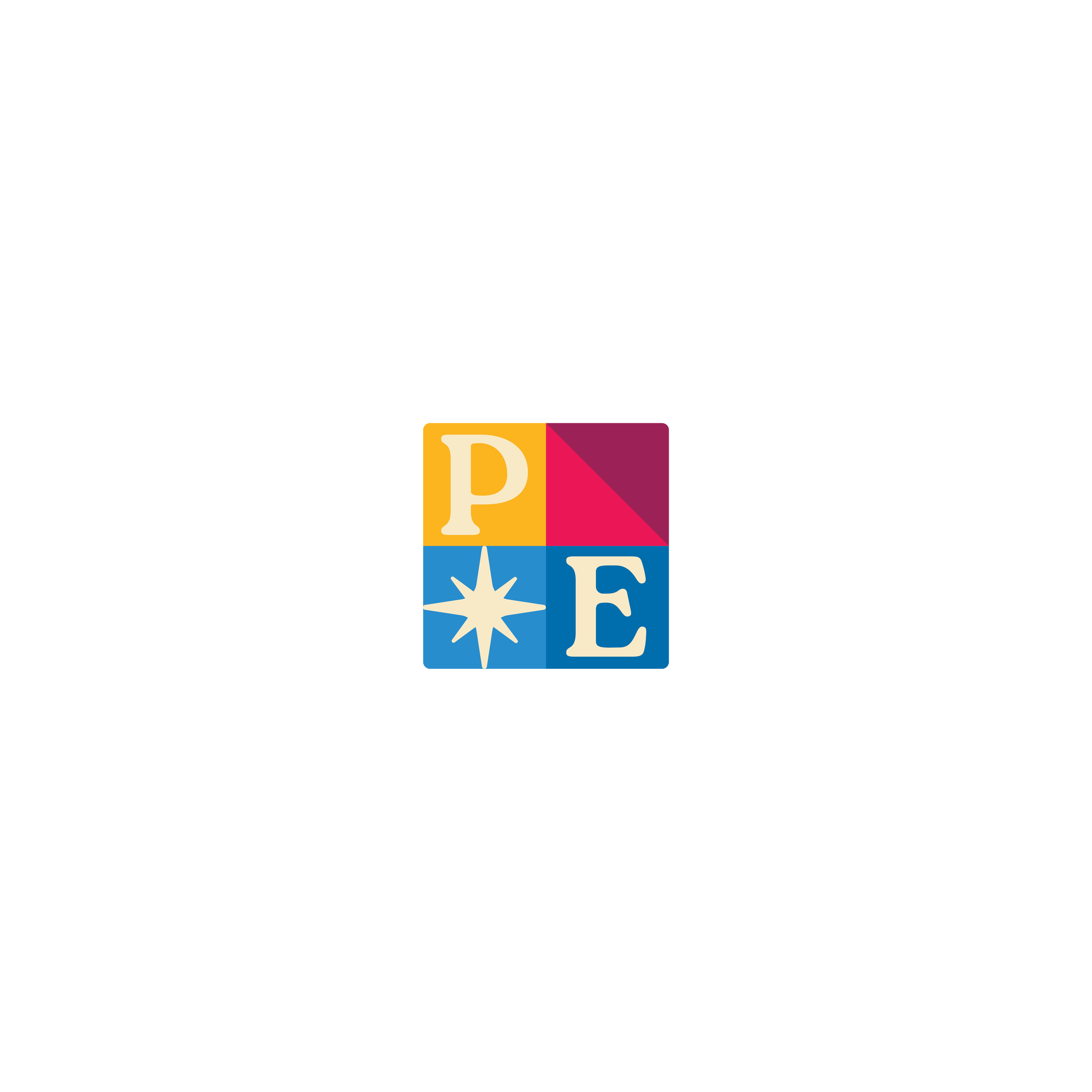
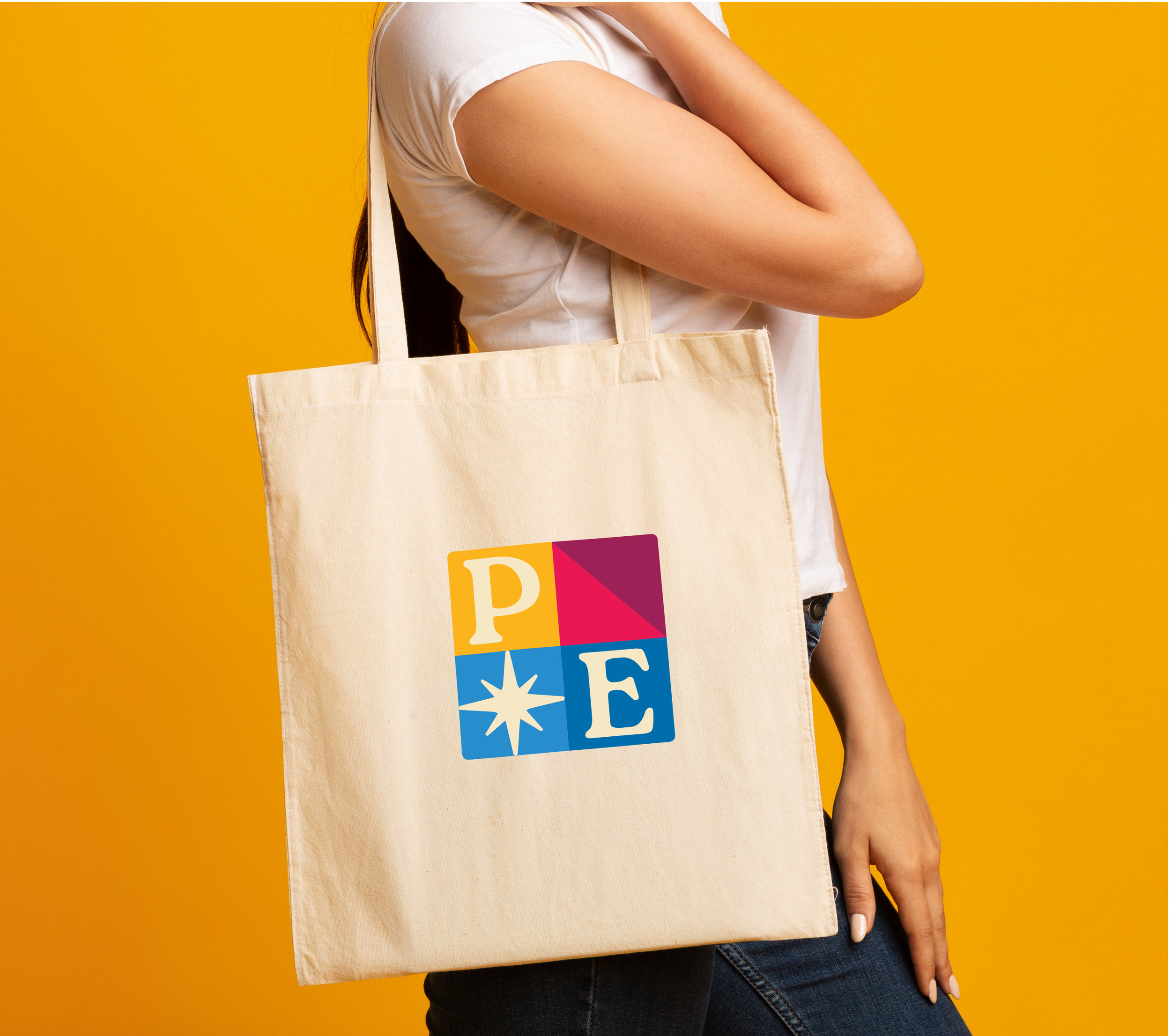
I designed a versatile logo system for The Patchwork Enterprise that works seamlessly across multiple applications and formats. Every iteration thoughtfully incorporates the needle imagery and quilt-inspired elements, ensuring visual cohesion throughout the brand ecosystem. The system was strategically designed to be flexible, whether used on packaging, social media, or physical signage, each version maintains consistency while adapting to different contexts and sizes.
The entire system is defined by a memorable, distinctive aesthetic that captures the vibrancy and energy of the brand. Bold, intentional design choices ensure The Patchwork Enterprise stands out in the community while staying true to its core identity: a dynamic, purposeful business led by creative young adults. More importantly, the design becomes a unifying visual language that brings students, customers, and community supporters together around a shared purpose: Recognizing the enterprise as a place where individual talents weave into something meaningful. The logo system proves that strategic thinking and careful execution can create a brand that's both visually striking and deeply connective.



Icons & Packaging
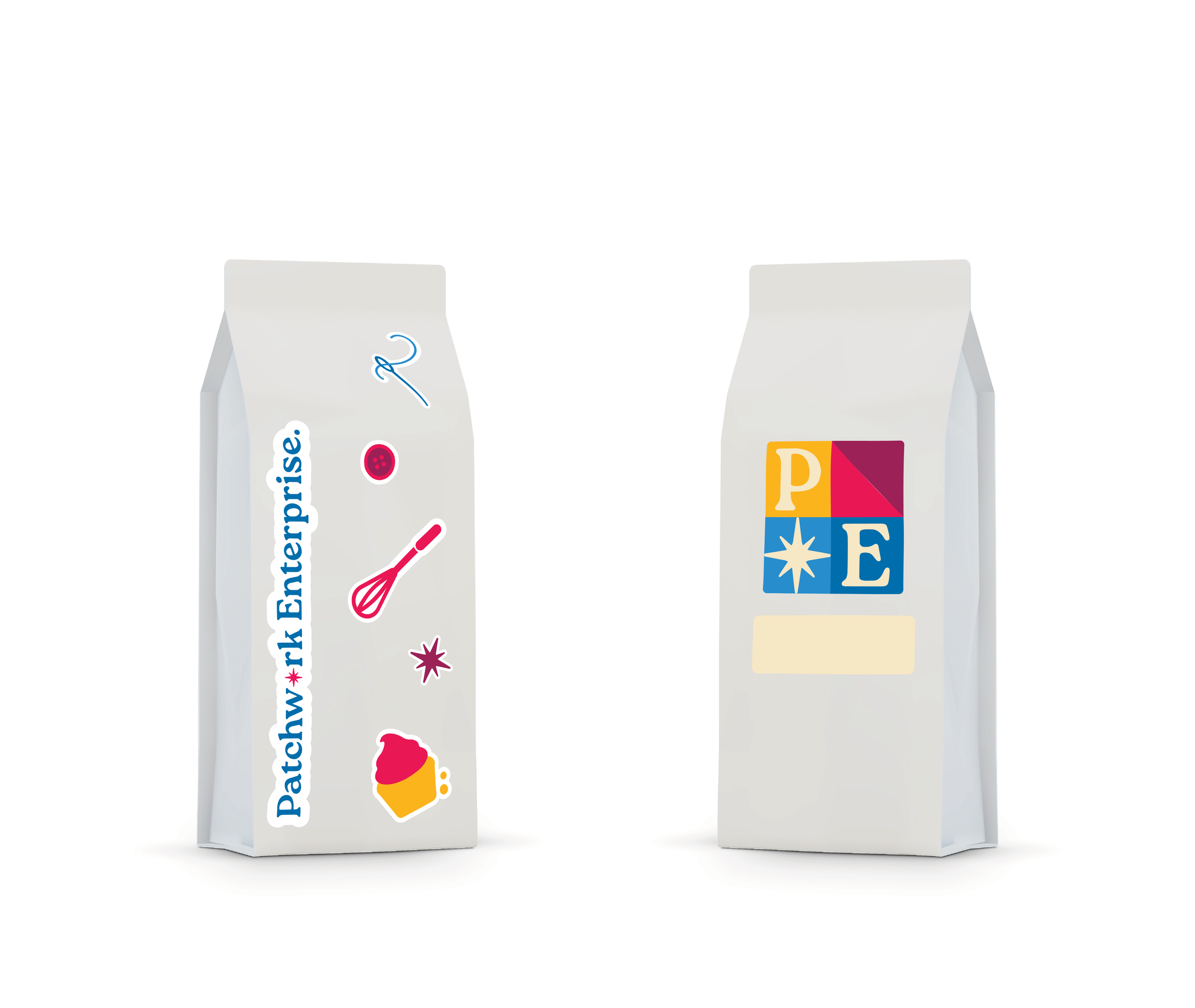
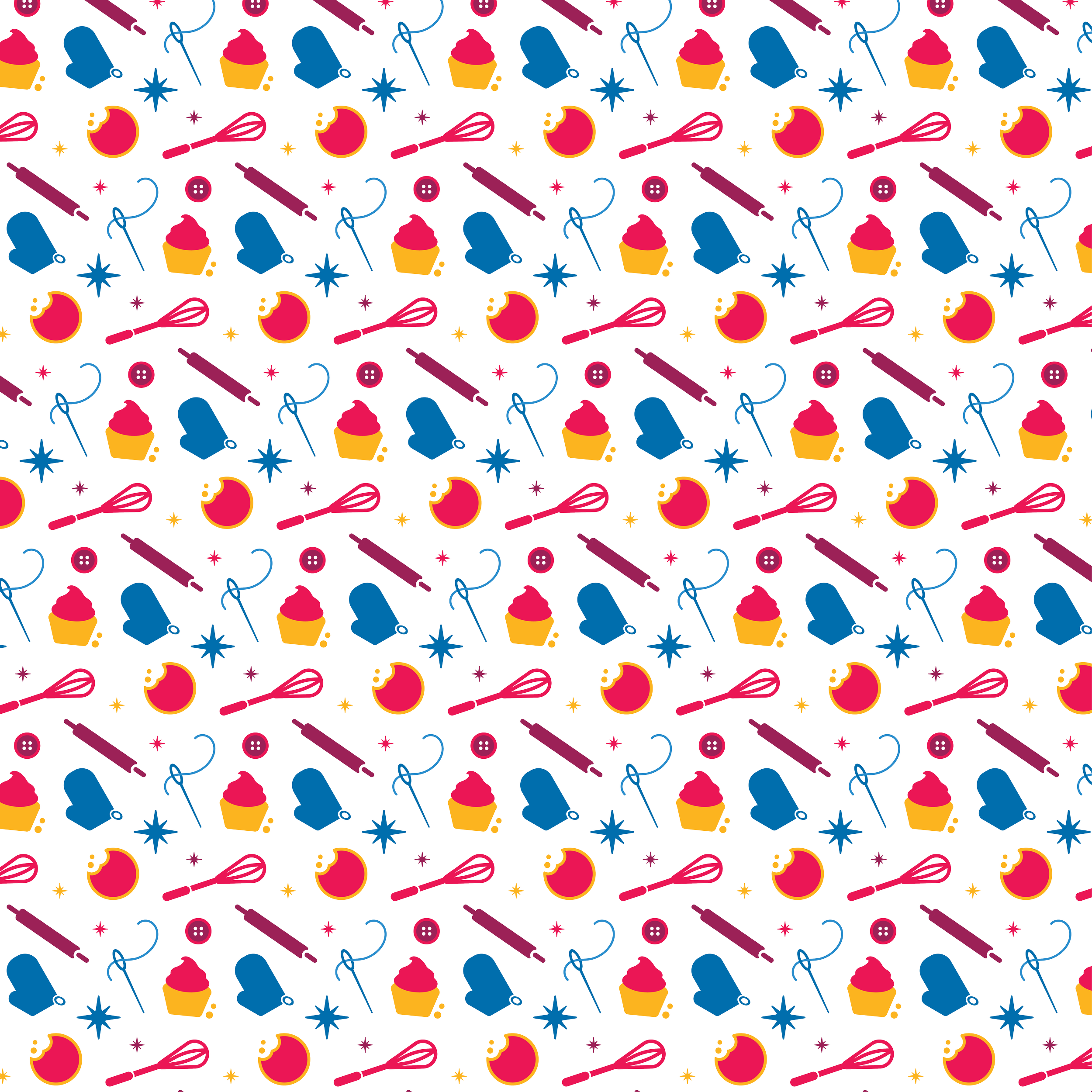
I designed a set of icons that communicate the brand's mission and ethos while remaining simple and practical for students to apply during packaging. Transformed into stickers, the icons give students a hands-on tool to customize products by arranging them in a patchwork style, literally bringing the metaphor to life.
This approach honors the brand's authenticity: each product is unique and student-made, yet visually cohesive. Customers recognize the consistent visual language while appreciating the individual touch each student brings. By putting design tools directly in students' hands, the icon system extends brand voice and memorability without sacrificing their agency. The stickers prove that thoughtful design can empower young adults to participate meaningfully in their own brand-building.