
Enjoy on desktop to learn more about the strategy behind the design.
Project Overview
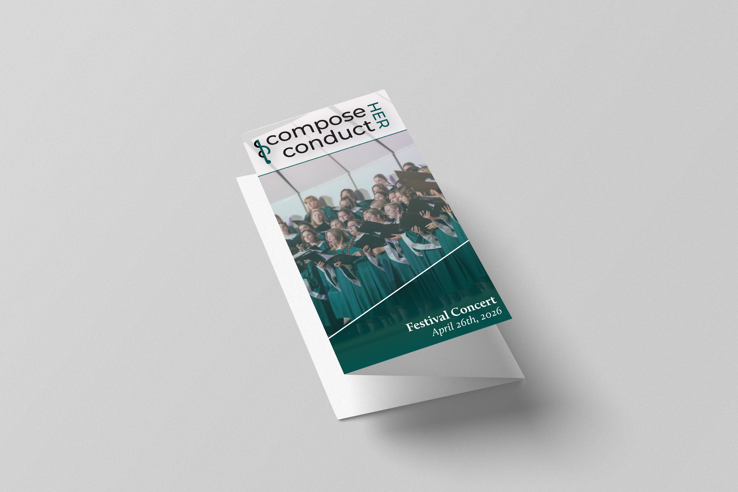
For the Manitou Singers' inaugural "ComposeHER, ConductHER Symposium and Festival" (April 25-26, 2026), I designed a cohesive visual identity celebrating women composers and conductors in classical music. Conducted by Associate Professor Therees Tkach Hibbard, the two-day event aimed to uplift voices historically marginalized in the field, particularly women writing and leading music for soprano and alto voices. I created a logo system and commemorative button that positioned this celebration as authoritative and essential. The design needed to feel both academic.
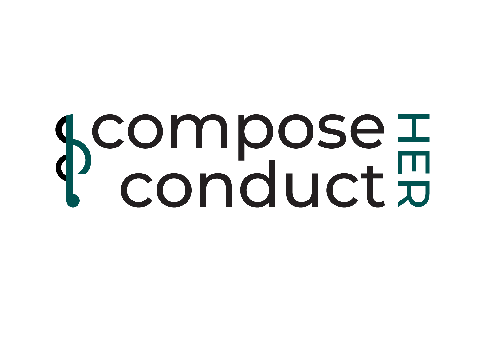


Primary Logo
A primary logo is the foundational visual identity for an event, organization, or brand, designed to be versatile and recognizable across all touch points. It serves as the central visual anchor that unifies promotional materials, signage, digital platforms, and collateral, ensuring consistent brand recognition whether scaled up for large installations or down for small print applications. The primary logo establishes visual authority and cohesion, allowing all other design elements (secondary marks, color systems, typography) to support rather than compete with it.
Logo Mark
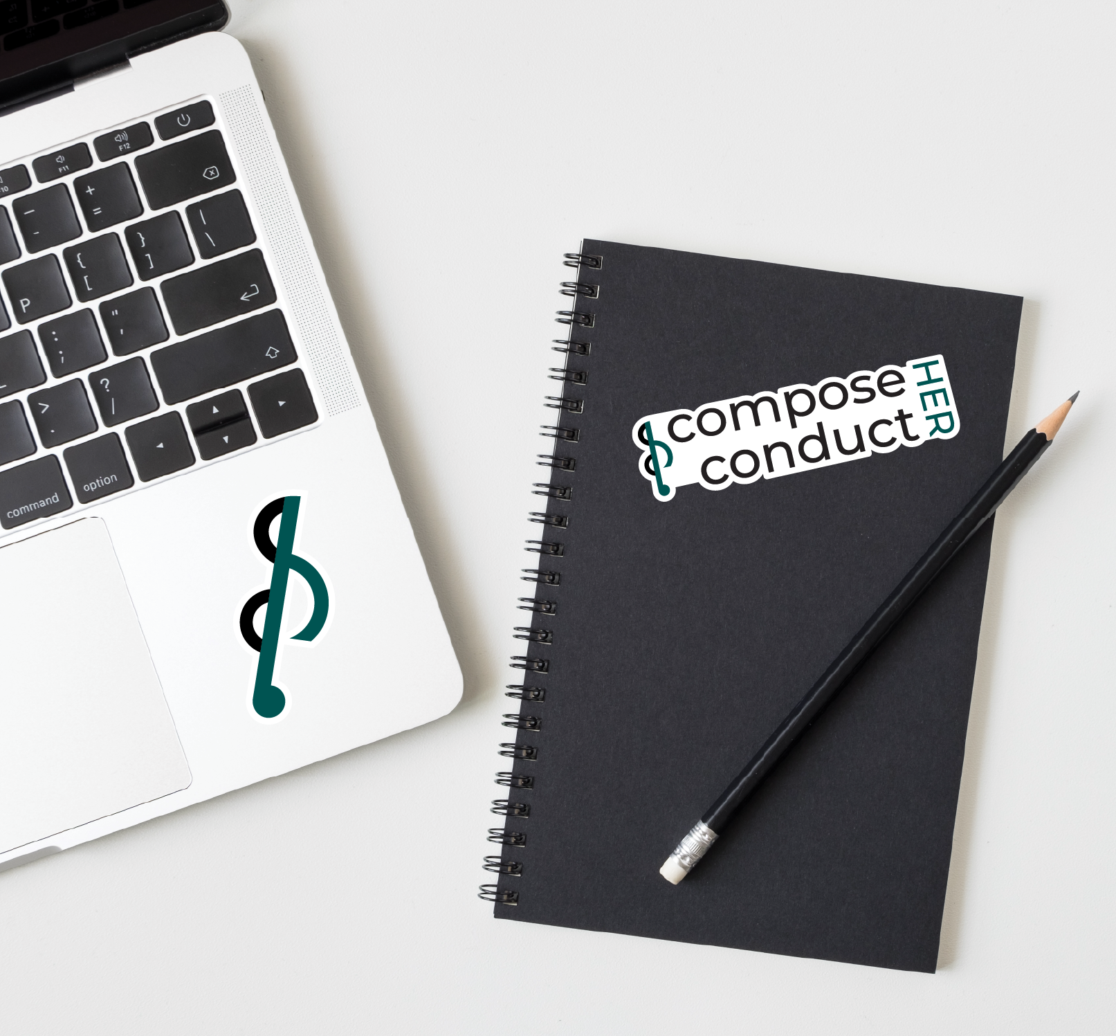
A logo mark (or symbol) is a visual element that encapsulates a brand's or event's core identity in simplified form. Designed to function independently from text, the mark serves as the recognizable visual shorthand, allowing for flexible application across diverse touch points: small formats (buttons, favicons, pins), signage, social media avatars, and collateral where the full logotype might not fit. A strong mark is immediately recognizable on its own, communicates the brand's essence without reliance on accompanying text, and scales seamlessly from large installations to thumbnail sizes.
Outcome
The logo successfully communicated musicality, mission, and professionalism in a single, flexible mark. The treble clef's strength meant it could function independently or support the full title text, giving the logo versatility across applications while maintaining visual clarity and impact. The design proved that restraint and strategic emphasis could achieve more than decorative complexity.
Problem
The mark needed to embody a fundamental reversal: women's capabilities and authority in classical music, a field historically structured to exclude and minimize their voices. Simultaneously, it had to communicate the symposium's name and mission while maintaining musical credibility. A straightforward approach would feel decorative; the design needed intellectual weight.
Outcome
The mark became instantly memorable and distinctly purposeful. It wasn't just visually striking, it was intellectually coherent. The reversal communicated the event's mission of flipping musical hierarchies, while the embedded letterforms proved that women's voices could be woven into the very foundation of musical identity. The mark satisfied all requirements simultaneously: musical, inclusive, memorable, and cohesive.
Solution
I integrated a treble clef as a structural design element rather than decorative addition, making it the visual anchor that carried the musical identity on its own. The clean sans-serif typography remained straightforward and professional, while strategic teal accents on "I" and "HER" centered the event's core message without overcomplicating the composition. This hierarchy meant the mark was recognizable and impactful whether used alone (on buttons, smaller applications) or alongside the full text (signage, programs).
Solution
I inverted the treble clef itself, a literal visual reversal of musical convention, and also embedded the event's core message within the mark through strategic color blocking. The black curved sections and teal vertical stem and curves read as C-H, C-H (Compose Her, Conduct Her) when viewed as letterforms, while functioning as a complete, recognizable musical symbol. The dual meaning worked on two levels: as pure musicality (the inverted treble clef) and as hidden text (the symposium's name), requiring viewers to look closer and discover the layered intentionality.