
Position Overview
& Why Branding Shifts So Frequently
Enjoy on desktop to learn more about the strategy behind the design.
As Media Editor for The Quarry Literary & Fine Arts Magazine, I drove brand, marketing, and social strategy for St. Olaf's longest-running arts publication. I managed the social presence, designed promotional campaigns and event posters, collaborated on artwork selection and visual identity, and partnered with Layout to maintain cohesive storytelling across print and digital.
The Quarry's visual identity shifts bi-annually because our core identity is change. We showcase a rotating roster of student artists and writers whose voices, aesthetics, and perspectives are inherently different and tying ourselves to a single visual language would contradict what we celebrate. With established campus recognition (over 100 years) and a loyal audience, we're freed from the pressure of consistency. Instead, each semester’s look reflects that semester's creative energy and community, allowing us to flourish rather than repeat. The Quarry is defined not by how we look, but by what we publish and whose voices we project.
Spring 2026
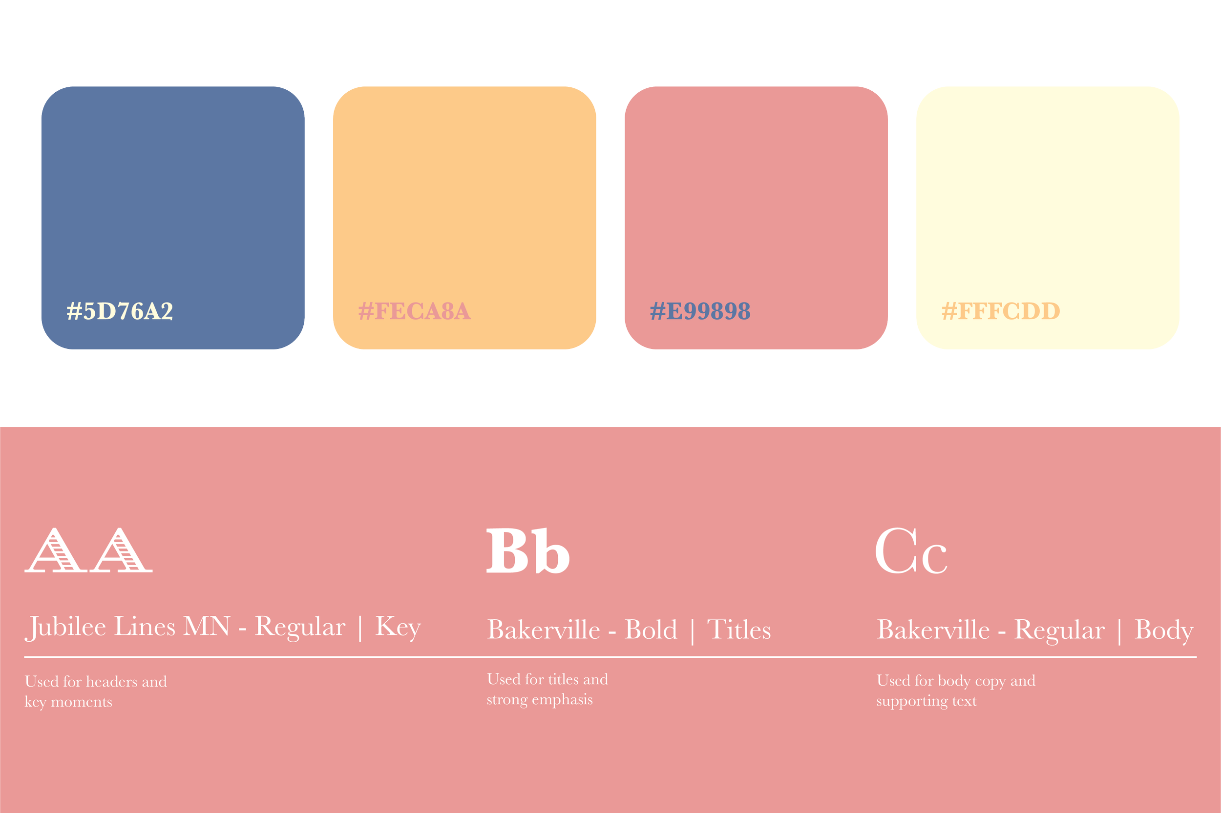
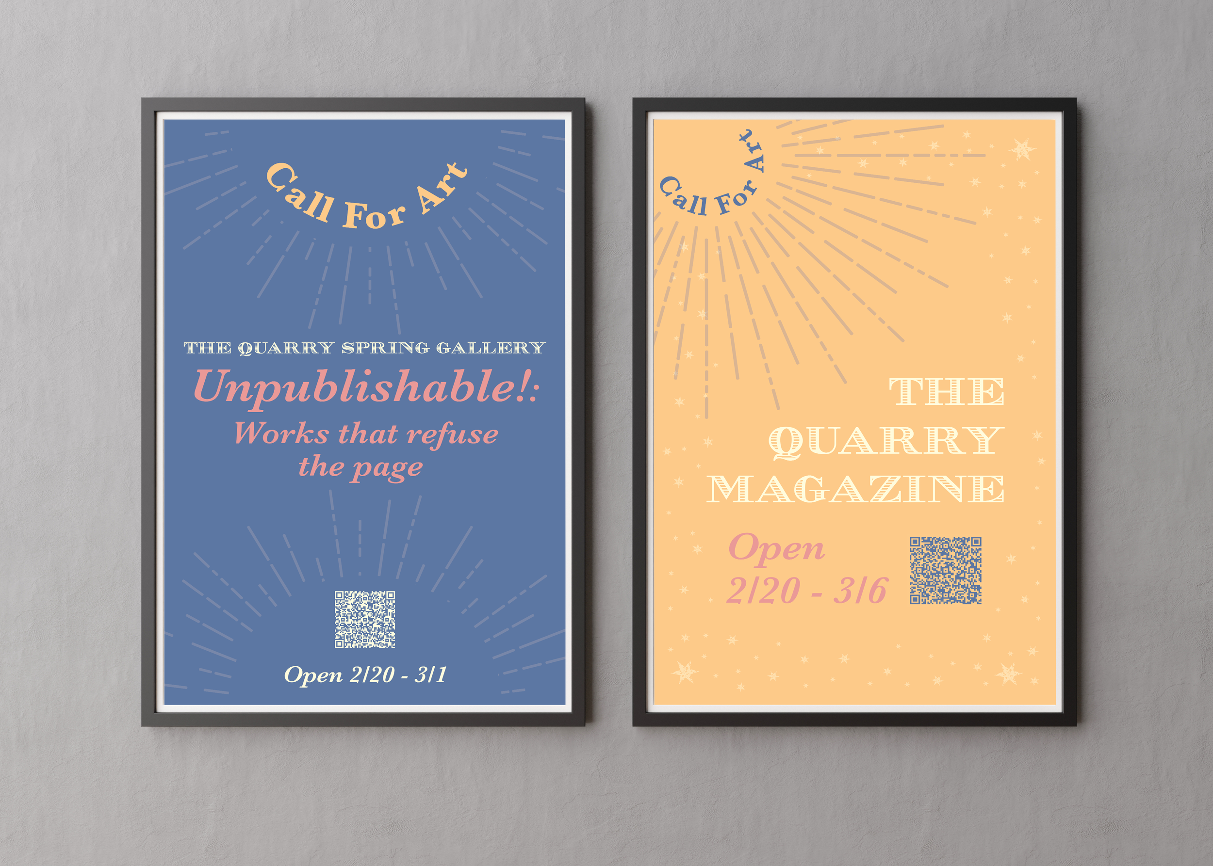
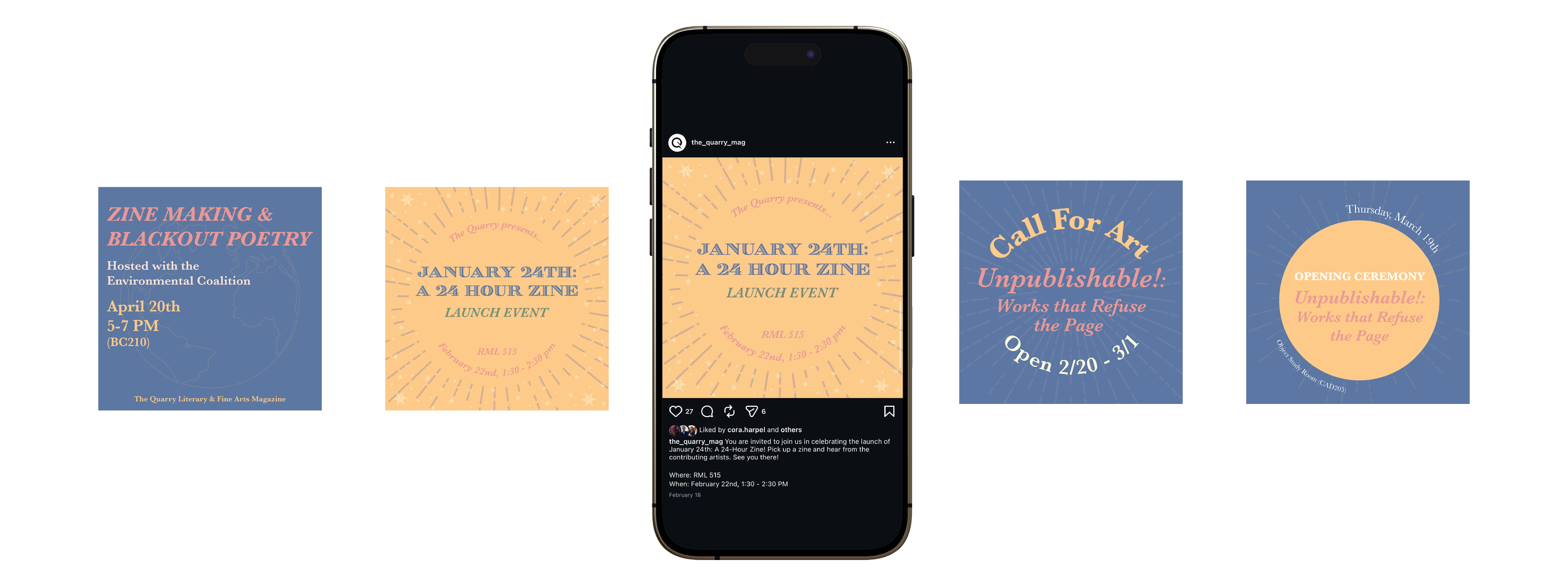
For spring 2026, I art directed "Radiant," developing a sun imagery system anchored by radiating geometric lines. I built a cohesive palette (golden yellow and navy) and paired it with serif typography to evoke renewal and growth. The motif scaled seamlessly across posters, social, and web, translating the theme's warmth and light from print into digital without losing formal elegance.
Problem
The Quarry needed a spring visual identity that honored the fall's moon theme while introducing a sun/growth motif, creating seasonal contrast without visual disconnection. The design also had to reinforce the publication's core brand voice: authenticity and inclusivity, avoiding slick or overly polished aesthetics.
Solution
I developed a radiating geometric system (sun rays) paired with a warm/cool color palette (golden yellow and navy) that echoed the moon theme's celestial language while introducing renewal energy. The serif typography and hand-drawn quality of the rays maintained The Quarry's authentic, literary feel, accessible and inviting rather than exclusive. This cohesive motif scaled across posters, social media, and digital channels, creating a unified visual system.
Outcome
The refreshed visual presence felt contemporary and intentional on campus while staying rooted in The Quarry's established identity. The sun-to-moon continuum deepened the publication's narrative arc across the year, and the inclusive, hand-crafted aesthetic reinforced the brand's values in every touchpoint.
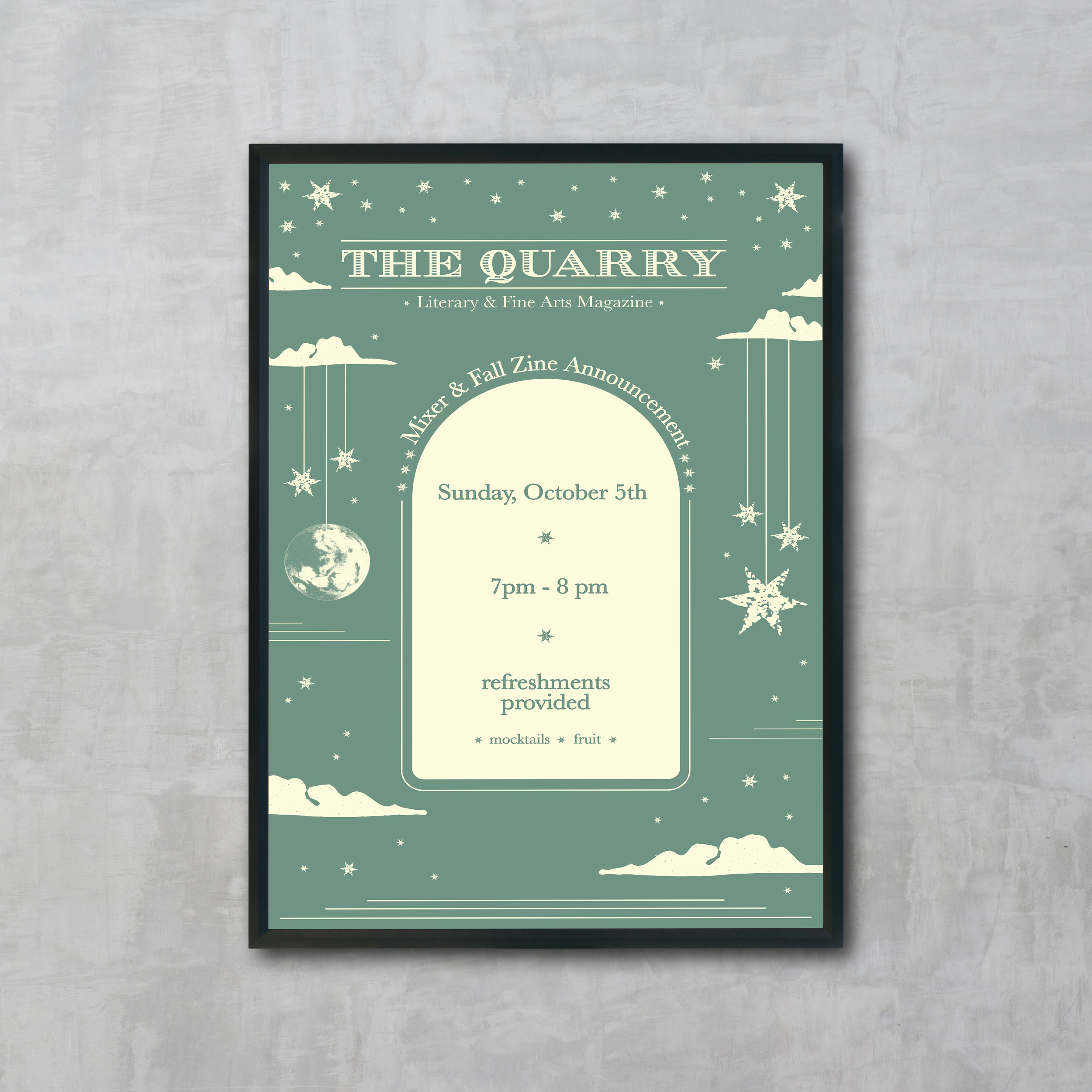
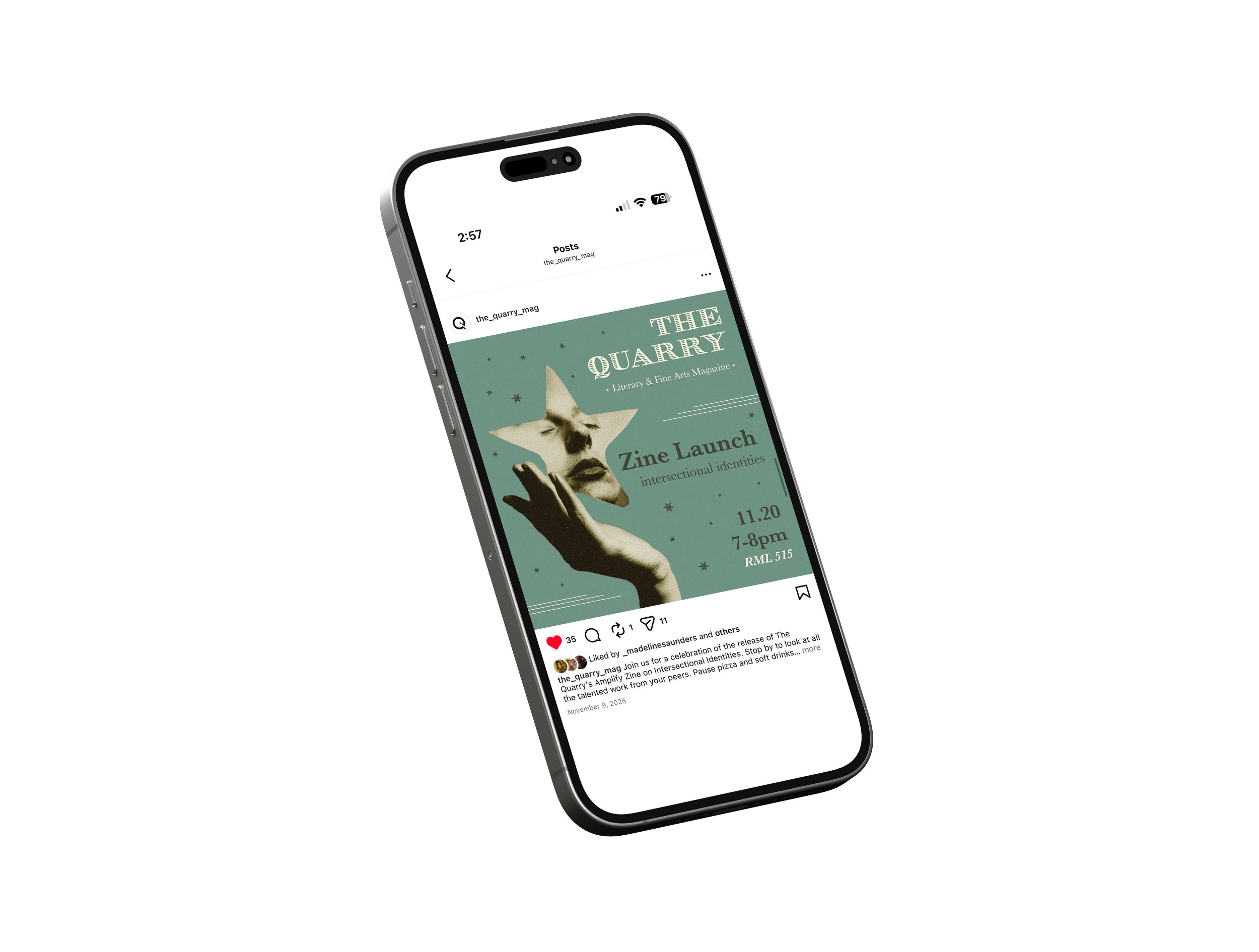
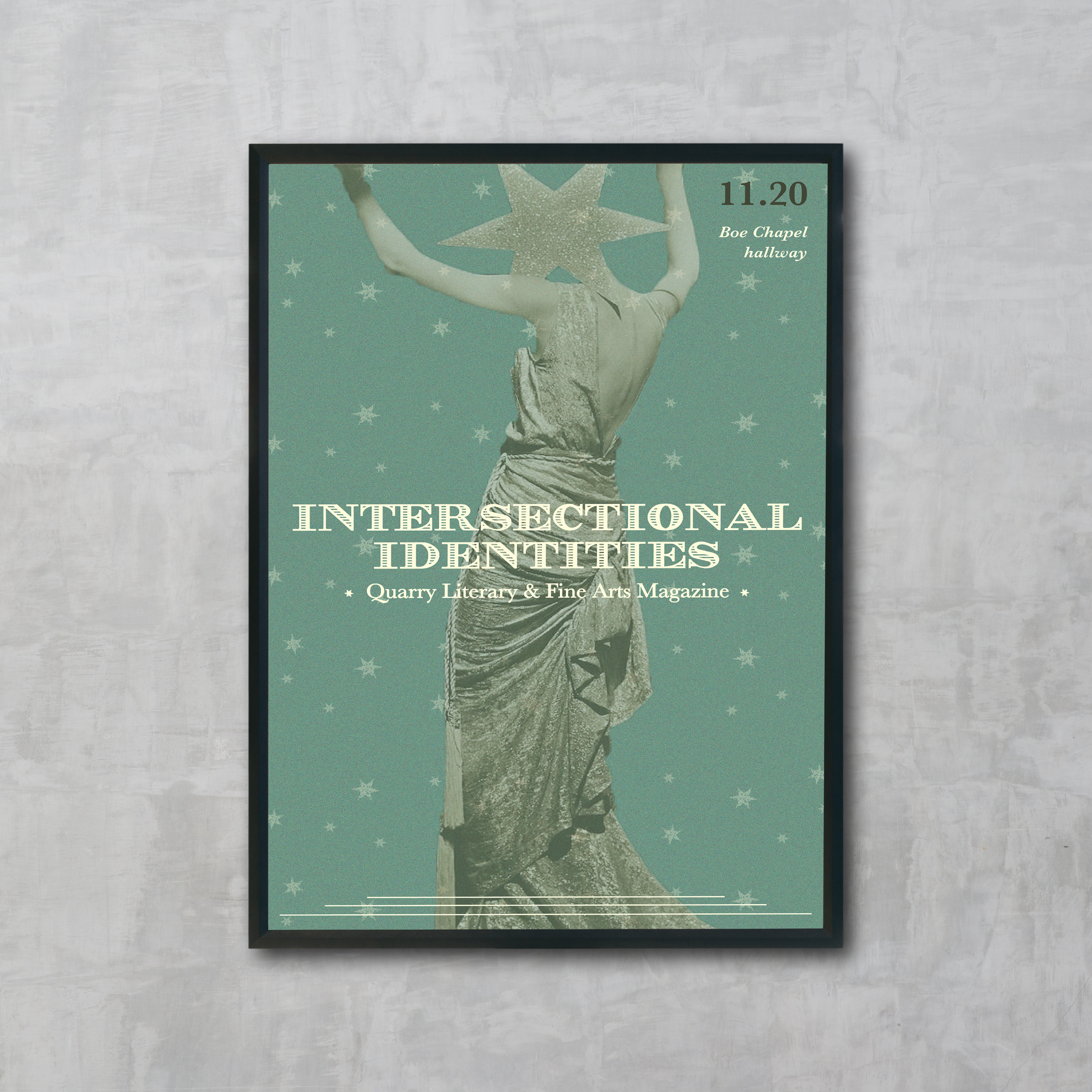
Fall 2025
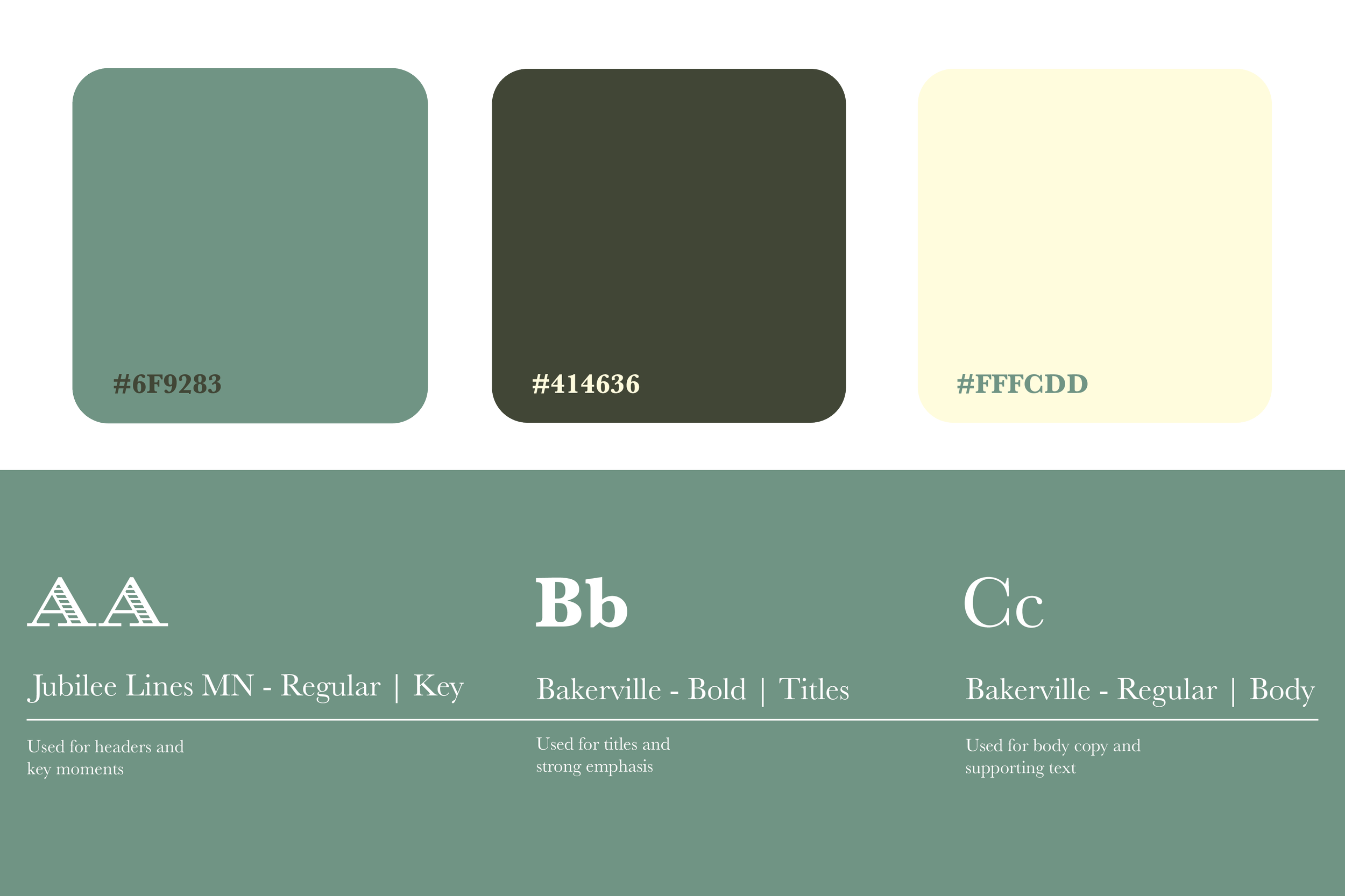
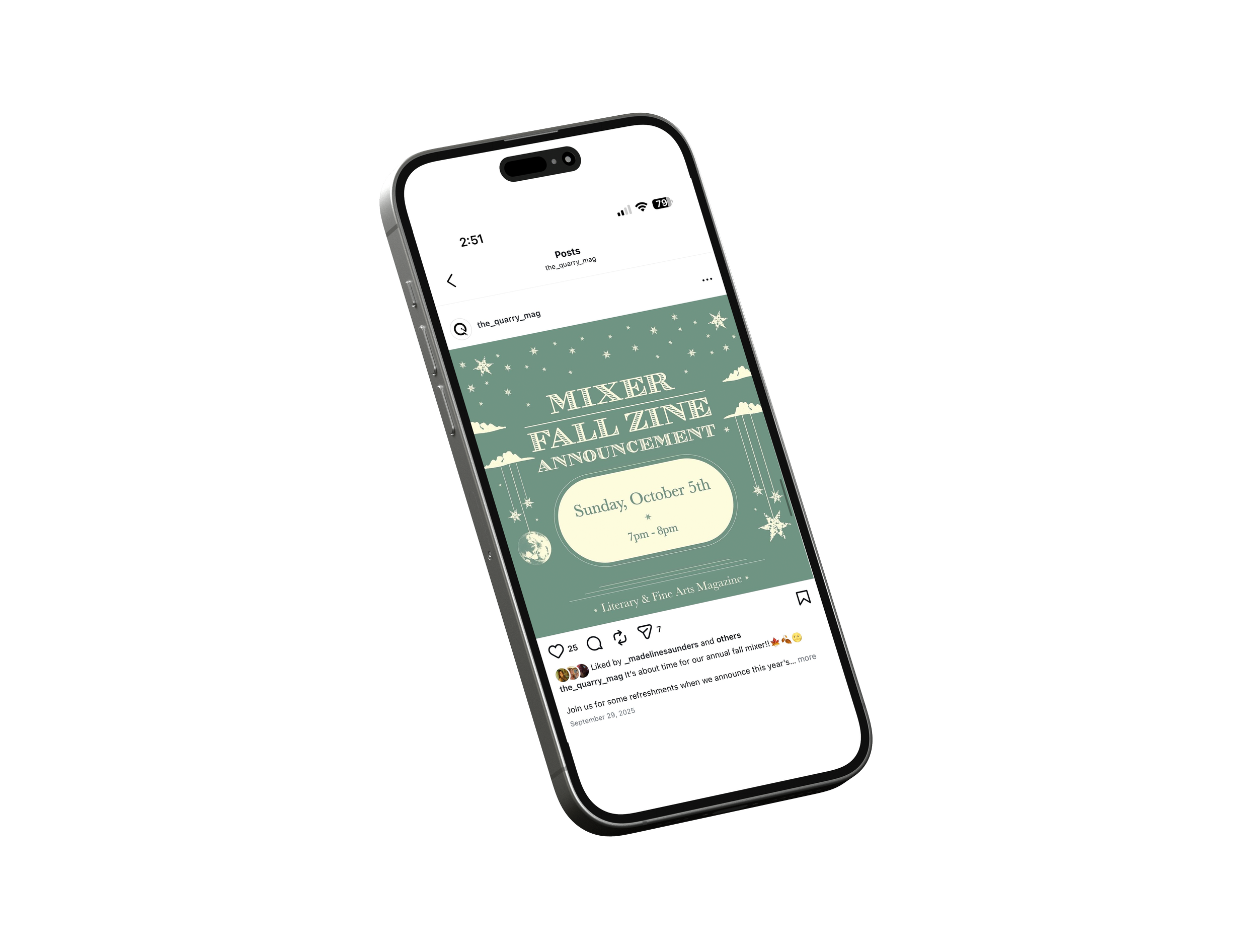
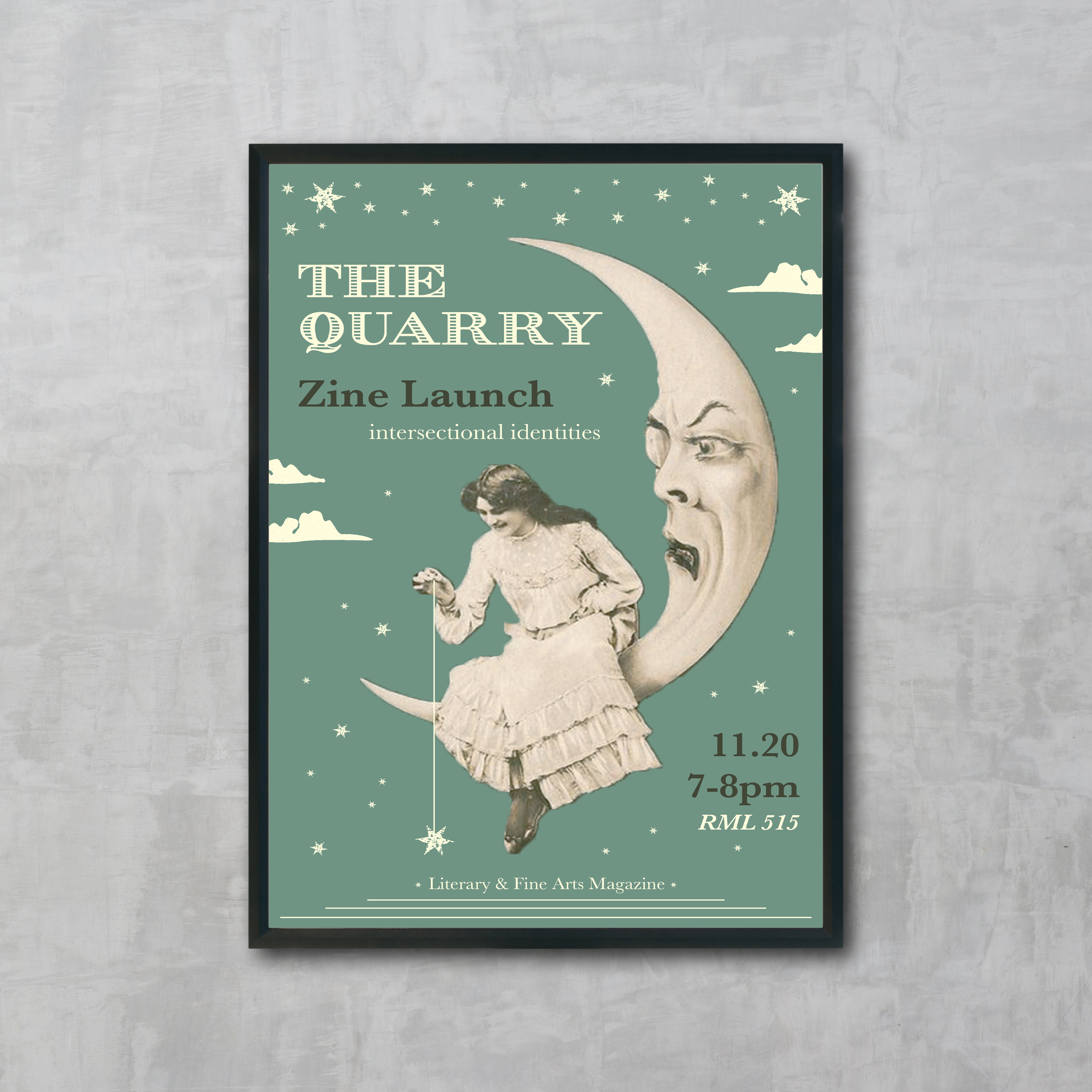
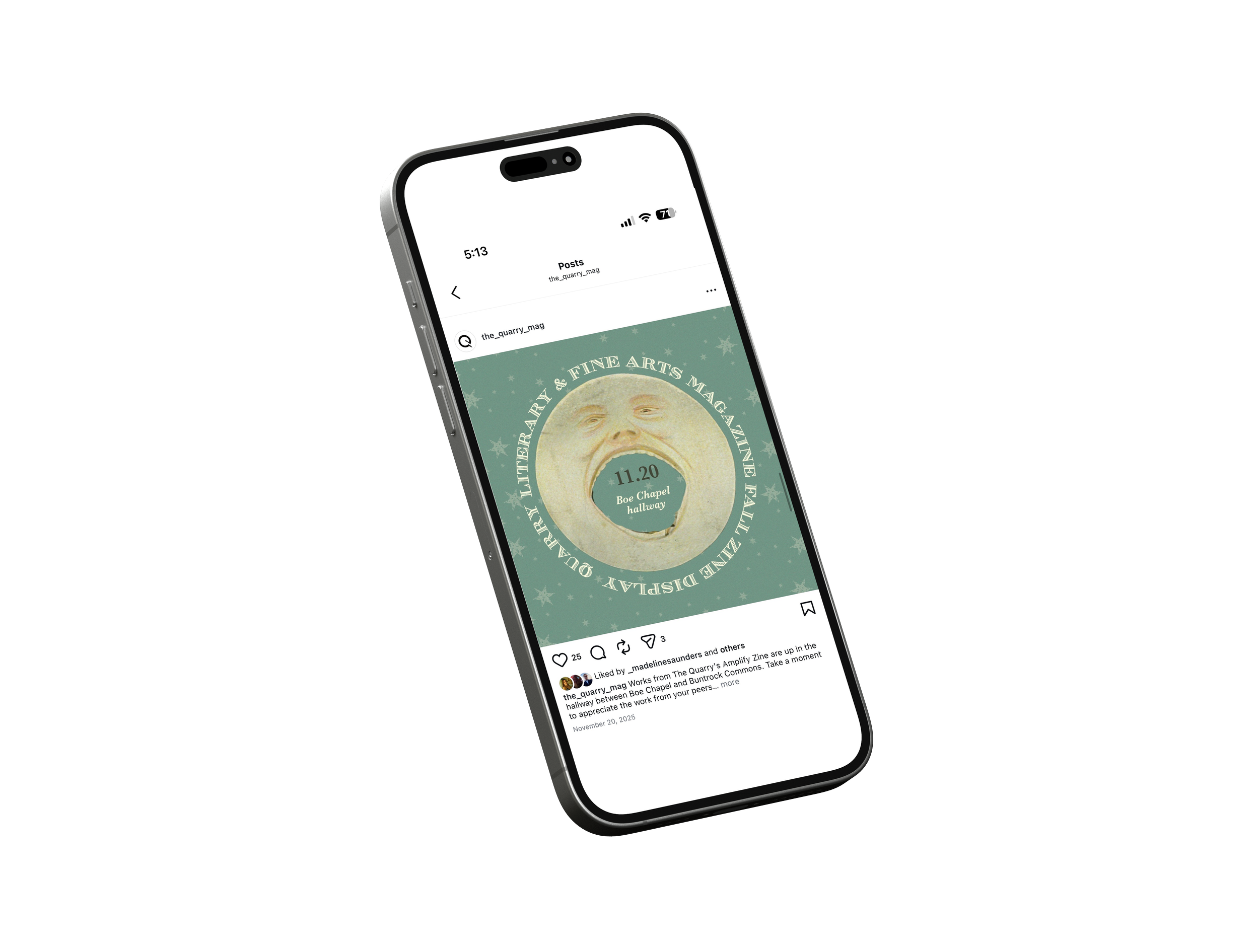
For fall 2025, I created a dreamy, vintage-inspired visual system centered on moon imagery and nocturnal wonder. Using a muted sage and cream palette, I paired ethereal celestial elements like moons, stars, clouds with surreal, hand-drawn illustration and vintage collage aesthetics. The design felt accessible and imaginative rather than dark or melancholic, inviting artists and writers to explore themes of identity, introspection, and transformation.
Problem
We needed a fall 2025 theme that could bridge intentionally into spring 2026's sun and radiance concept, creating a yearlong narrative arc rather than disconnected seasons. Simultaneously, we wanted to honor the vintage, academic sophistication established in fall 2024 without simply repeating it or feeling like we'd abandoned that visual language.
Solution
I developed a moon-and-stars celestial system that naturally complements spring's sun imagery, creating a day/night continuum that feels cosmically inevitable rather than arbitrary. By maintaining the vintage aesthetic alongside the ethereal moon motifs, the design stayed grounded in the academic feel while introducing more whimsy and dreaminess. This allowed the visual identity to evolve without losing its intellectual anchor.
Outcome
Fall 2025 established the first half of a yearlong celestial narrative: moon leading to sun, night into day, introspection into radiance. The vintage aesthetic created visual consistency with fall 2024, validating the bi-annual refresh as intentional evolution rather than constant reinvention. The interconnected themes demonstrated that The Quarry's rotating identities were part of a larger, considered creative vision.
Spring 2025
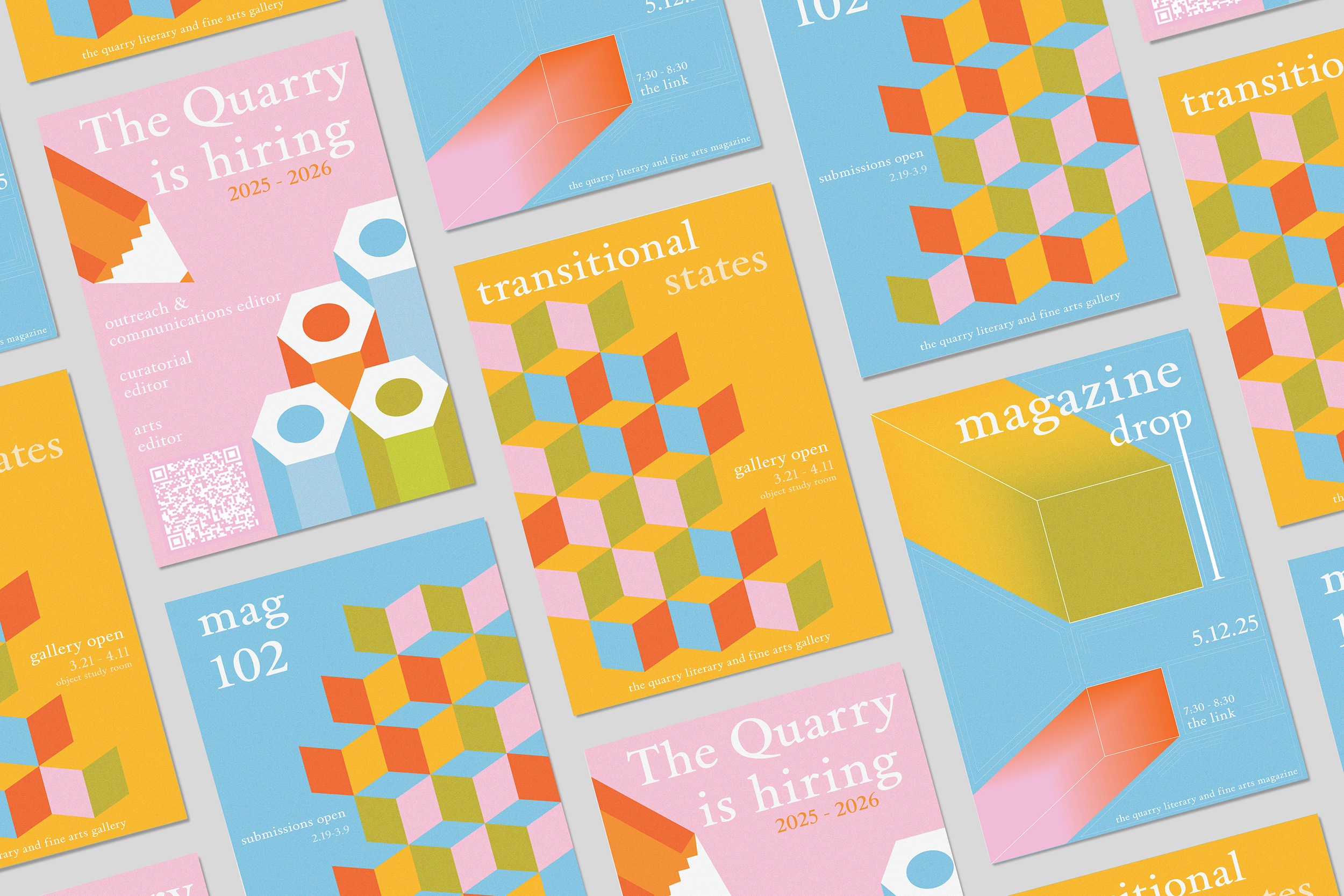
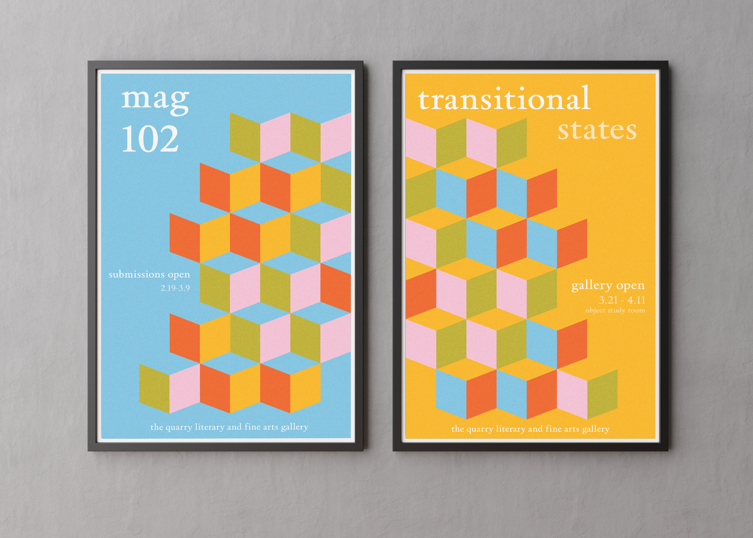
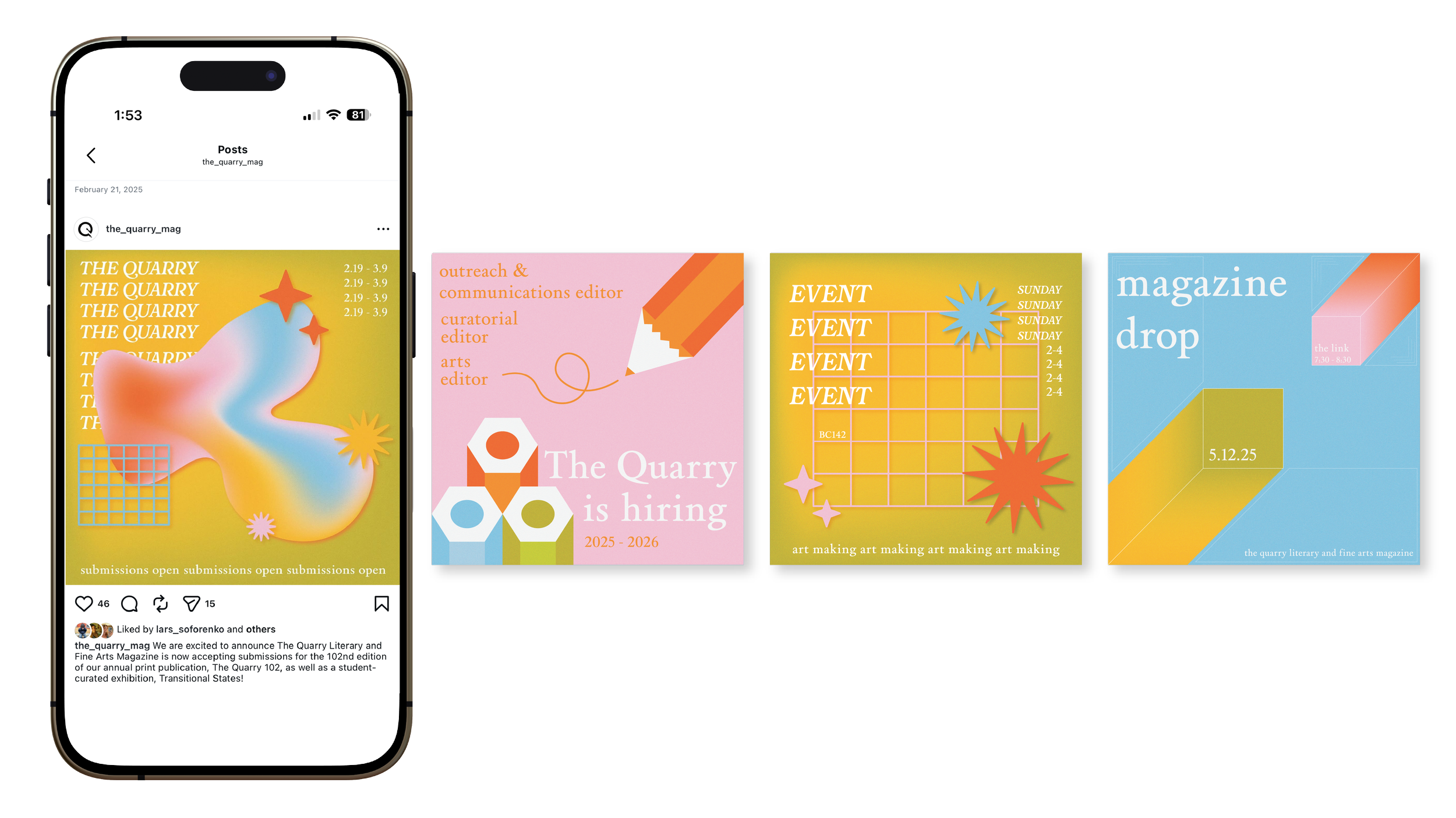
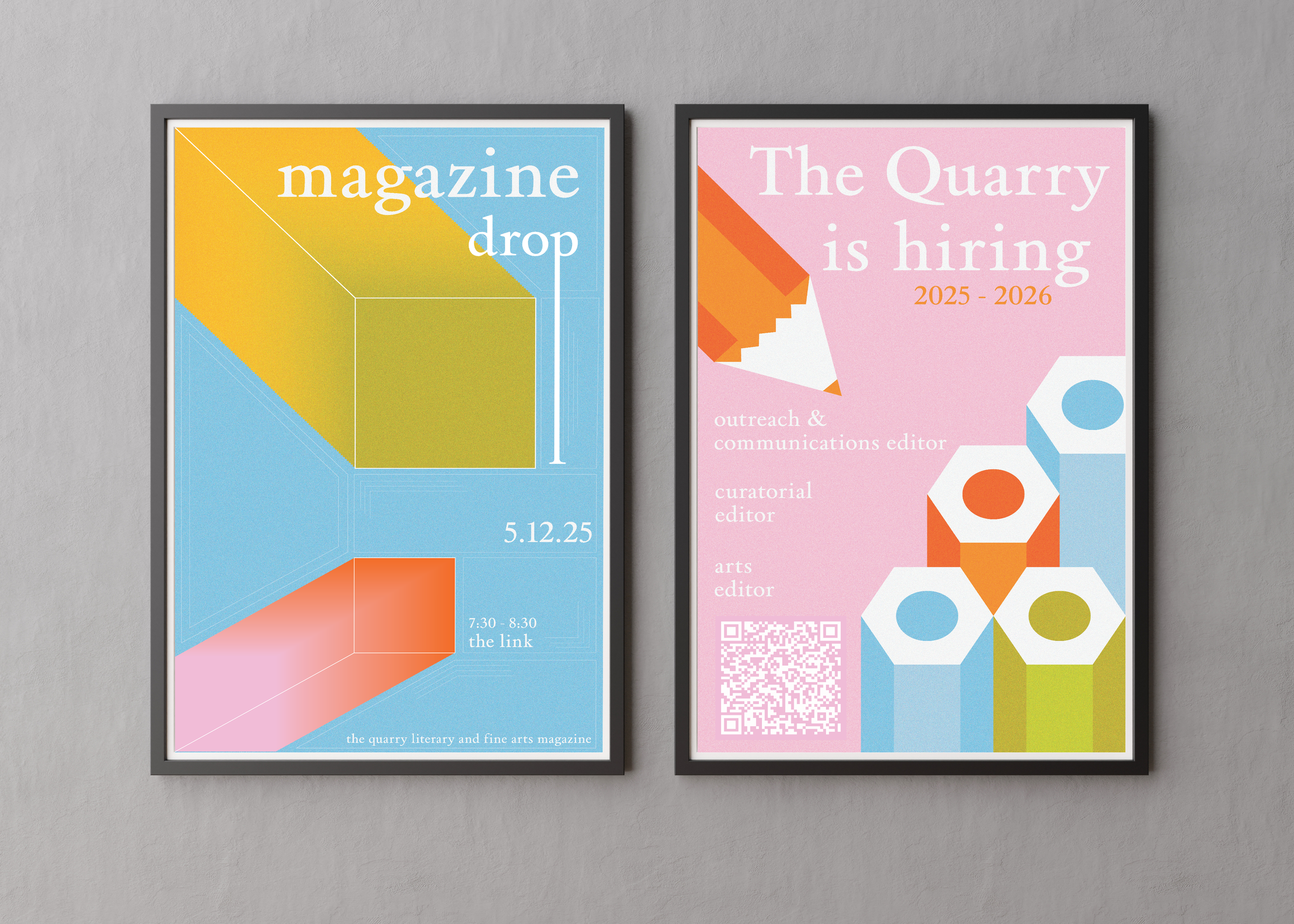
For spring 2025, I developed a bold, expressive visual system anchored by an isometric diamond pattern in a vibrant color palette. The geometric motif created dynamic visual movement while linear details within each shape added sophistication and rhythm. This direction prioritized energy and playfulness over subtlety, signaling The Quarry's creative confidence while the structured geometry maintained editorial credibility. The pattern scaled across posters, social assets, and collateral, creating a distinctive, recognizable visual language that felt contemporary and inviting.
Problem
After the fall's darker aesthetic, The Quarry needed a visual refresh that felt brighter and more expressive, moving beyond restraint into boldness. The challenge was introducing vibrant energy and creative confidence without feeling frivolous or losing editorial credibility.
Solution
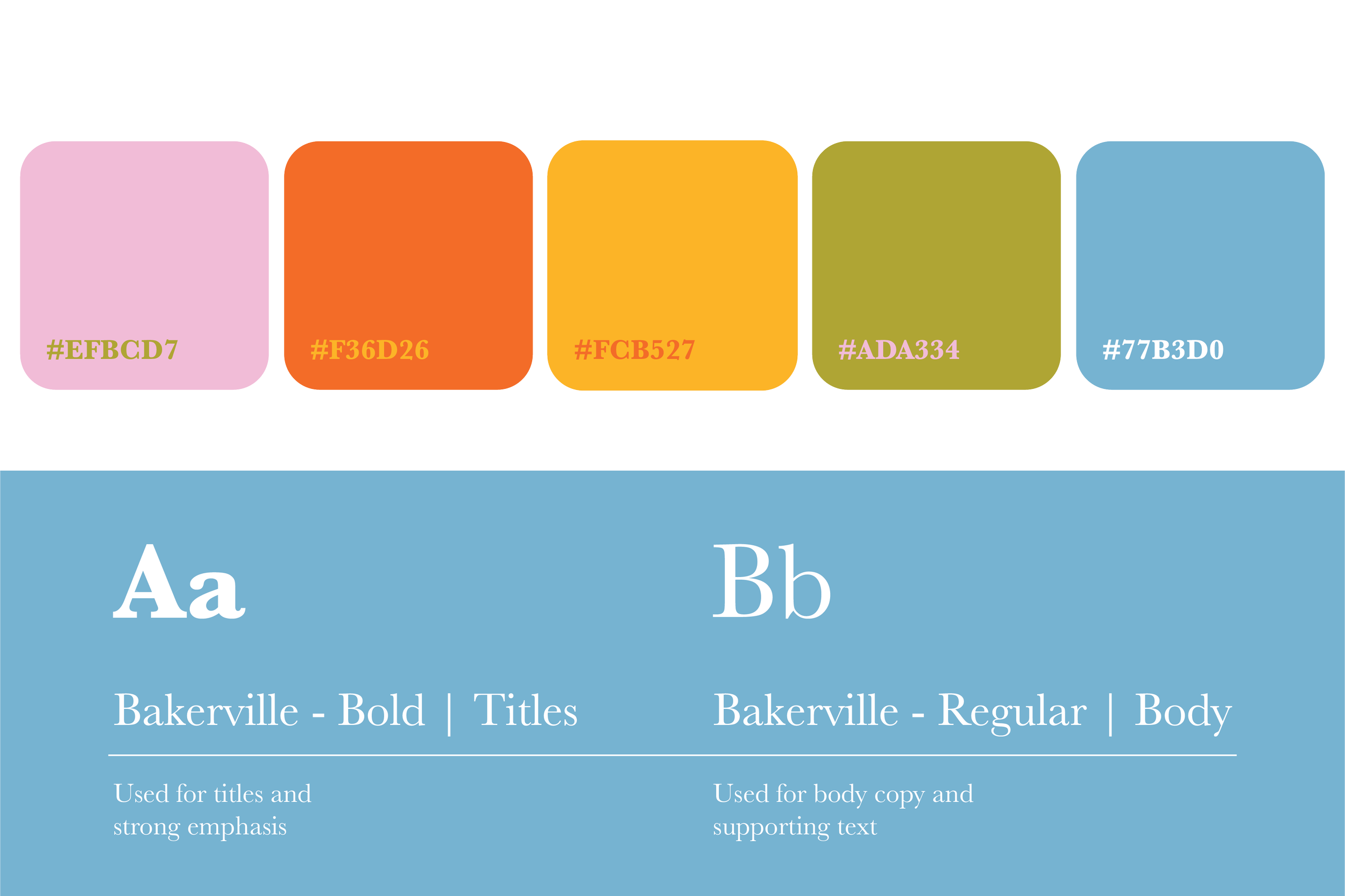
I developed an isometric diamond pattern system using a bold, mixed warm/cool palette (orange, yellow, pink, blue) that signaled optimism and visual play. The geometric structure, precise, repeating, and intentional, grounded the expressiveness, ensuring the brightness felt designed rather than chaotic. Linear details within the shapes added sophistication, creating a visual language that was energetic without sacrificing The Quarry's literary foundation.
Outcome
The refreshed identity successfully shifted the publication's tone from introspective to expansive, signaling creative confidence and playfulness on campus. The bright, geometric system was instantly recognizable and distinctive, scaling seamlessly across posters, social media, and collateral while maintaining The Quarry's editorial integrity.
Fall 2024
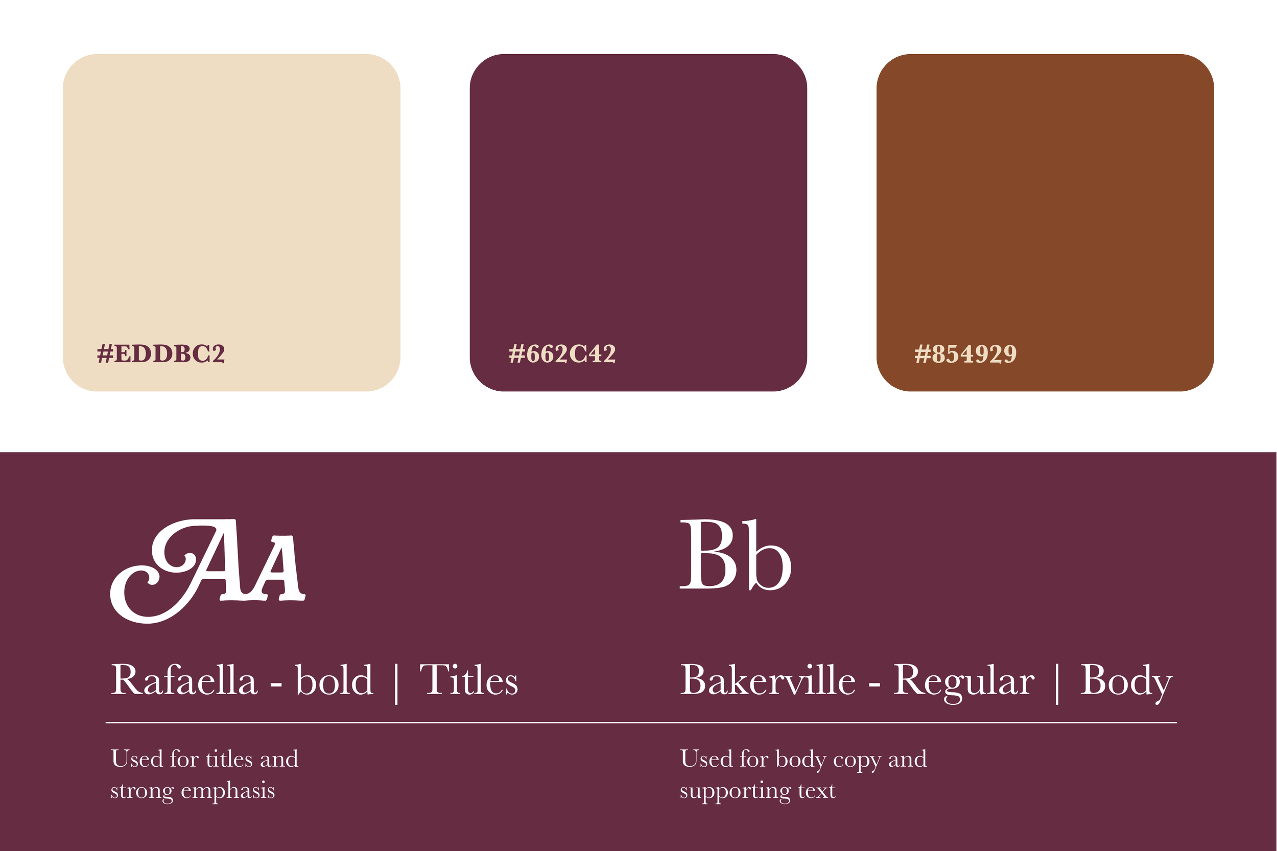
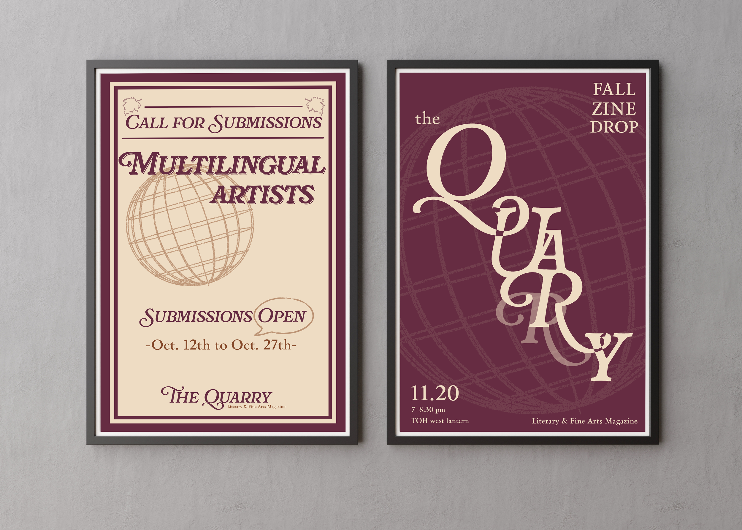
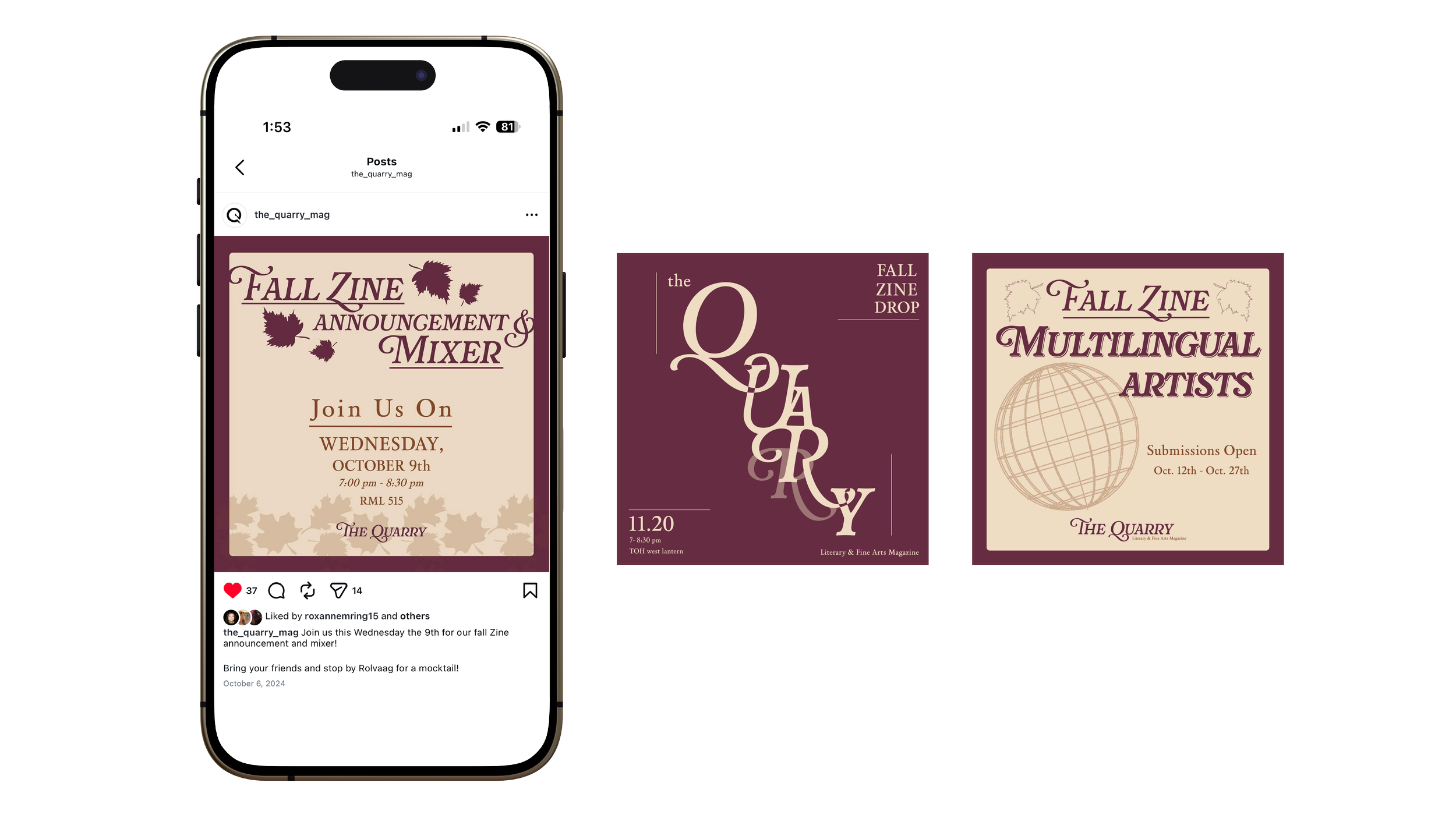
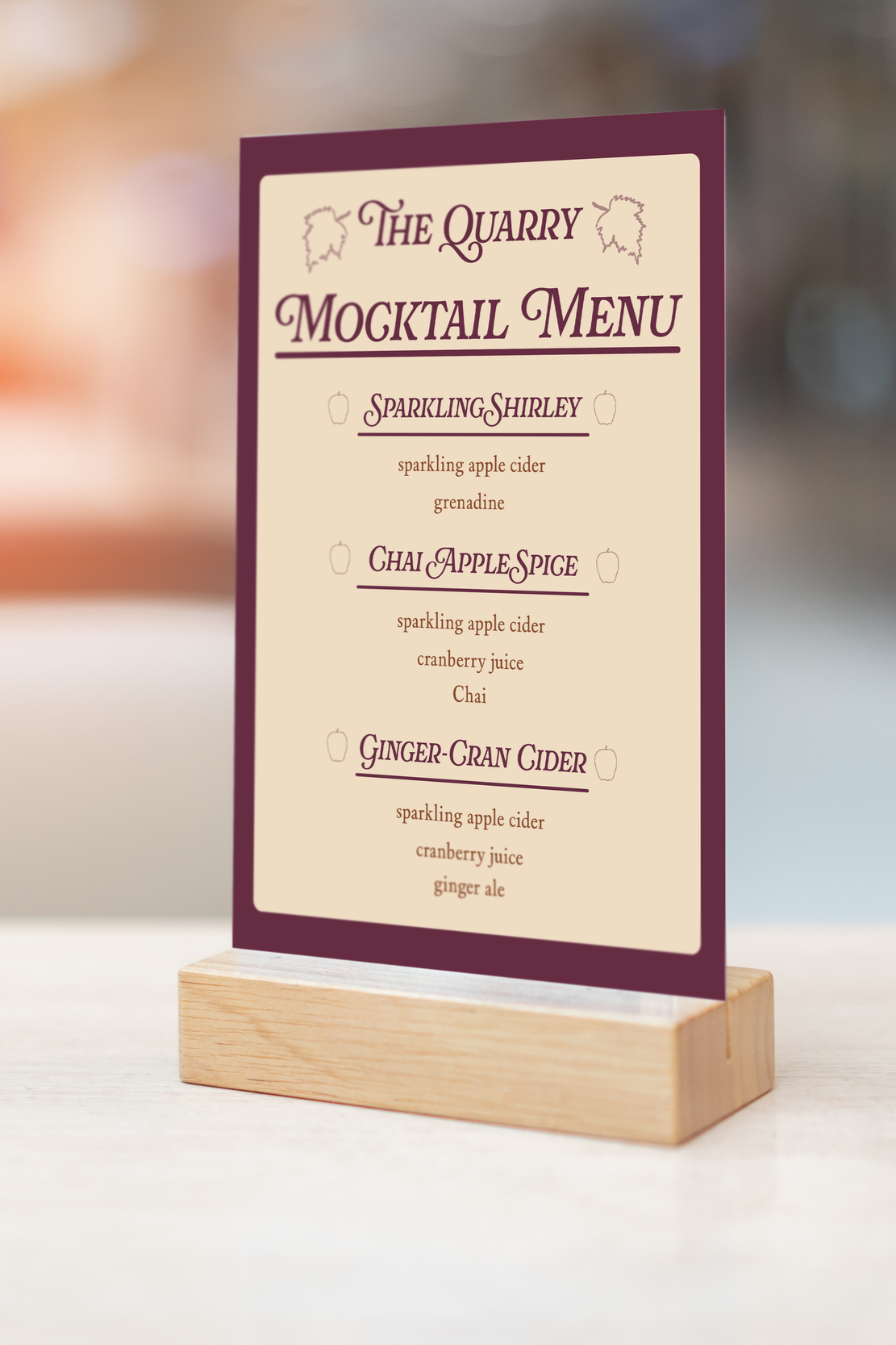
For fall 2024, I developed an elegant, classically informed visual system that celebrated artists and writers from all backgrounds and identities. Using a refined burgundy and cream palette with ornate serif typography, the design evoked literary tradition and intellectual rigor, elevating the work of multilingual and globally diverse creators. Decorative elements like the globe motif signaled openness and cross-cultural dialogue, while restrained, sophisticated layouts created breathing room and dignity for each artist's voice.
Problem
The Quarry had no established design standards or visual framework. As we committed to a new bi-annual refreshing cycle, we needed a strong foundation, something professional and substantial enough to set the tone for future iterations while signaling that this shift was intentional, not arbitrary.
Solution
I developed a classically refined identity anchored in literary tradition: a burgundy and cream palette, elegant serif typography, and restrained, sophisticated layouts. This "academic and renowned" approach positioned The Quarry as a serious platform while remaining open to evolution. The formality gave permission for future seasons to shift, establishing that consistency wasn't the goal; intentionality was. The globe motif and refined ornamentation subtly communicated our commitment to cross-cultural inclusivity without being literal.
Outcome
The fall 2024 identity established a design standard that felt both grounded and flexible, giving The Quarry the credibility to refresh annually without seeming aimless. By starting with something genuinely professional and considered, we created a foundation that validated the entire philosophy of evolving visual identity as a core part of our brand.