
Position Overview
St. Olaf College's Marketing and Communications Office tells the stories of the college community through print, writing, video, photography, and other media. The team collaborates across campus departments to create integrated marketing solutions that strengthen the institution's brand and amplify diverse voices within the St. Olaf community.
I collaborated closely with staff members to develop creative visual solutions that support the college's marketing goals across both digital and print platforms. I am responsible for designing a variety of materials, such as social media graphics, posters, brochures, and presentations, ensuring that all content aligns with the college's brand identity and messaging standards.
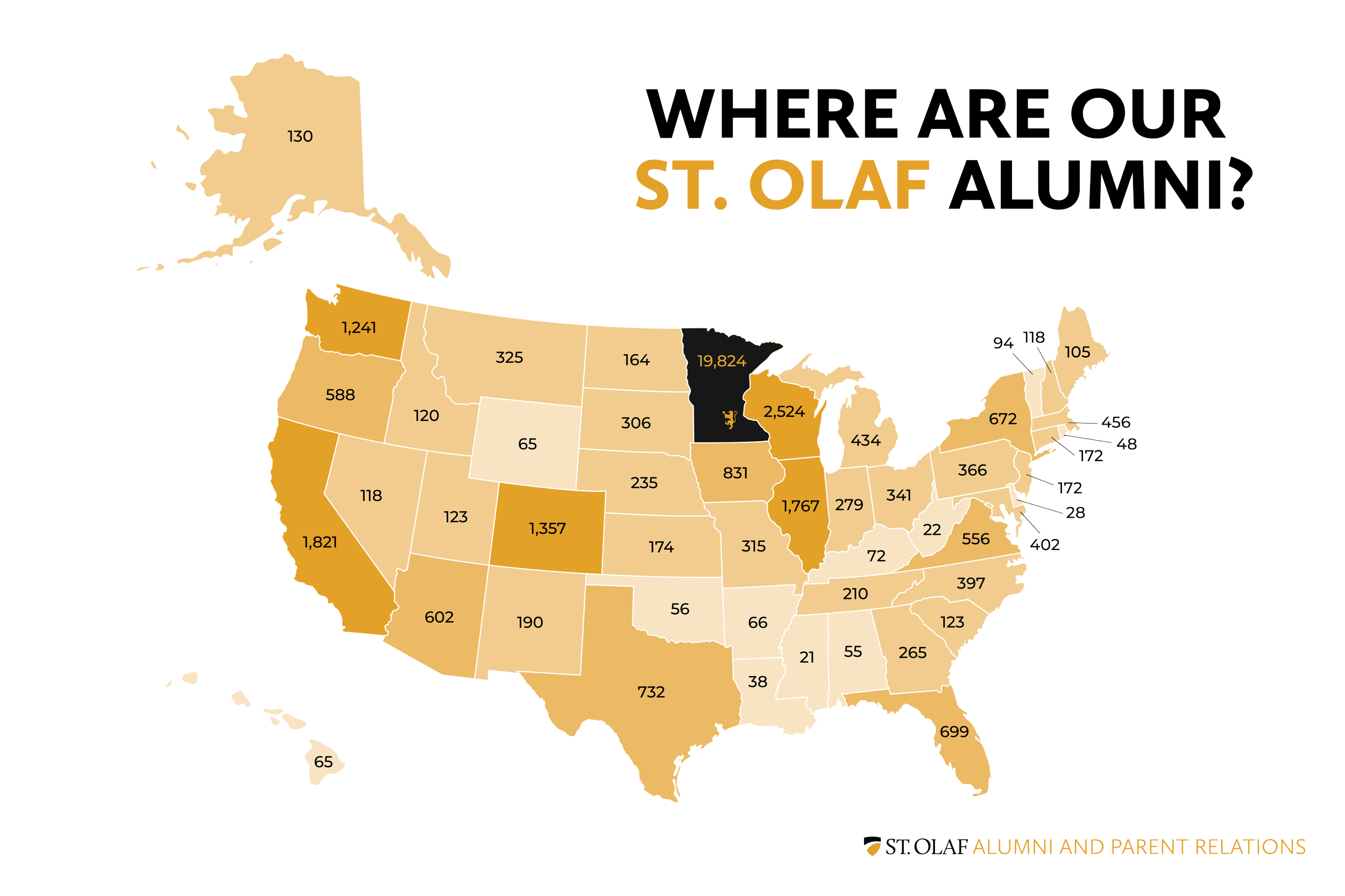
Alumni Infographic
Problem
St. Olaf lacked a visual asset to effectively showcase alumni distribution across the country and illustrate the college's broader community impact and legacy. Without a clear, data-driven representation of where alumni were located and how they'd built the St. Olaf network, the college missed opportunities to highlight institutional reach and inspire donor/student engagement with the broader community.
Solution
I created an infographic that balanced visual sophistication with clear data presentation, mapping alumni locations while telling the story of St. Olaf's community-building over time. The design prioritized both aesthetic impact and information accuracy, ensuring the piece was engaging to view while remaining a reliable, factual resource.
Outcome
The alumni infographic became an essential institutional tool, one that effectively communicated St. Olaf's geographic reach and community strength to multiple audiences. By visualizing alumni impact and distribution, the piece strengthened institutional pride while serving as a practical asset for admissions, advancement, and internal communications while demonstrating the tangible legacy of the college's mission across the country.
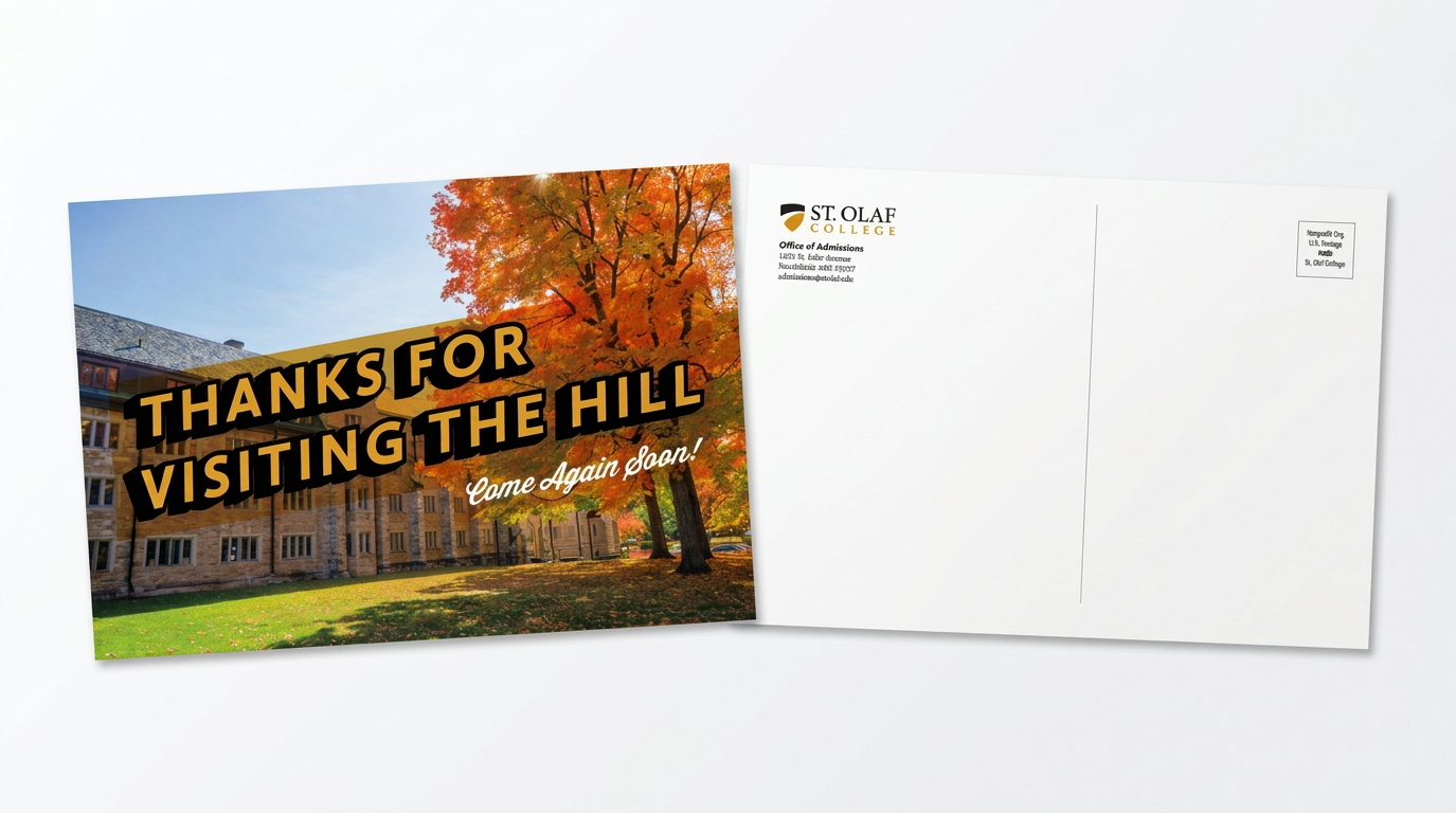
Post Cards
Admissions Post Card
Problem
The existing admissions postcard felt dated and disconnected from St. Olaf's authentic character and culture. It failed to capture the college's genuine ethos or appeal to prospective students' interests, missing an opportunity to make them feel valued and excited about visiting or committing to campus.
Solution
I redesigned the postcard with a more authentic, travel-inspired aesthetic that reflected St. Olaf's true vibe and community spirit. The new direction prioritized genuine imagery and messaging that resonated with student experiences, making the piece feel like a personal invitation rather than institutional promotional material.
Outcome
The refreshed postcard became a meaningful touchpoint that made prospective students feel genuinely appreciated and excited about St. Olaf. By authentically representing campus culture and ethos, the design strengthened emotional connection to the college, encouraging campus visits and enrollment commitments while positioning St. Olaf as a community that valued and understood its students.
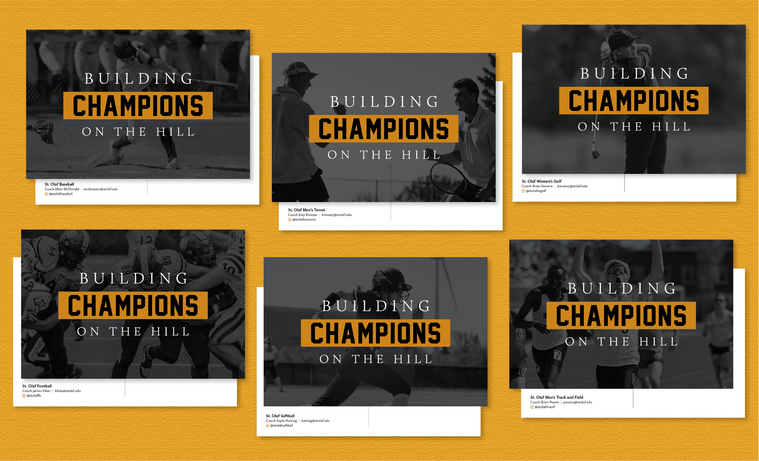
Building Champions Athletics Post Cards
Problem
The original athletic postcards were generic and uninspired, failing to capture the energy, determination, and authentic culture of St. Olaf's athletic programs. Prospective athletes didn't see themselves reflected in the messaging, missing a critical opportunity to attract recruits by showcasing the genuine passion and drive that defines Ole athletics.
Solution
I redesigned the postcard series to feature authentic action shots of each team in motion, emphasizing the strength, determination, and competitive spirit inherent to Ole athletics. Each design prioritized genuine athletic moments over staged imagery, allowing the personality and culture of individual programs to shine through while maintaining cohesive visual branding across all sports.
Outcome
The revitalized postcards became powerful recruitment tools that prospective athletes could genuinely connect with. By authentically representing the intensity and camaraderie of Ole athletics, the designs sparked real interest and pride among recruits, transforming the postcards from bland promotional materials into windows into the athlete experience at St. Olaf.
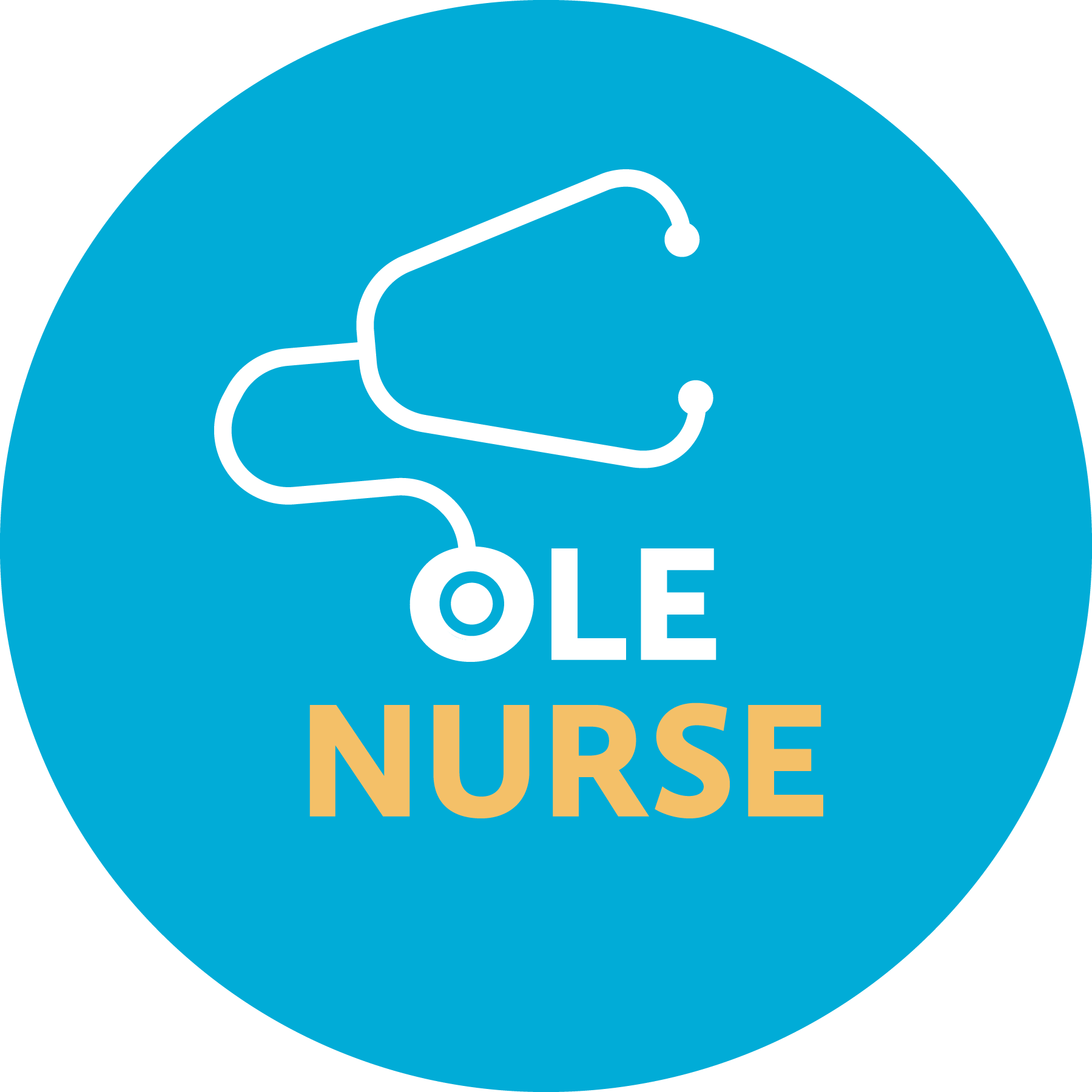
Nursing Reunion Logo Button
Problem
St. Olaf needed a commemorative logo for nursing alumni reunion buttons that would translate effectively at small scale while celebrating the nursing program and maintaining brand consistency.
Solution
I developed a wearable mark that distilled nursing symbolism into clean, geometric forms. The design prioritized scalability and visual clarity while adhering to St. Olaf's aesthetic standards, ensuring the logo worked seamlessly across button reproduction without sacrificing detail or meaning.
Outcome
The final mark became a refined, memorable icon that connects alumni while celebrating program heritage. Optimized for both wearable and digital applications, it successfully balanced professional imagery with the college's clean visual identity.

Class of 2028 Pins
Problem
Major declaration day at St. Olaf lacked engagement. Students participated in the event without feeling a strong sense of community or celebration around their class accomplishments. There was no meaningful tangible way to commemorate the moment or connect the class of 2028 to the college's values and identity.
Solution
I developed three enamel pin designs that merged St. Olaf values and imagery with visual styles that resonated with students. Each iteration balanced functional wearability with authentic representation of class pride, giving students agency in choosing a design that reflected their connection to the college.
Outcome
The three-option format became an engaging touchpoint during major declaration day, sparking student participation and conversation. By offering choice, the pins transformed from collectibles into personalized badges of class identity, deepening student investment in their St. Olaf experience while celebrating program accomplishments.




Problem
Current and incoming students lacked authentic, relatable ways to connect with and promote St. Olaf on their personal items. There was a disconnect between official college messaging and student culture there was a lack of accessible entry points for students to express genuine pride in the campus and become active ambassadors for the college.

Campus Sticker Set
Solution
I created a sticker set featuring iconic campus imagery including buildings, mailboxes, apparel, and the college mantras, which translated into visual language that resonated with student interests and daily campus life. Each design balanced authentic campus identity with aesthetics students actually wanted to display, making college pride feel organic rather than obligatory.
Outcome
The sticker set became a tangible bridge between student culture and campus identity. By featuring elements students encountered and cared about daily, the designs sparked genuine interest in promoting St. Olaf across laptops, water bottles, and social spaces, transforming students into authentic brand ambassadors while deepening their connection to the college community.
Admitted Student Day Signage
Problem
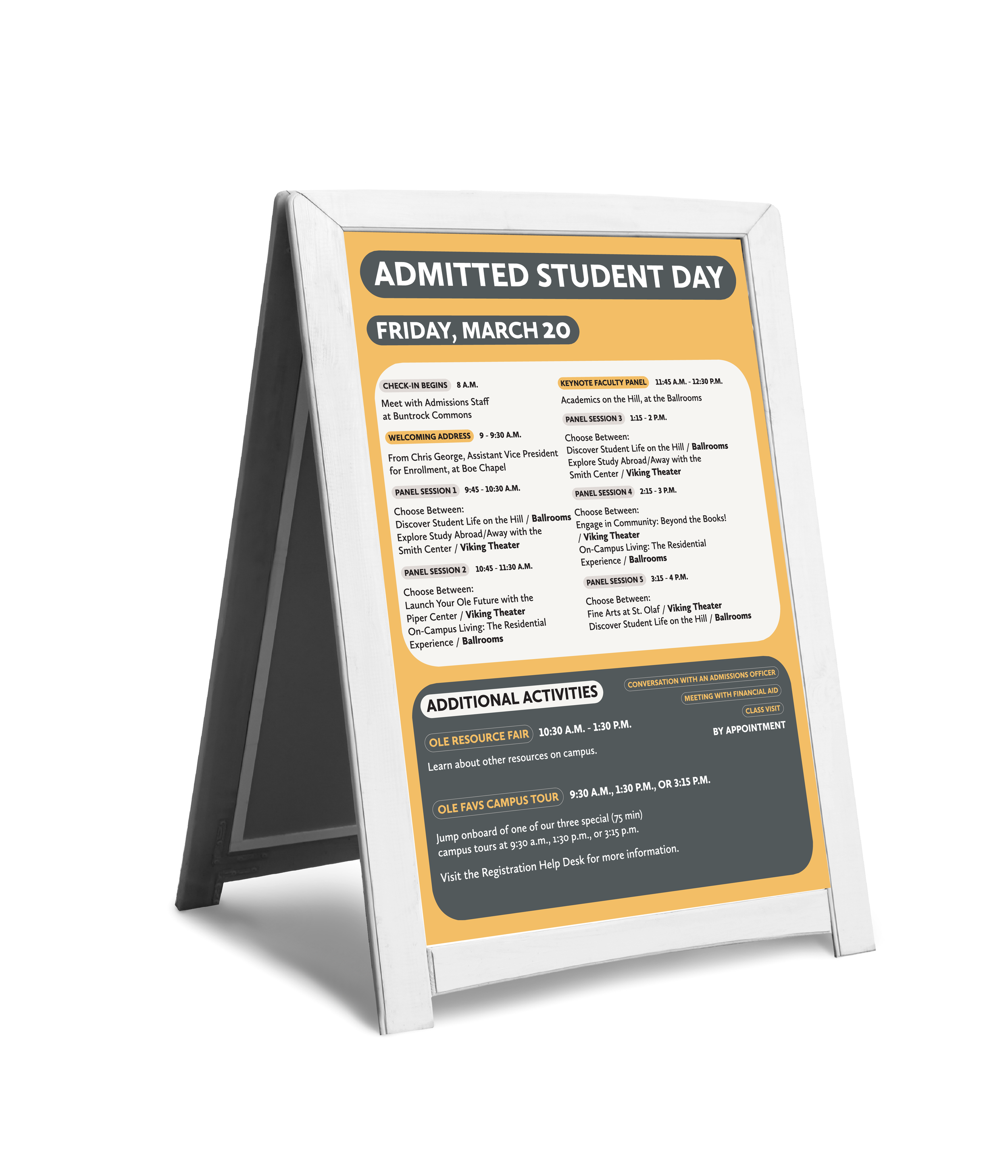
Admitted student day needed cohesive physical signage on a tight timeline, but creating new assets risked visual inconsistency with the event's web design. Without clear visual hierarchy, admitted students and families faced confusion navigating campus and engaging with program information.
Solution
I designed a modular signage system that directly mirrored the web design for admitted student day, leveraging existing brand assets and design standards. By strategically repeating visual elements and establishing clear typographic and spatial hierarchy.
Outcome
The unified signage system created a seamless visual journey across campus that extended the digital event experience into physical space. Clear hierarchy guided admitted students and families through campus while reinforcing key messaging, increasing engagement with programming and planning opportunities, strengthening their sense of belonging before they even arrived on the hill.
Problem
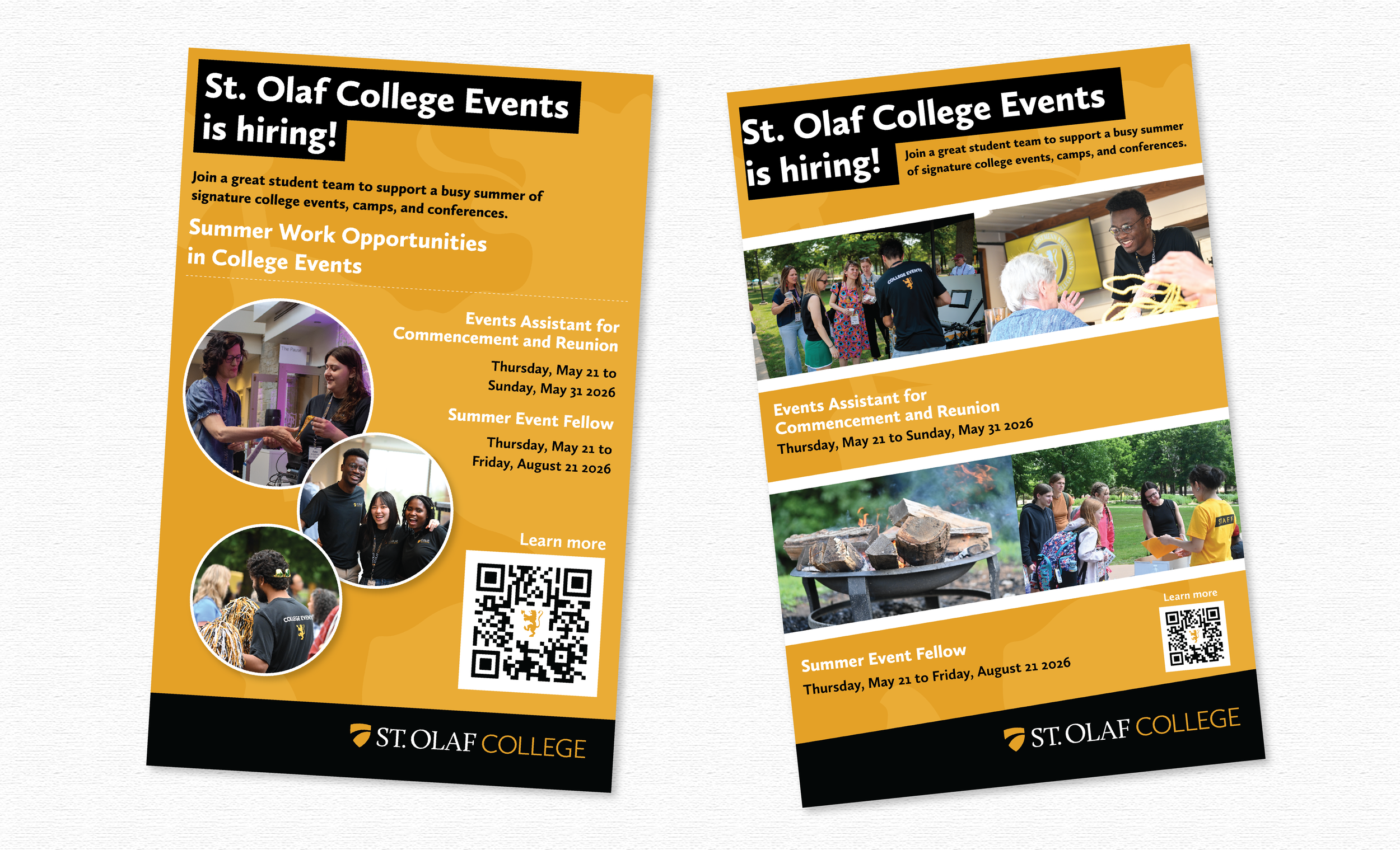
St. Olaf's event posters weren't capturing student attention or driving engagement. Previous designs felt either too formal and institutional or lacked clear information hierarchy, making it difficult for students to quickly understand event details. Posters weren't standing out in campus spaces or connecting authentically with student interests.
Event Posters
Solution
I developed a playful poster series that balanced visual personality with functional clarity. Using digital imagery and dynamic layouts, each design prioritized information hierarchy while maintaining authentic connection to campus culture and St. Olaf brand standards. The posters were engineered to grab attention across crowded campus spaces without sacrificing readability or event details.
Outcome
The event posters became engaging focal points around campus that sparked student curiosity and participation. By blending playful aesthetics with clear visual hierarchy, the designs successfully communicated event information while reflecting student culture, transforming posters from institutional announcements into inviting calls to action that drove attendance and community engagement.