Project Overview
Hall of Fame, a city-edition jersey design campaign for League One Volleyball (LOVB), explores the unique histories and identities of nine major U.S. cities that host the top professional volleyball teams in the country. Through depictions of cultural traditions, architecture, the environment, and consistent brand style, I created Hall of Fame as if LOVB tasked me with designing not only their first-ever city-edition campaign, but the first-ever professional volleyball hall of fame exhibition. Through logo development, digital illustration, and photo rendering, the campaign explores how design can elevate visibility within a growing genre of women’s sports and emphasize athletes’ cultural narratives built through their cities. Featuring the class of 2026 St. Olaf Volleyball athletes, each custom jersey intends to capture the expressiveness and mottos of each LOVB team while celebrating the importance and drive of female athletes and their ties to the cities they represent.
#1 Atlanta
Built upon hustle, the Atlanta team emphasizes movement and spirited pursuit. The city of Atlanta, Georgia, is often recognized as fast-paced and bustling with energy. To capture this vibrancy, I designed with the intention of highlighting the rapid movement of the city and its cultural background and significance, specifically in pop culture and hip-hop. The result is a jersey with graphic graffiti imagery, movement, and reference to the album ATLiens, the 1996 studio rap album by Outkast.
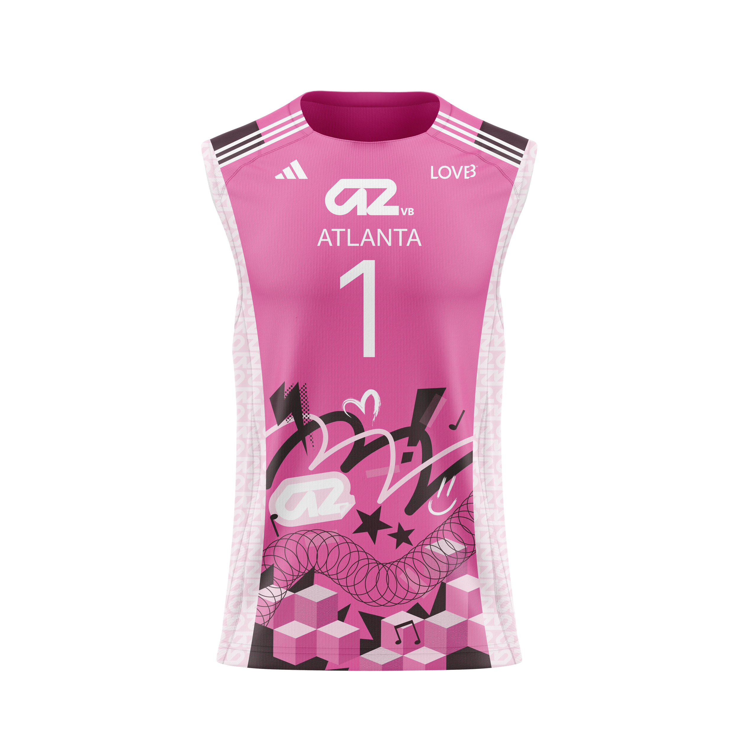
ATL
ATL
#2 Houston
Backed by the vision of pulse, or a short burst of energy, the Houston team embodies team-driven success. Driven by Houston, Texas’s ties to NASA, I design this jersey directly referencing the significance of air and space in the city. Through swift, propelling shapes, the imagery sweeps towards the top of the jersey, encapsulating the team’s pursuit of excellence.
HTX
HTX
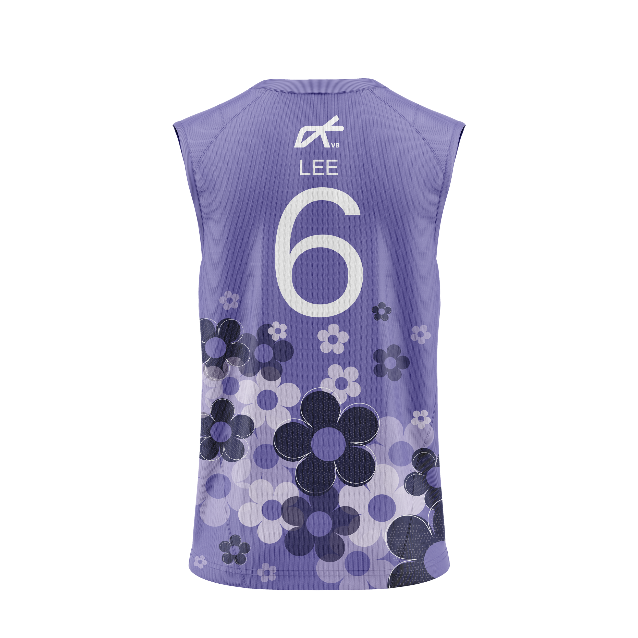
#3 Madison
Madison, a city recognized for its iconic city-centered lakes, houses a team that strives for consistency and cohesion, pushing athletes to reach a flow. Through a softer strategy of design, I included imagery of the infamous isthmus of Madison, the strip of land between Lake Mendota and Lake Monona. Similarly, the iconic Union Terrace Chairs of the University of Madison, Wisconsin, make a floral appearance on the back of the jersey, tying many of the now professional volleyball athletes to their alma mater.
MAD
MAD
#4 Nebraska
Nebraska, built upon legacy and tradition, is known as the volleyball state. Highlighting growth, advancement, renewal, and a long history of legendary volleyball athletes, I centered this design on the true commitment Nebraska displays to support female volleyball athletes. Historically, the University of Nebraska has sent one of the largest groups of athletes to the Olympic Games. Honoring the cultural significance of Nebraska volleyball within the country, I created an Olympic-themed jersey design. Focusing on Olympic imagery and pictograms, the bold, abstract style mirrors some of the most iconic design campaigns from the past summer Olympic Games.
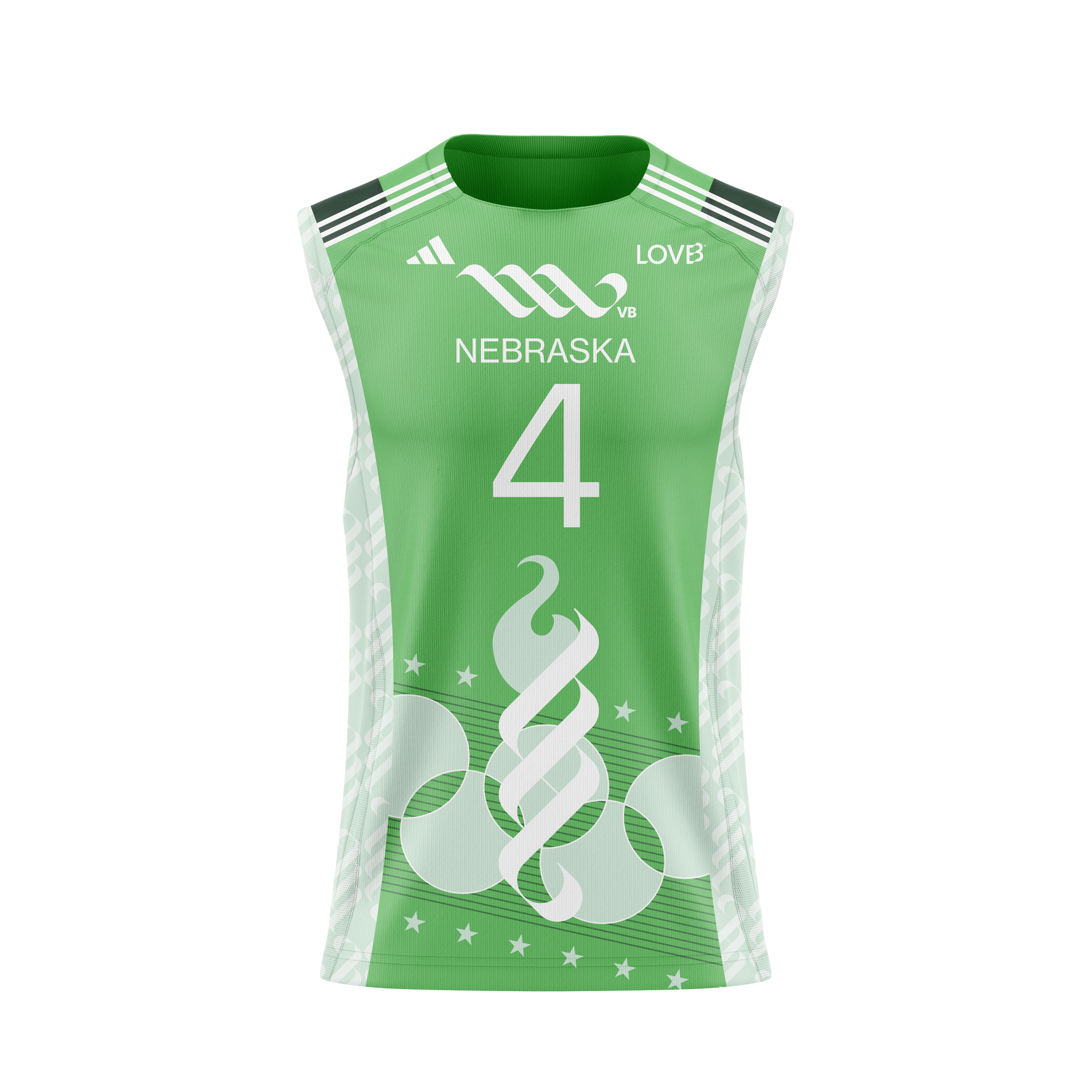
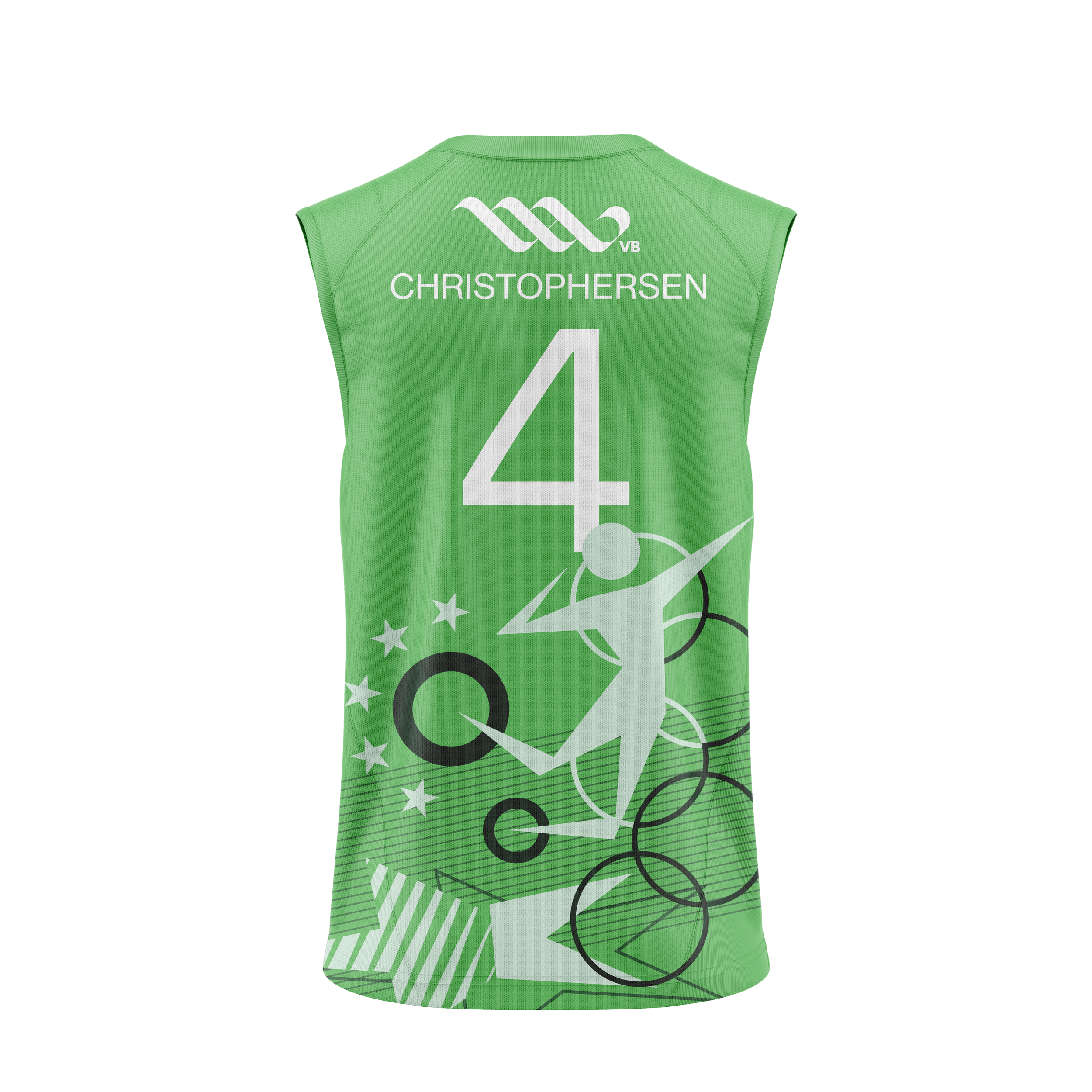
NEB
NEB
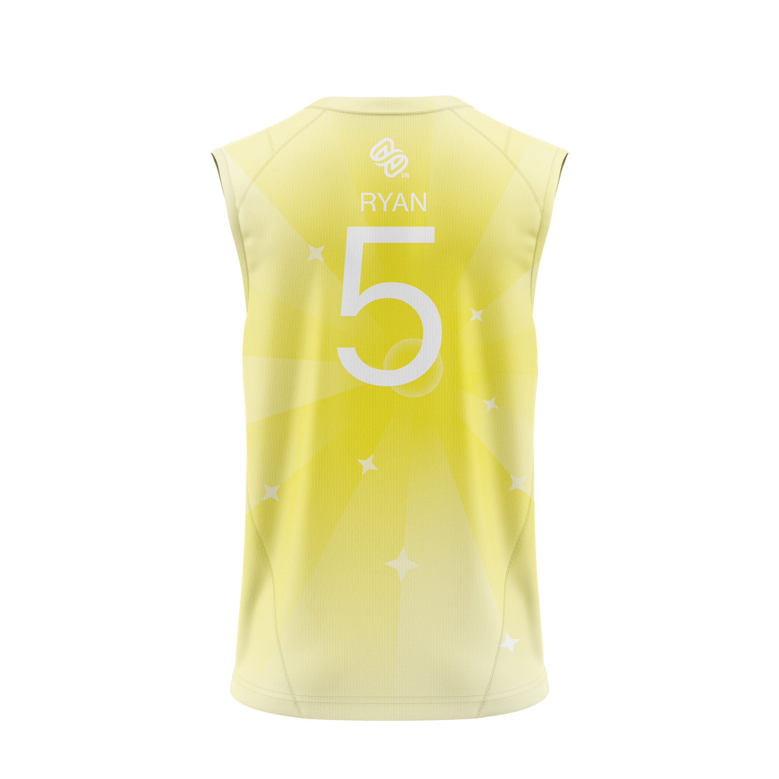
#5 Salt Lake
Ascend, Salt Lake’s driving word, centers on the optimism, growth, and radiance required to excel in professional sports. Built upon Salt Lake City’s stunning scenery and mountainous views, this jersey was designed to emit the brilliance of sunlight onto the court. With soft gradients, delicate light rays, and rocky mountain structure, this piece embodies the landscape backing the newly crowned 2026 LOVB champion.
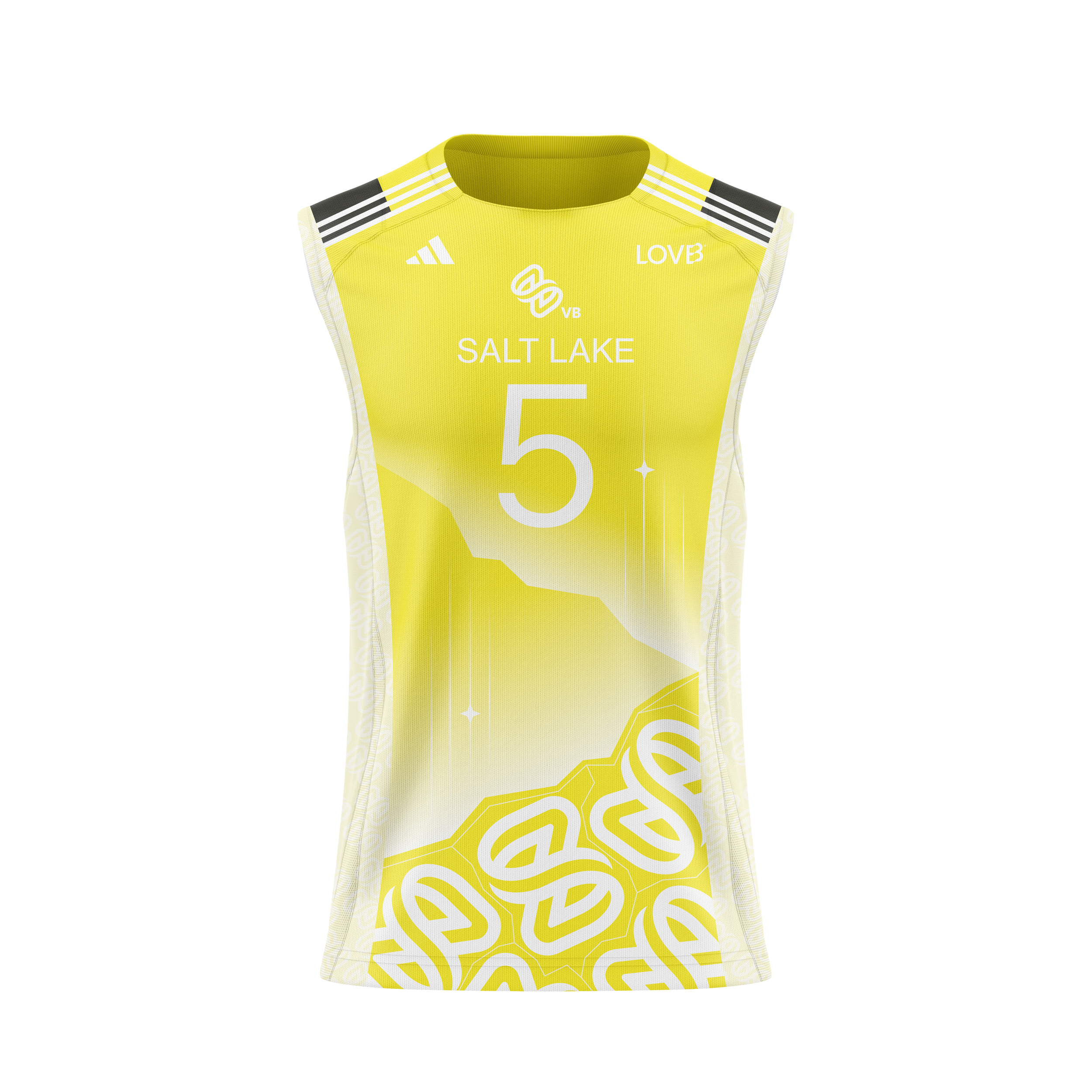
SLC
SLC
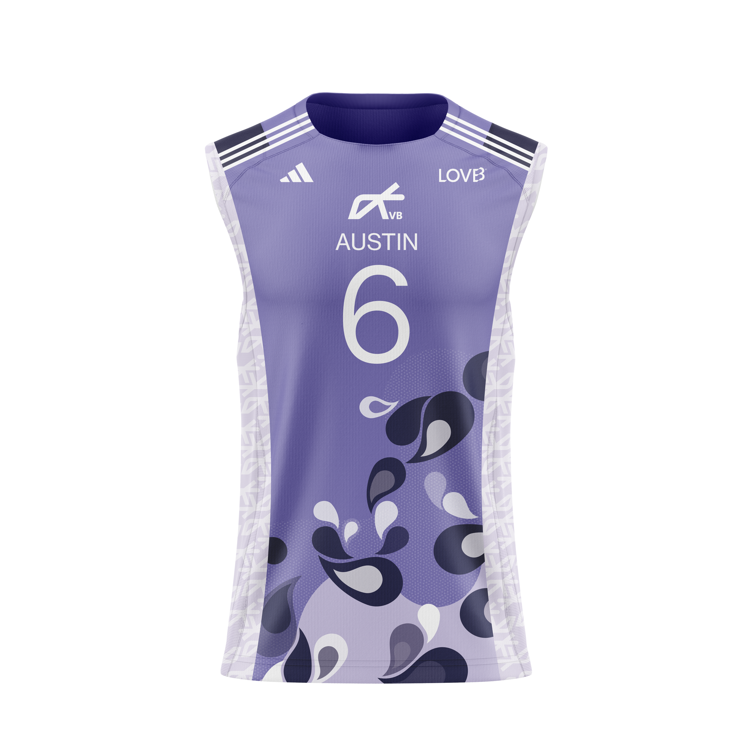
#6 Austin
Reminiscing on the 2000’s slogan “keep Austin weird”, this jersey design accentuates the nostalgic feel of psychedelic imagery and positive energy echoing through the city. Primarily focused on a simplified unification of repetitive paisleys and flowers, the subdued movement and texture stress the precise consistency involved in becoming a great volleyball team.
ATX
ATX
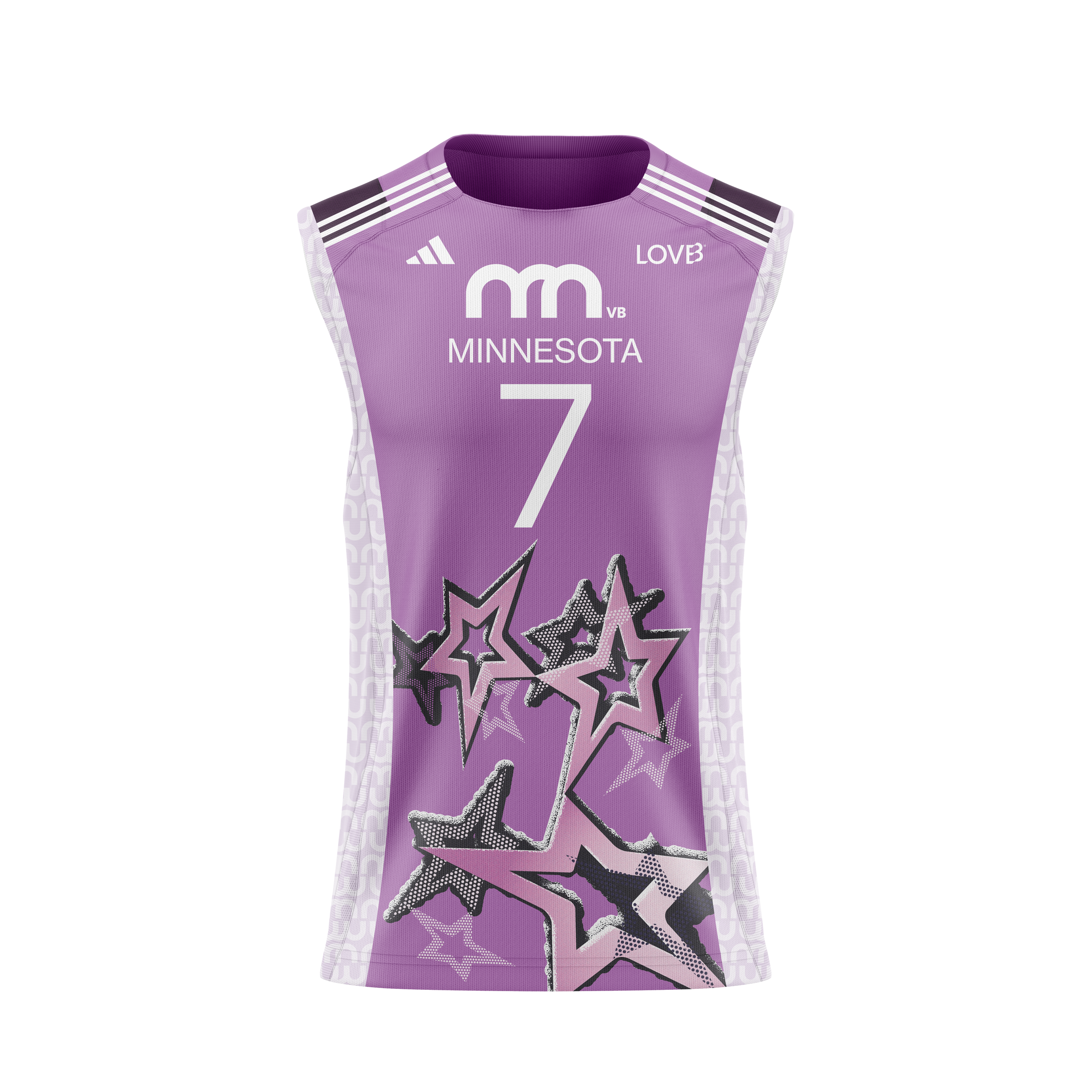
#7 Minnesota
Minnesota, one of three up-and-coming 2027 LOVB additions, has yet to make its first impression on the volleyball world. With nothing but the color purple chosen to represent the team thus far, I designed with little guidance from LOVB’s existing values. Known as the north star state, and for its chilling climate, I centered this design around the vivid feeling of withstanding the cold. Similarly, with ties to Prince and the stardom he founded in Minnesota, jersey #8 incorporates sharp lines, layers of texture, and punchy personality.
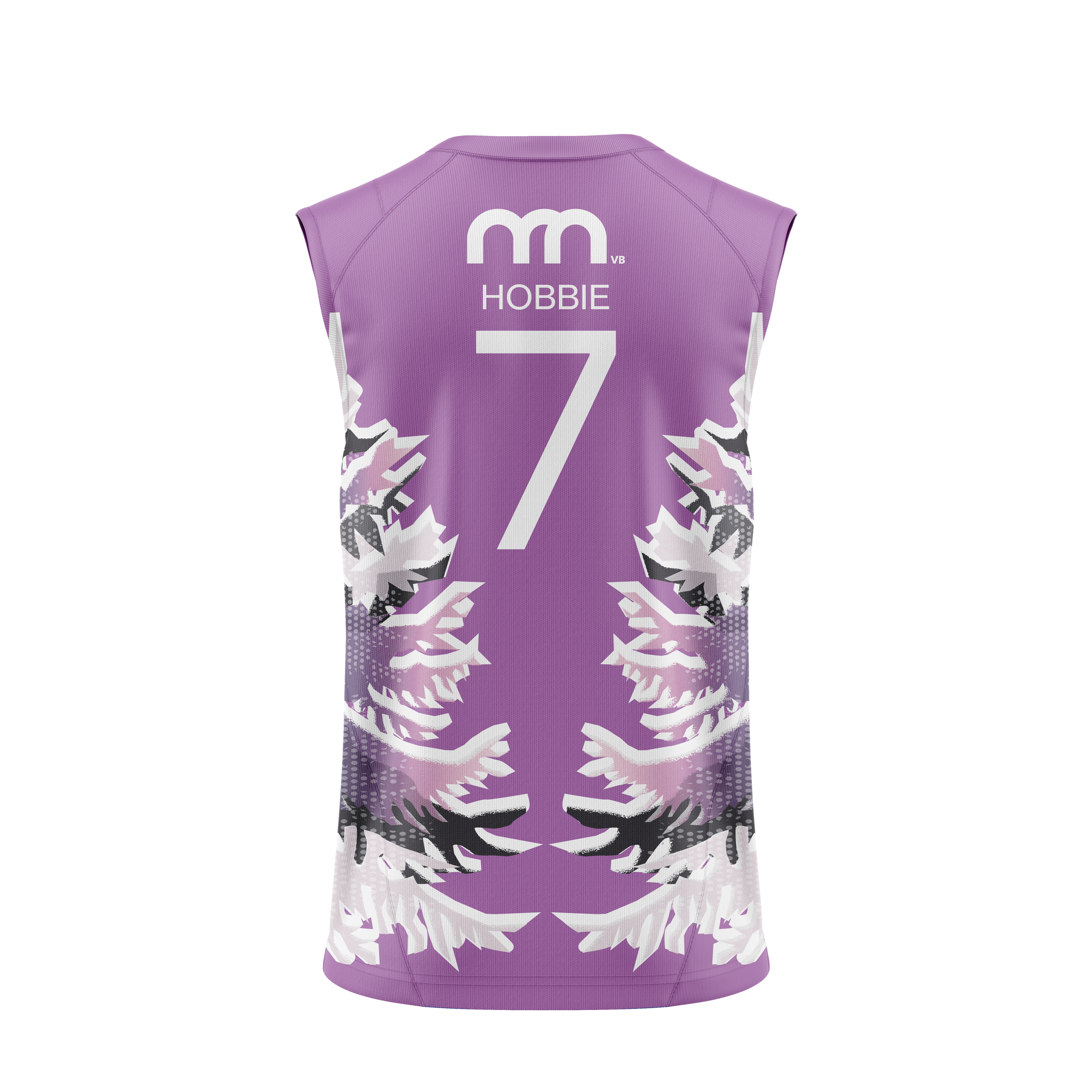
MIN
MIN
Logo Ideation
With no official brand imagery, I designed an original team logo that can coexist with the LOVB brand. Maintaining the sleek, curved lines that are utilized in other teams, such as Madison, the MN in Minnesota becomes three satisfying arches that maintain the interwoven relationships between each LOVB team. As a result, this logo functions naturally within the existing brand identity and clearly communicates its proximity and relationship with Madison.

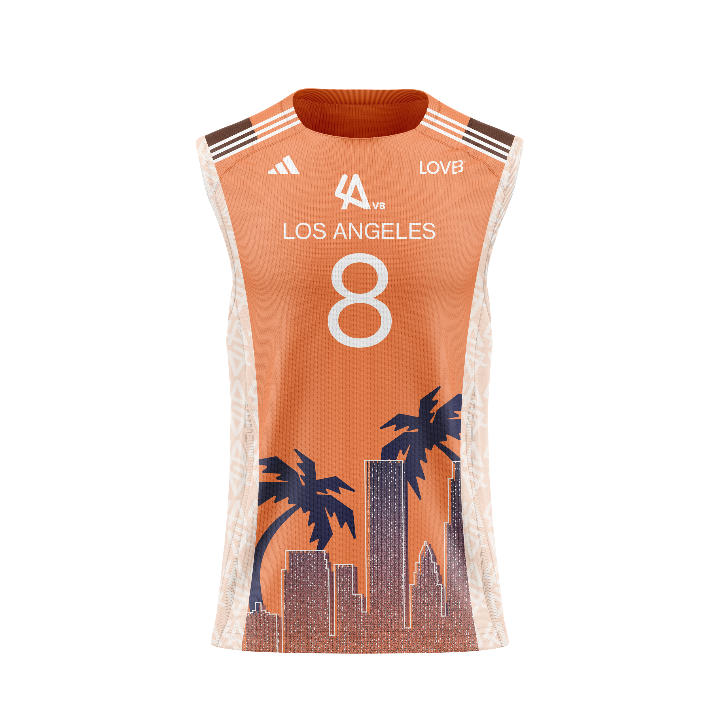
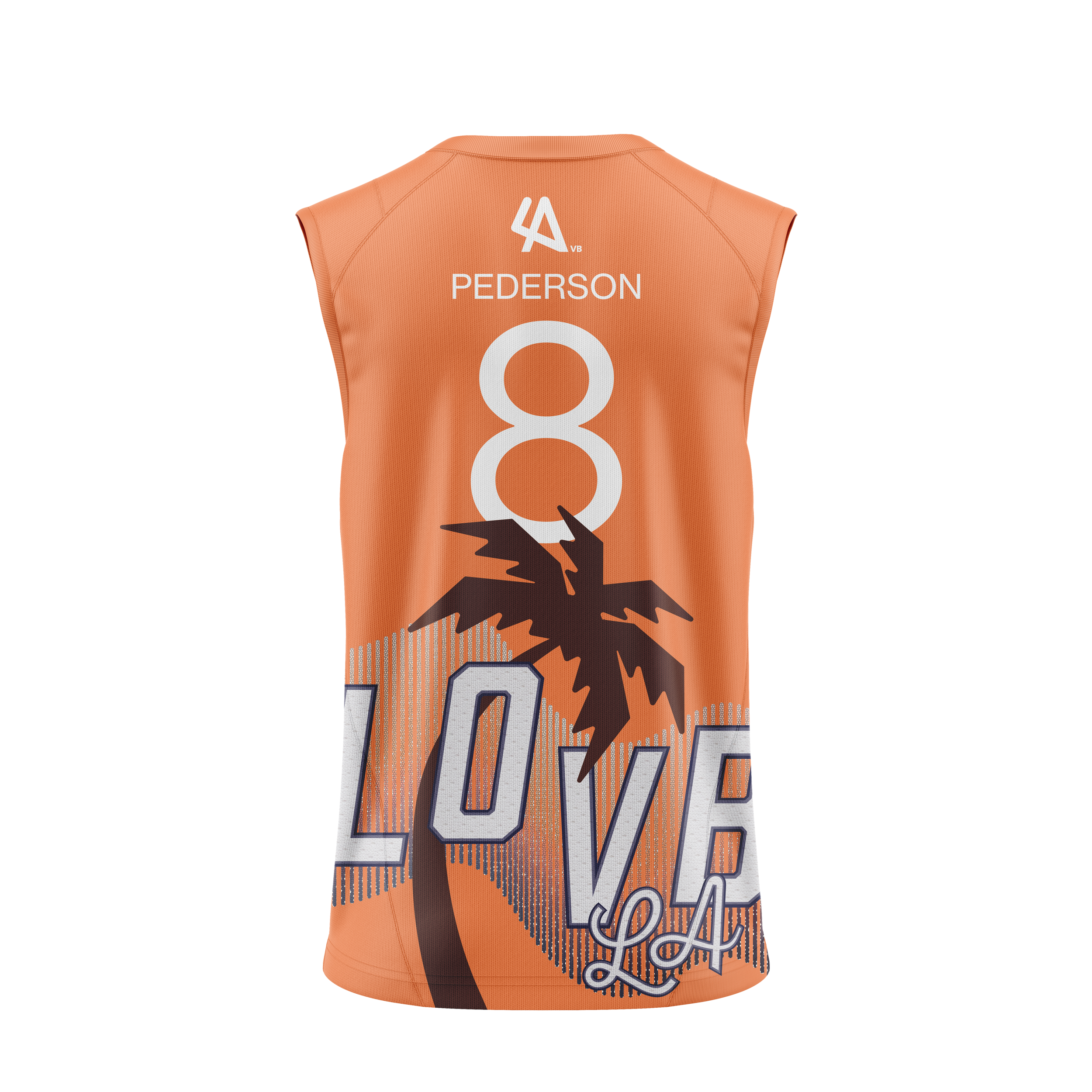
#8 Los Angeles
Los Angeles, LOVB’s soon-to-be eighth edition team in 2027, communicates the iconic vibe of LA life. Focusing on the glitz and glam of the Los Angeles area, along with imagery of the Hollywood sign and desert heat, this design transforms the sunny metropolis on textile.
LA
LA
Logo Ideation
Again, with no existing LA imagery, I designed an original team logo that maintains synergy with the LOVB brand. Inspired by the bold, accentuated lines in Austin and Houston’s logos, the “L” and “A” reference the iconic hand gesture that represents the city. As a whole, this logo replicates the edginess of urban life and connection to its sister teams.
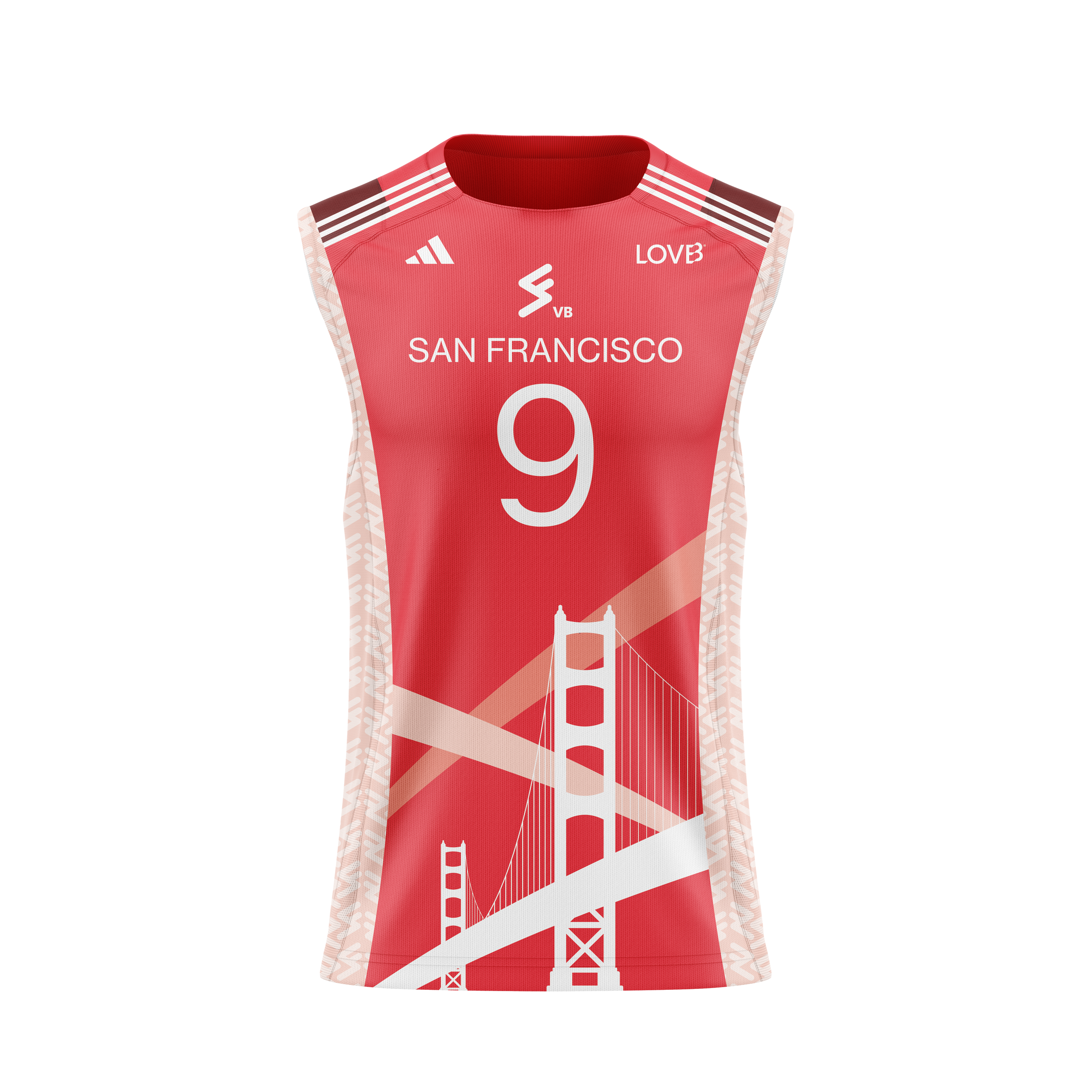
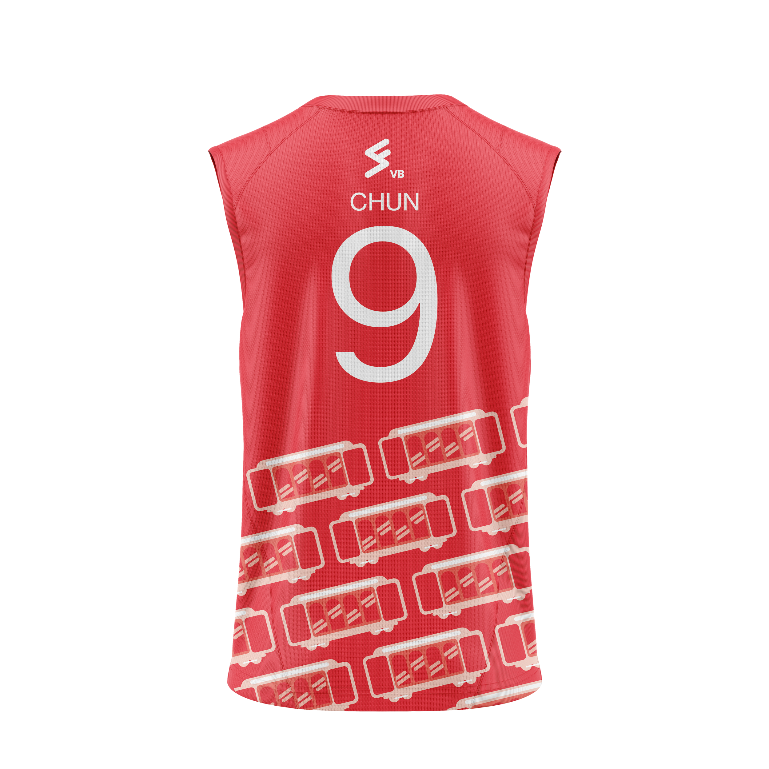
#9 San Francisco
San Francisco, the last upcoming 2027 team, will be the second edition on the West Coast, further expanding LOVB’s influence in women’s sports. I centered this final design around the iconic landmarks and architecture that define San Francisco and connect the future athletes to their city. Utilizing repetition and animated icon style of trollies, this design encapsulates the lively nature of the bustling city environment and signature hilly landscape.
SF
SF
Logo Ideation
The third and final logo addition continues the sleek flow of the LOVB brand imagery. I designed this logo with the steep hills of San Francisco at the forefront of the vision. Similar to Los Angeles, San Fran incorporates the bubbly graphic line work that is sleek and straightforward when communicating the team's vision and aesthetic.